A good pitch deck makes the company, problem, proof and next step obvious on a fast scan. A bad pitch deck forces investors to hunt through vague claims, crowded slides and unsupported numbers. In the first 10 seconds, clear purpose, credible momentum and readable hierarchy determine whether the rest feels worth examining.
What investors notice in the first 10 seconds
The first scan is not a miniature investment committee. It is a relevance and credibility check. Can the reader tell what the company does, who needs it, why the opportunity matters and whether there is any real evidence? A polished layout helps only when it shortens that path to understanding.
Storydoc's 2026 analysis of its own pitch deck viewing data reports that 31% of readers leave within 10 seconds and that 82% of investors who reach slide four finish the deck. Treat those figures as platform-specific, not a universal law. The useful lesson is that the opening must earn attention instead of spending it on a slow introduction.
The full review is longer. Dropbox DocSend's March 2026 seed deck research reports an average review time of three minutes and 44 seconds, with 58% of decks viewed to completion. Investors can inspect details, but only after the opening gives them a reason to continue.
Good vs bad pitch deck: the differences at a glance
- Purpose: A good deck explains the company in one specific sentence. A bad deck opens with a slogan that could describe dozens of businesses.
- Problem: A good deck names a customer, pain and consequence. A bad deck presents a broad trend without proving an urgent need.
- Solution: A good deck shows the changed customer outcome. A bad deck lists features before the reader understands the job.
- Evidence: A good deck defines metrics, periods and sources. A bad deck uses large numbers with missing context or flattering denominators.
- Story: A good deck answers the next investor question in sequence. A bad deck jumps between market, product, team and forecasts.
- Design: A good deck uses hierarchy to reveal one conclusion. A bad deck treats every sentence, logo and chart as equally important.
- Team: A good deck proves founder-market fit and execution. A bad deck fills space with advisors and generic biographies.
- Ask: A good deck connects capital to measurable milestones. A bad deck names a round without explaining what it buys.
1. The cover: specific purpose beats clever positioning
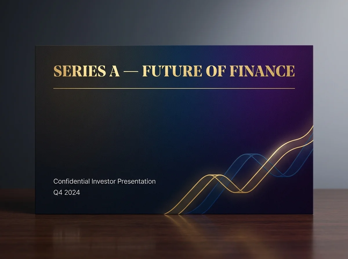
A good cover combines the company name with a plain-language purpose statement. 'Compliance workflows for regional banks' gives an investor a category, customer and reason to keep reading. 'Reimagining trust for a connected world' sounds polished but leaves the reader to decode the business.
The cover should also look intentional: one focal point, readable type and no visual noise. It does not need to explain the whole company. It needs to orient the right investor quickly enough to make slide two feel relevant.
2. The problem: evidence beats adjectives
Bad problem slides say a market is broken, inefficient or huge. Good ones show who experiences the pain, how often it occurs and what it costs. Replace 'procurement is inefficient' with a defensible statement such as 'mid-market finance teams spend 11 staff hours reconciling each new vendor.' Then source the number or label it as customer research.
Specificity lets the investor test the premise. It also creates a clean bridge to the product. If the solution slide does not resolve the exact pain described, the narrative has already split into two stories.
3. Product and solution: show the change, not the interface
A screenshot is not automatically proof. Tiny interface labels, callout arrows and six feature boxes usually make the reader work harder. Show the shortest path from problem to outcome: the input, the key action and the result. Crop product screens to the part that matters and caption the business value in a conclusion-led headline.
Y Combinator's pitch deck design guidance reduces the visual standard to three useful tests: make slides legible, simple and obvious. The enduring point is not minimalism for its own sake. It is reducing the time between looking at a slide and understanding its one idea.
4. Traction: defined numbers beat impressive-looking numbers
Investors notice missing definitions quickly. '300% growth' is weak without a period, starting value and metric. 'Monthly recurring revenue grew from $18,000 to $72,000 between January and July 2026' is testable. Show the period, unit, source and denominator directly on the slide, then keep deeper cohort or pipeline detail in the appendix.
- Use the metric that fits the model: revenue, retention, active usage, paid pilots, repeat purchase or another real behavior.
- Separate contracted, invoiced and collected revenue when the distinction matters.
- Do not mix cumulative and period metrics in one chart without clear labels.
- Name exclusions, sample size and whether a figure is actual, forecast or target.
5. Market and competition: a method beats a giant number
A bad market slide points to a trillion-dollar category and assumes a tiny share will become revenue. A good market slide works from reachable customers, realistic annual value and a credible route to them. Show the calculation so the investor can disagree with an assumption without doubting the entire slide.
Competition deserves the same honesty. The real alternative may be an incumbent, a spreadsheet, an internal team or doing nothing. A matrix where your company wins every row feels engineered. Compare the criteria customers actually use, admit trade-offs and explain what is hard to copy.
6. Team and ask: execution beats biography
The team slide should answer why these people can solve this problem now. Use relevant shipped products, customer access, technical depth, regulated-market experience or prior operating results. Employer logos without a connection to the business add prestige but not proof.
CRV's current seed and Series A guidance emphasizes team and traction, while noting that the evidence bar changes by stage. Seed investors may underwrite insight and early execution. Series A investors expect repeatable performance, retention, growth quality and a credible scaling plan. The deck should show the evidence your round promises, not imitate a later-stage template.
Finish with a specific ask: the amount, expected runway and milestones the round is designed to achieve. '40% for product and 30% for sales' is a budget category. 'Launch the regulated product, hire three account executives and reach $2 million ARR by Q4 2027' is an operating plan an investor can examine.
7. Visual design: hierarchy beats decoration
A visually strong deck does not make weak evidence true. It makes the argument easier to evaluate. Use one conclusion per slide, a consistent grid, generous margins, readable type, restrained color and charts that emphasize the relevant comparison. Repeated furniture such as logos, page numbers and source notes should stay quiet.
If every element is bold, nothing leads. If the reader must zoom, scan a legend repeatedly or remember a color from three slides ago, the design is adding cognitive work. The goal is not to look expensive. It is to make the company's strongest evidence impossible to miss.
Run the 10-second test before sending the deck
Give the PDF to a smart person who does not know the company. Let them view the cover and first two slides for 10 seconds, then close it. Do not ask whether they liked it. Ask what the company does, who has the problem, what feels credible and what they expect to see next.
- Test the cover, then every slide individually at normal laptop size.
- Ask the reviewer to state the slide's conclusion in one sentence.
- Flag any claim they cannot distinguish as fact, estimate or target.
- Check that charts keep their meaning when viewed on a phone.
- Remove one element from every crowded slide and test again.
- Verify sources, dates, definitions, contact details and sharing permissions.
- Track repeated investor questions and revise the argument, not only the layout.
When professional pitch deck help is worth it
Get help when the evidence is complex, the fundraising window is expensive to miss or the founder is losing days to charts and formatting. Keep ownership of every claim. A strong partner should challenge unclear logic, protect factual accuracy and make revisions coherent across the deck and appendix.
PitchWorx can shape the narrative, charts and visual system through its pitch deck design service. Creative Assist is currently $699 per month with unlimited queued requests, two active requests, revisions, editable source files and most everyday requests delivered within about 72 hours. That model fits founders who need the deck, appendix and investor updates to evolve together.
Frequently asked questions
What makes a pitch deck good or bad?
A good pitch deck makes a specific investment case with clear language, credible evidence and one conclusion per slide. A bad pitch deck forces the reader to infer the business, hides weak assumptions behind polish or presents numbers without definitions. Good design improves comprehension, but clarity and proof do the persuasive work.
What do investors notice first in a pitch deck?
Investors first notice whether they understand the company, customer and reason to care. They also scan for credibility signals such as real traction, a coherent visual hierarchy and specific claims. The exact priority varies by investor and stage, so the opening should orient quickly and bring the strongest relevant proof forward.
What is the biggest pitch deck mistake?
The biggest mistake is making the reader work to find the point. Vague headlines, several ideas per slide, dense text and unsupported numbers all create that problem. Write the conclusion first, attach the best evidence and remove anything that does not help the investor understand or evaluate it.
How much text should be on a pitch deck slide?
Use the least text needed to make one idea understandable without narration. A send-ahead deck needs more context than a live presentation, but it should still scan easily at normal size. Move definitions, methods and diligence detail to source notes or an appendix rather than shrinking the type.
How many slides should a pitch deck have?
There is no universal count. A focused main deck often falls between 10 and 15 slides, while DocSend's current seed guidance describes 19 to 20 pages across 12 sections. Use the shortest sequence that proves the case for your stage, then place supporting analysis in an appendix.
Can good design save a weak pitch deck?
No. Design can reveal logic, improve recall and make evidence easier to inspect, but it cannot create product-market fit, traction or founder credibility. If the story is weak, fix the customer problem, business evidence and round logic first. Then design the deck so those strengths are obvious.
A fundraise rarely stops at one deck. Founders also need an appendix, investor updates, data visuals, a landing page, launch graphics, social assets, video and brand refinements. PitchWorx keeps that work in one managed queue with senior review. One subscription does all of this. See the current $699/month Creative Assist plan.