
QUICK ANSWER
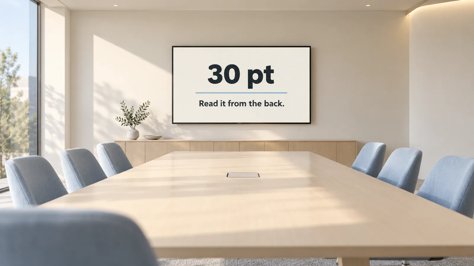
The 30-point font rule says no slide text should be smaller than 30 points, so people at the back of the room can read it. But the rule only works if you test it in real conditions. Sit where your farthest viewer will sit, check the slide on the actual screen, and use simple desk tests, such as viewing slides at 25% zoom, to spot text that is too small, too thin or too low in contrast. A presentation design agency like PitchWorx builds this testing into every deck.
Table of Contents
- Introduction
- Where the 30-Point Rule Comes From
- Why Font Size Alone Is Not Enough
- How to Test Readability at Real Distances
- Quick Desk Tests Before You Present
- Why Creative Design Matters for Business
- How Readable Design Shapes Social Media and Growth
- Social Media Growth Hacks
- Free Design Tools and Their Hacks
- PitchWorx Services and Subscription Model
- Case Study: The Back-Row Problem
- Why Choose PitchWorx
- Conclusion
- FAQs
Introduction
A slide can look perfect on your laptop and still fail in the conference room. Text that seems clear at arm's length blurs from the back row, and people stop listening and start squinting.
PitchWorx has designed presentations for 14 years, since 2012, across the USA, UK, UAE and India. As a presentation design agency, we know readability must be tested, not guessed. This guide explains the 30-point font rule and how to check it at real conference room distances.
Where the 30-Point Rule Comes From
The 30-point guideline was made popular by Guy Kawasaki's 10/20/30 rule: ten slides, twenty minutes and no font smaller than thirty points. His logic was simple. If you need small text, you have too much text.
It also makes practical sense. In a typical meeting room, the farthest viewer sits several screen heights away, where small text becomes hard to read, especially for older viewers.
Why Font Size Alone Is Not Enough
Thirty points is a starting line. Any experienced presentation design agency also checks:
- Font weight: Thin fonts fade at distance.
- Contrast: Grey text and busy photo backgrounds lose clarity.
- Font style: Clean sans serif fonts read best on screens.
- Room conditions: Projectors and window light wash out colours.
A thin grey 30-point font can be harder to read than a bold dark 24-point one.
How to Test Readability at Real Distances
1. Measure the Room
A common rule of thumb is that the farthest viewer should sit no more than about six to eight screen heights from the display.
2. Do the Backrow Walk
Open your deck on the actual screen and sit in the farthest seat. If you cannot read every word without leaning forward, increase size, weight or contrast.
3. Test With Fresh Eyes
Ask a colleague who has not seen the deck to read three random slides from the back row.
4. Check Charts and Labels
Chart labels and footnotes fail most often. Cut extras and enlarge key numbers.
5. Test the Lighting
Test with lights on and blinds open to reveal low-contrast text.
Quick Desk Tests Before You Present
When the room is not available, try these:
- The 25% zoom test: View your slides at 25% zoom on your laptop. If you cannot read the text, the back row cannot either.
- The paper test: Print a slide on A4 paper, place it on the floor and read it standing up.
- The phone test: If it reads on your phone, it reads on Zoom.
Our presentation design agency team runs these checks on every deck before delivery.
Why Creative Design Matters for Business
Readable slides show respect and confidence. Good business presentations put meaning first: one message per slide, numbers as simple charts and every claim backed by evidence.
Poor readability makes strong businesses look careless, which is why companies turn to a presentation design agency before important pitches.
How Readable Design Shapes Social Media and Growth
The rules that make slides readable in a big room also make posts work on small screens. When slides and social posts share one clear style, your brand becomes recognisable, building trust and enquiries. Many growing teams use an unlimited graphic design agency to keep decks and social content consistent.
Social Media Growth Hacks
- Apply the 30-point mindset: If text is not readable at thumbnail size, cut words.
- Turn slides into carousels: Readable decks convert easily into swipeable posts.
- Use branded templates: An unlimited graphic design agency can supply layouts that keep every post consistent.
- Design mobile first: Always preview at phone size.
Free Design Tools and Their Hacks
- Google Slides: Set a master layout with 30-point minimum body text so every new slide follows the rule.
- PowerPoint (free web version): Use the Accessibility Checker to flag low-contrast text.
- WebAIM Contrast Checker: Paste your text and background colours to test contrast before presenting.
- Google Fonts: Choose clear sans serif fonts such as Inter, Roboto or Open Sans.
Hack: Use free tools for drafts, then let a presentation design agency or an unlimited graphic design agency refine high-stakes work.
PitchWorx Services and Subscription Model
PitchWorx offers:
- Investor pitch decks and sales presentations
- Board, conference and event slides tested for readability
- Template systems with built-in font rules, brand identity and social creatives
Clients choose project-based services for one-time needs, or a subscription plan for ongoing support. As an unlimited graphic design agency, our subscription covers decks and graphics for a flat monthly fee. We are ISO 27001:2022 certified, so confidential material stays protected.
Case Study: The Back-Row Problem
A UK-based professional services firm (details anonymised) heard the same feedback after every client meeting: the back row could not read its 18-point, thin, grey slides.
Our presentation design agency team rebuilt the master template with 30-point minimum body text, bolder fonts, high-contrast colours and simplified charts. Every layout passed the backrow walk and 25% zoom test.
The client later moved to our subscription, using PitchWorx as an unlimited graphic design agency for ongoing decks and social content.
Why Choose PitchWorx
- 14 years of experience: Designing presentations across four markets since 2012.
- Tested readability: Every presentation design agency project we deliver is checked for distance and contrast.
- Specialist focus: A presentation design agency first, with decks as our core craft.
- Flexible models: Projects or a flat-fee subscription.
- Security assured: ISO 27001:2022 certified processes.
Conclusion
The 30-point font rule is a strong start, but real readability comes from testing: measure the room, sit in the back row, check contrast and use desk tests when the room is unavailable.
PitchWorx brings 14 years of experience as a presentation design agency to every deck. Talk to us to make your next presentation readable from every seat.
| Make every slide readable from the back row Talk to PitchWorx about a project or design subscription. |
|---|
Frequently Asked Questions
1. What is the 30-point font rule?
It is a guideline that says no slide text should be smaller than 30 points, so everyone in the room can read it.
2. Are 30 points always big enough?
Not always. Thin fonts, low contrast and large rooms can defeat it. Always test.
3. How can I test readability without the room?
Use the 25% zoom, paper or phone test, or ask a presentation design agency to review your deck.
4. What is the most common readability mistake?
Small chart labels and footnotes, followed by grey or thin text.
5. Does the rule apply to online presentations?
Yes. Large, high-contrast text also reads better on laptops and phones during video calls.