A US sales team can lose a deal on slide 4. Not because the numbers were wrong, but because the brand font fell back to Arial, the chart lost its colors, and the animation broke in a browser tab. Presentation design has quietly become a software problem. The tool your team opens every morning sets the ceiling on how good your deck can look.
Introduction
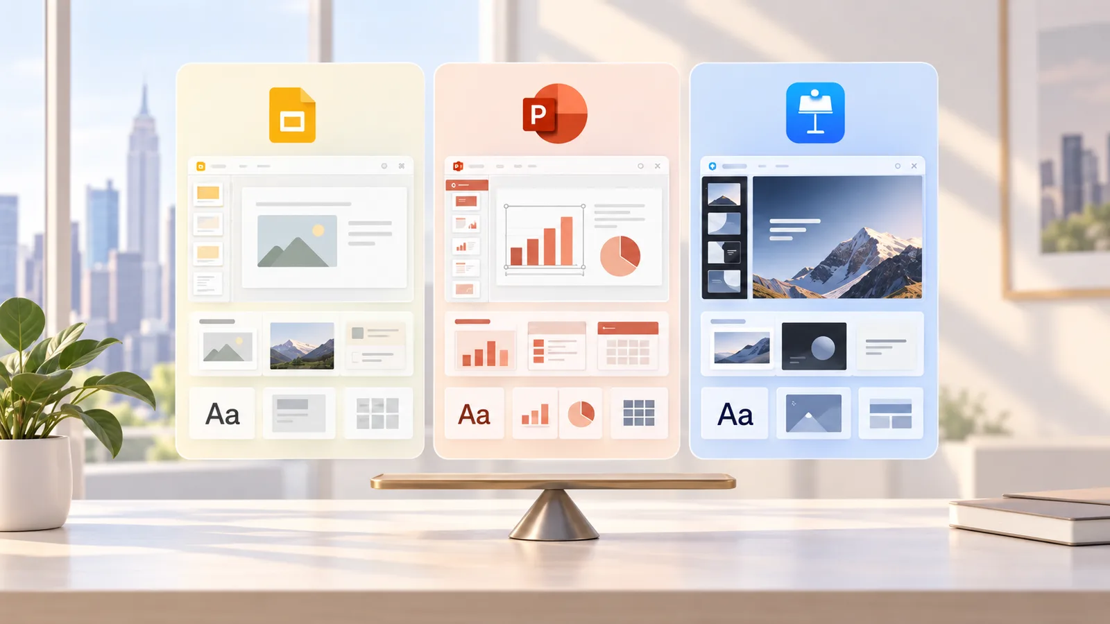
US teams rarely pick a presentation tool on design merit. IT picks it. Google Workspace companies land in Google Slides, Microsoft shops live in PowerPoint, and design-led startups on Mac's drift toward Keynote.
Each tool then imposes its own design constraints: which fonts load, how masters behave, what survives export, and how charts update. Those constraints decide whether your deck looks premium or improvised.
This guide compares Google Slides, PowerPoint and Keynote strictly through that lens. You get the facts, the workarounds designers actually use, the tools that sit around each app, and a cross-platform case study. It comes from the PitchWorx team, which has designed presentations for clients in the USA, UK, UAE and India since 2012.
Table of Contents
- Quick Answer
- The Market Behind the Tools: Growth Charts and Numbers
- Design Constraints Compared: Slides vs PowerPoint vs Keynote
- Fact vs Hack: What Each Tool Limits and How Designers Work Around It
- The Designing Tools That Sit Around Each App
- Case Study: One Deck, Three Platforms
- About PitchWorx and Our Design Subscriptions
- Final Verdict for US Teams
Quick Answer
PowerPoint gives US teams the most design control: font embedding, deep Slide Master layouts, Morph transitions, Excel-linked charts, and the widest compatibility with clients and investors. Google Slides wins on real-time collaboration and browser access, but it limits you to Google Fonts, simpler animation and basic charts. Keynote produces the most polished motion and typography on a Mac, yet it loses fidelity when exported to .pptx and suits Windows-heavy teams poorly. Choose by where the deck travels: external and enterprise decks in PowerPoint, internal collaborative decks in Slides, stage talks on Mac in Keynote. Then build one master template that respects all three.
The Market Behind the Tools: Growth Charts and Numbers
Presentation software is a growth market, and North America is its largest region. The design stakes rise with it.
[embed: node/7f10b6ac-d436]
The platforms behind these tools are enormous. Google Workspace reports more than 11 million paying customers, and the US accounts for roughly 59% of its tracked business deployments. Microsoft 365 commercial seats have passed 450 million, with seat growth of about 6% a year, while consumer subscribers rose from 82.5 million to 89 million in fiscal 2025.
More decks on more platforms means more broken fonts and mismatched templates. That is why demand for a PowerPoint design subscription or an Unlimited design subscription keeps climbing among US teams.
Design Constraints Compared: Slides vs PowerPoint vs Keynote
PowerPoint carries the fewest hard design limits; Google Slides and Keynote each trade some control for a specific strength.
| Design constraint | PowerPoint | Google Slides | Keynote |
|---|---|---|---|
| Custom brand fonts | Installed fonts work; fonts can be embedded on save | Google Fonts library only, no font upload | Any font installed on the Mac; may substitute on export |
| Slide Master and layouts | Multiple masters, deep layout control | One theme with layouts, fewer options | Master slides with solid control |
| Animation and motion | Morph, motion paths, triggers | Basic transitions and entrances | Magic Move and cinematic builds |
| Charts and data | Native charts linked to Excel, plus add-ins | Charts linked to Google Sheets | Native charts, limited live data |
| Real-time collaboration | Co-authoring through OneDrive or SharePoint | Best in class, browser native | iCloud collaboration, Apple ID needed |
| Cross-platform fidelity | The .pptx industry standard | Imports .pptx but drops some effects | .pptx export can lose builds and fonts |
PowerPoint is the safe choice when a deck leaves the building. Investors, procurement teams and enterprise buyers in the US still expect .pptx files, and the Slide Master is deep enough to hold a full brand system.
Google Slides shines when ten people edit one deck on a Friday afternoon. The tradeoff is typography and motion. If your brand font is not on Google Fonts, Slides cannot show it.
Keynote is the stage performer. Founders presenting from a MacBook get smooth Magic Move transitions and crisp type, but the file becomes fragile the moment a Windows colleague opens it.
Fact vs Hack: What Each Tool Limits and How Designers Work Around It
A fact is a limit the software imposes. A hack is the workaround a professional designer uses so the audience never notices it.
| Tool | The fact | The designer's hack |
|---|---|---|
| PowerPoint | A font not installed on the viewer's machine gets replaced. | Turn on font embedding in the save options and send a PDF alongside the .pptx for anyone viewing on mobile. |
| PowerPoint | Hand-built charts drift out of date. | Paste charts linked to one Excel source, so a single number change updates every slide. |
| Google Slides | You cannot upload a custom brand font. | Pick the closest Google Fonts pairing and lock it in the theme. For the wordmark or a hero headline, place a transparent PNG or SVG. |
| Google Slides | Charts come from Google Sheets. | Keep one data Sheet per deck and click Update on linked charts before every meeting. |
| Keynote | Exporting to .pptx can drop builds and swap fonts. | Present from Keynote, share a PDF, and keep a separate .pptx version for editors. |
| All three | Masters break when a deck bounces between apps. | Build the master in PowerPoint first, import it into Slides and Keynote, then audit each layout once. |
The last hack matters most. Teams that skip it end up with three slightly different versions of their brand, and nobody remembers which one is current.
The Designing Tools That Sit Around Each App
No serious deck is built inside the presentation app alone. Professional teams use a small stack around it:
- Figma for layout exploration, icon systems and slide wireframes before anything touches PowerPoint.
- Adobe Illustrator and Photoshop for custom vector illustrations, infographics and image retouching.
- think-cell for waterfall, Gantt and Mekko charts inside PowerPoint, a favorite of consulting and finance teams.
- Google Fonts and Adobe Fonts for licensed typefaces that travel safely between machines.
- Canva for quick social cutdowns of slides, though it should never hold the master template.
- Built-in AI: Copilot in PowerPoint and Gemini in Google Slides now draft layouts and summaries. They speed up first drafts, but they follow the template you give them, so the template still decides the quality.
Case Study: One Deck, Three Platforms
Illustrative scenario based on a typical PitchWorx engagement. Client details are anonymized.
The client: a Series B SaaS company with a sales team on Google Workspace, a finance team on Microsoft 365, and a founder who presents from Keynote.
The problem: the same pitch existed in three versions. Fonts changed between files, charts showed different quarters, and the investor deck looked nothing like the sales deck.
What PitchWorx did:
- Audited every live deck and mapped the brand fonts to the closest Google Fonts pairing.
- Built one master template in PowerPoint with locked layouts, color tokens and chart styles.
- Converted that master into Google Slides and Keynote versions, then tested each layout on Windows, Mac and the browser.
- Linked all financial charts to a single Excel source and a mirrored Google Sheet.
- Delivered a one-page usage guide so new hires could build on-brand slides without a designer.
The result: one visual system across three apps, faster deck turnaround for sales, and an investor deck the finance team could update without breaking the design.
About PitchWorx and Our Design Subscriptions
PitchWorx is a presentation and Graphic design agency founded in 2012 and operated as a unit of M/s BonzoHeads Interactive LLP. The team serves clients across the USA, UK, UAE and India, and holds ISO 27001:2022 certification, so confidential board decks and pre-launch material stay protected.
The core services are pitch deck design, PowerPoint template systems, brand identity and Google Slides or Keynote conversions. Most US clients work with us through a PowerPoint design subscription: a flat monthly plan where your team sends deck requests and gets on-brand slides back, without hiring in-house.
For teams that need more than slides, the unlimited design subscription covers presentations, social graphics, sales collateral and brand assets in one queue. It suits marketing and sales teams that produce new material every week and cannot wait on freelancer availability.
Why a subscription works for the Slides vs PowerPoint vs Keynote problem:
- One design team owns your master template across all three apps.
- Font, color and chart rules stay consistent as decks multiply.
- Requests are handled in days, not after a fresh agency briefing each time.
- Costs stay predictable, which finance teams appreciate.
Final Verdict for US Teams
There is no single winner, only a right tool for where the deck is going. Use PowerPoint for anything external, Google Slides for fast internal collaboration, and Keynote when a Mac-based presenter owns the stage. What separates strong teams from average ones is not the app. It is one master template, managed by people who understand the constraints of all three.
If your decks look different every time they change hands, a PowerPoint design subscription or an unlimited design subscription from PitchWorx gives you that system without adding headcount. Book a call with the PitchWorx team and send us your messiest deck. We will show you what it looks like rebuilt.