Quick Answer
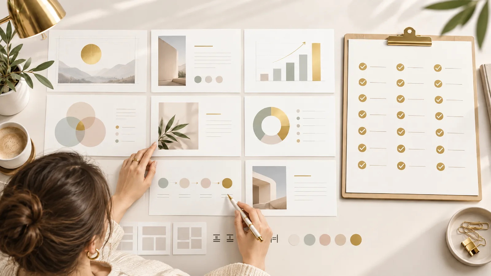
Good presentation design follows a short list of repeatable rules: one idea per slide, a full-sentence headline that states the takeaway, 30-point minimum type, two fonts, three colors, six words per bullet, real images instead of clip art, one chart with one message, and a consistent grid on every slide. Run the 21-point checklist below before you present and most slide problems disappear on their own. If your team builds decks every week, an Unlimited design subscription applies these rules for you, every time, instead of leaving them to whoever happens to have time that afternoon.
Table of Contents
- How to use this checklist
- Rules 1 to 7: message and structure
- Rules 8 to 12: text and type
- Rules 13 to 17: layout and visuals
- Rules 18 to 21: color and data
- Why checklists fail in real teams
- How the PitchWorx subscription works
- Active vs unlimited requests
- Service categories covered
- Pricing compared
- Case study
- Market growth and the PitchWorx vision
- FAQs
How to use this checklist
Do not apply all 21 rules while writing. Write the content first, then run the checklist as a review pass. Rules 1 to 7 are structural, so fix those before touching design. Rules 8 to 21 are visual cleanup.
Rules 1 to 7: message and structure
- One idea per slide. If a slide carries two arguments, split it. Reading and listening compete for the same mental channel, so a crowded slide costs you the room.
- Write the headline as a full sentence. "Q3 Revenue" says nothing. "Q3 revenue grew 18% on enterprise renewals" does the work.
- Outline in plain text first. Draft the story in a document before opening PowerPoint, or you will decorate instead of deciding.
- Lead with the answer. Put the conclusion on slide one or two, then support it. Executives decide early.
- Cap the deck. For an investor pitch, 10 slides and 20 minutes. Meetings start late, so build for the time you will actually get.
- Add a divider every four to six slides. Breaks show the audience where they are and give you a place to pause.
- Cut any slide you cannot justify in one sentence. If you cannot say why it exists, the audience will not either.
Rules 8 to 12: text & type
- Set a 30-point minimum font. Small type is a symptom of too much content, and a floor forces the edit.
- Use two fonts maximum. One for headings, one for body. More looks accidental.
- Six words per bullet, six bullets per slide, or fewer. It is a ceiling, not a target. Three tight bullets beat six padded ones.
- Never paste paragraphs onto a slide. Detail belongs in speaker notes or an appendix.
- Left-align body text. Centered paragraphs give the eye no fixed starting point and slow reading.
Rules 13 to 17: layout & visuals
- Keep one grid and one set of margins. Elements that shift between slides read as sloppy, even when each look fine alone.
- Protect the white space. Empty space is what makes the important thing look important.
- Use full-bleed photography, never clip art. Source at 150 DPI or better so images hold up on a conference screen.
- Align every element to something. Eyeballing it is not alignment.
- Give every slide one focal point. Decide what they look at first, then make everything else quieter.
Rules 18 to 21: color & data
- Work with three colors. One base, one neutral, one accent for emphasis. An accent used everywhere emphasizes nothing.
- Check your contrast. WCAG sets 4.5:1 as the minimum for body text. Grey on white fails in a bright room.
- One chart, one message. Label data directly instead of making the audience decode a legend.
- Build inside your brand template. Locked masters and set styles mean every deck matches without anyone thinking about it.
Why checklists fail in real teams
A checklist works for one deck. It breaks down when decks go out weekly and a different person builds each one, because rules 13, 18 and 21 need a designer maintaining a system, not a reminder note.
That is the gap a presentation design subscription close. PitchWorx started in 2012 as a presentation design company and brings 13 years of experience in the design industry, with over 150,000 slides designed for more than 500 brands including Wipro, Samsung, Honeywell, PepsiCo and Caterpillar. It is ISO 27001:2022 certified, so this presentation design subscription carries enterprise process, not just output.
How the PitchWorx subscription works
The plan is called Creative Assist, and it works in one loop:
- Start a 7-day free trial with a real brief.
- Onboarding week: the team builds your template, colors, type and slide masters, so rule 21 is handled once.
- Submit requests through the dashboard, with no limit on team members.
- Most requests return in about 72 hours. AI agents handle the first pass; senior designers review every file.
- Unlimited revisions until it is right.
- You own the editable source files in PowerPoint, Keynote, Google Slides or Figma.
- Cancel anytime, with no contract.
Active vs unlimited requests
This is the term small business owners misread most often in any unlimited design subscription.
Unlimited means no cap on requests you put in the queue each month. Active means how many the team works on at once.
PitchWorx runs two active requests. When one is delivered, the next starts, so 25 queued requests move through two at a time. The active number, not the word unlimited, tells you your real output.
Service categories covered
One plan covers eight categories, which is why it replaces several freelancers:
- Presentation design: pitch decks, sales decks, board and investor presentations, through a dedicated deck team
- Branding design: logos, brand identity, guidelines and refreshes
- Marketing design: social creatives, ads, email graphics, landing page visuals
- Creative design: illustration and infographics
- Web design and development: websites, landing pages, microsites
- Video and motion: explainers, logo animation, reels
- Print and outdoor: brochures, packaging, signage
- Books and magazines: layouts and annual reports
Because decks go to their own team, a Presentation design subscription request never queues behind a social media banner. That separation is the main reason to pick this unlimited design subscription over a general one.
Pricing compared
Creative Assist is $699 per month, flat, for US and UK clients.
| Option | Starting monthly price (2026) |
|---|---|
| Penji | $499 |
| ManyPixels | $699 |
| PitchWorx Creative Assist | $699 |
| Flocksy | $1,199 |
| Kimp (Graphics) | $1,397 |
| Superside | about $5,000 |
| US in-house designer | $5,000+ (over $60,000 a year before benefits) |
Upwork lists presentation designers at $35 to $60 an hour, and 24Slides charges $43 per slide for a redesign, so a 40-slide redesign costs $1,720, more than two months of the presentation design subscription.
Teams needing more output move to a custom plan, which adds active slots, a dedicated designer, multi-brand workflows and larger video or web production. Ownership terms are identical on both.
Case study
PitchWorx's published results include:
- A Boston medical device manufacturer recorded a 41% increase in sales conversion rate after new product presentations.
- A New York investment firm reported client retention up 28% after redesigning its quarterly review decks.
- A 22-slide Series A deck, rebuilt with a clear hook, evidence and ask, helped close the round within nine weeks.
None of those came from a checklist alone. They came from a senior team applying these rules consistently through an unlimited design subscription.
Market growth and the PitchWorx vision
Mordor Intelligence values the global graphic design market at $59.29 billion in 2026, rising to $85.53 billion by 2031, a 7.6% annual growth rate, and credits AI-assisted production for making flat-fee plans viable.
Chart note: plot the market curve 2026 to 2031 at 7.6% CAGR ($59.3B, $63.8B, $68.6B, $73.9B, $79.5B, $85.5B) plus a bar chart of the pricing table, PitchWorx highlighted.
PitchWorx runs its subscription and custom model across the USA, UK, UAE and India. The vision is simple: one design partner, one flat price, files the client owns outright, and standards that hold whether you are a three-person startup in Manchester or a mid-market team in Chicago.
FAQs
What are the golden rules of presentation design?
One idea per slide, a sentence headline, 30-point minimum type, two fonts, three colors, six words per bullet, real photography, one chart with one message, and a consistent grid.
Which rule matters most?
One idea per slide. Most density problems solve themselves once it is applied.
What font size should I use?
30 points minimum for body text, larger for headings. If content will not fit, cut content, not type size.
How many slides should a pitch deck have?
Around 10 for an investor pitch. Technical decks run longer, with dividers every four to six slides.
Can these rules be broken?
Yes, deliberately. A full-bleed image with a six-word headline breaks most text rules and often works best. A presentation design subscription is how teams keep those exceptions intentional.
Who applies these rules if my team is small?
An unlimited design subscription puts a senior team on it. PitchWorx Creative Assist is $699 a month, unlimited requests, no contract.
Is there a free trial?
Yes, 7 days. Send a real deck brief and judge the output before you subscribe. Most requests return in about 72 hours.