Thoughts on AI, design, and brand work.
Scroll for the latestOne deeper essay each week. Slower, more honest, and aimed at founders who actually have to make the design call.

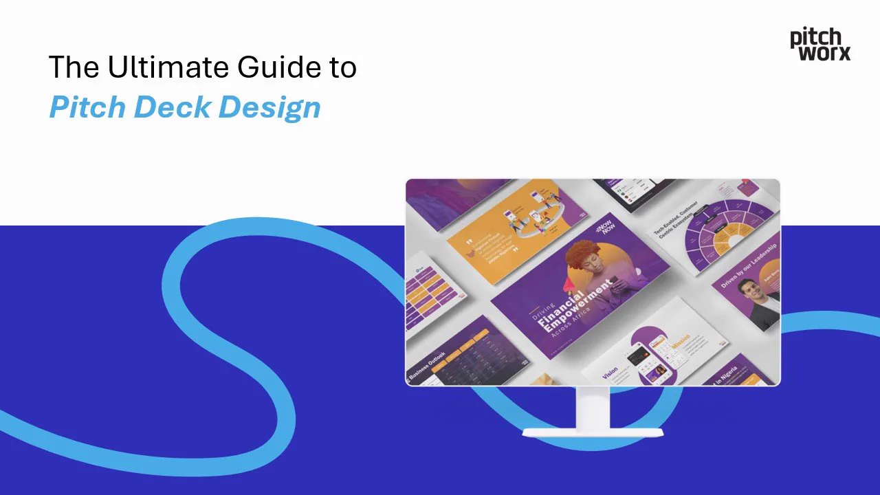
AI is reshaping design agencies, but it isn't replacing designers. Here's where AI excels, where it falls short, and why senior creative judgment still wins.
Read the essay
Six Designjoy alternatives for 2026 when $4,995/mo is too steep. Compare flat-fee subscriptions on price, breadth and deck depth, from $699/mo.

The best Penji alternatives in 2026 for startups that also need great pitch decks. Compare flat-fee subscriptions on breadth, deck depth and price.

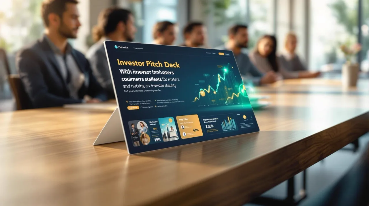
Who designs investor pitch decks? Freelancers, specialist agencies and design subscriptions each fit different needs. Here is how to choose the right one.

The best Design Pickle alternatives in 2026, compared on flat pricing, breadth and deck depth. Skip the demo call with a transparent $699/mo option.

The best pitch deck design agencies in 2026, ranked on depth, breadth, speed and price, plus the flat $699/mo subscription alternative.

What is a design subscription? A flat monthly fee for unlimited design requests and revisions from one team. Here is exactly how it works in 2026.

Unlimited design for startups explained: what a flat $699/mo subscription actually covers, how the queue works, and where the limits really are.

Design subscription vs agency vs freelancer: compare cost, speed, breadth and quality to pick the right model for your startup at a flat $699/mo.
How much does it cost to design a pitch deck in 2026? Real numbers: freelancers $50 to $150/hr, agencies $5k+, or a flat $699/mo subscription.

Is a design subscription worth it? An honest founder breakdown of cost, speed and quality vs hiring or freelancers, at a flat $699/mo.
The 10 best design subscription services in 2026, ranked and compared on price, breadth, turnaround and deck depth. PitchWorx, Superside, Penji and more.
One design subscription for a startup's whole stack: decks, brand, social, web, video and print. Flat $699/mo, one senior team, unlimited requests.

You don't need a big marketing team to build a credible brand. A founder's guide to the branding assets that matter most, the mistakes to avoid, and how to scale creative without overhead.
AI is reshaping design agencies, but it isn't replacing designers. Here's where AI excels, where it falls short, and why senior creative judgment still wins.

In-house designer, freelancer, agency, or design subscription? A clear breakdown of the true cost of each, and when a subscription makes the most financial sense.

"Unlimited design requests" sounds too good to be true. Here's how design subscriptions really work, what providers don't tell you, and the questions to ask before subscribing.
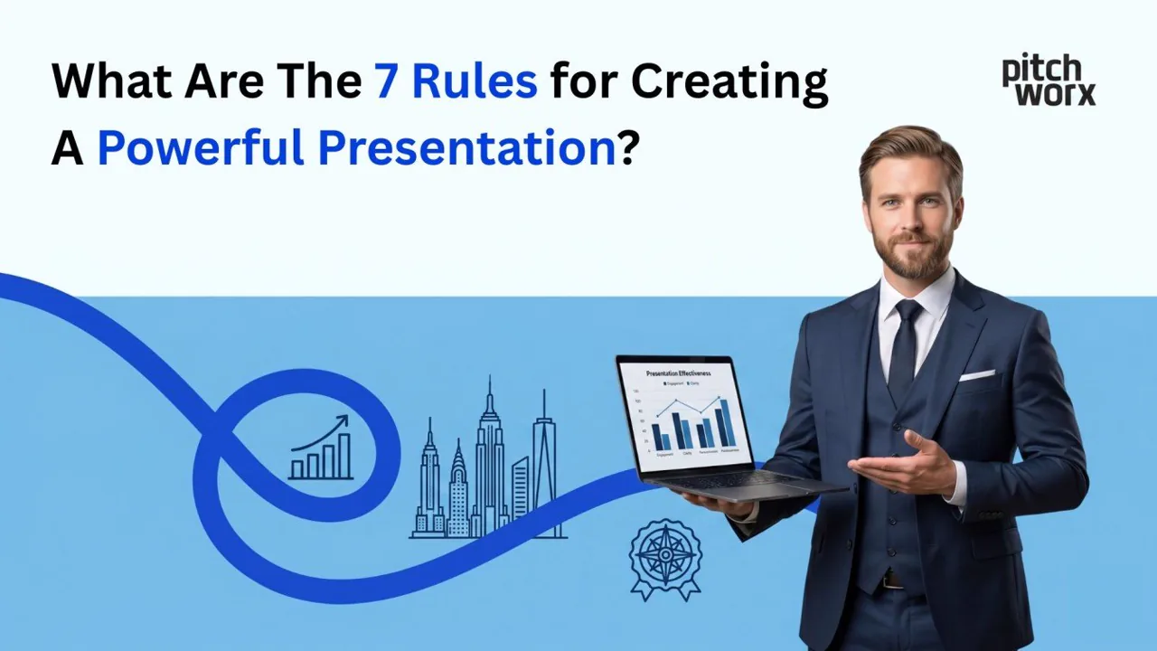
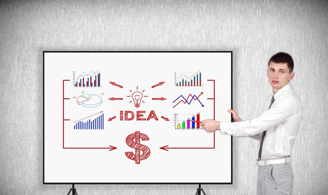
Why these 7 rules matter more than templates Rule 1: Start with the audience, not the
The best logo design tools for USA startups in 2026 combine AI-powered design capabilities with professional-grade customization.
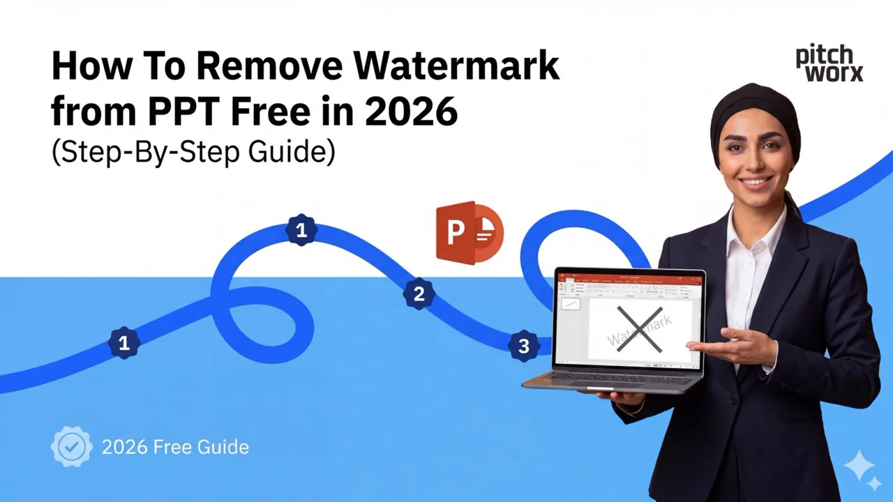
A free, step-by-step 2026 guide to removing watermarks from PowerPoint, with safe, legal methods that keep your slides intact.
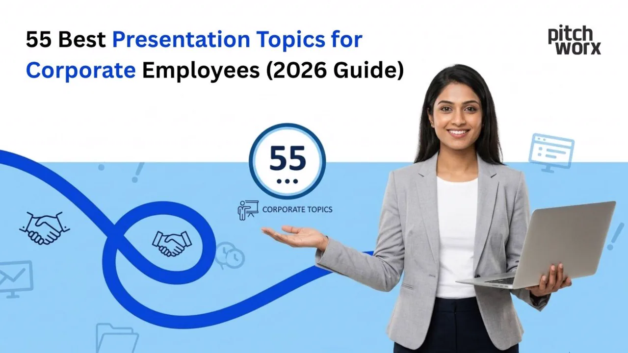
The best presentation topics for corporate employees in 2026 span leadership, digital transformation, mental
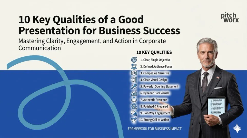
A good business presentation combines a clear structure, strong visual design, compelling storytellin
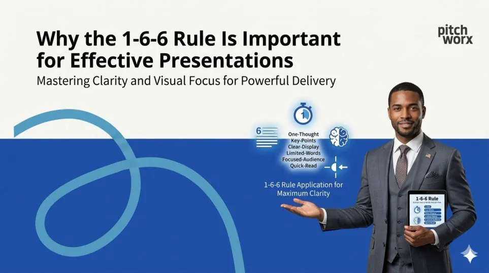
The 1-6-6 rule states that each presentation slide should contain only 1 main idea, a maximum of 6 bu
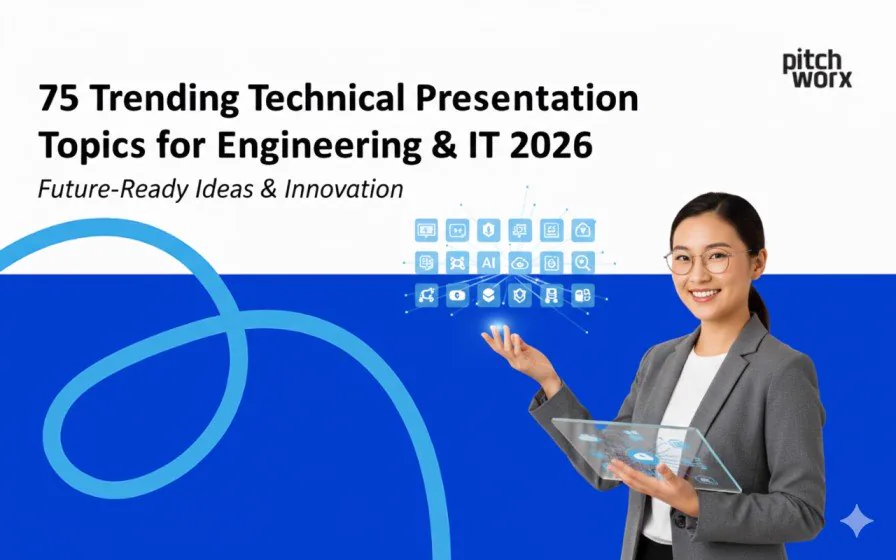
75 trending technical presentation topics for engineering and IT in 2026, with ideas across AI, IoT, cybersecurity and emerging tech.
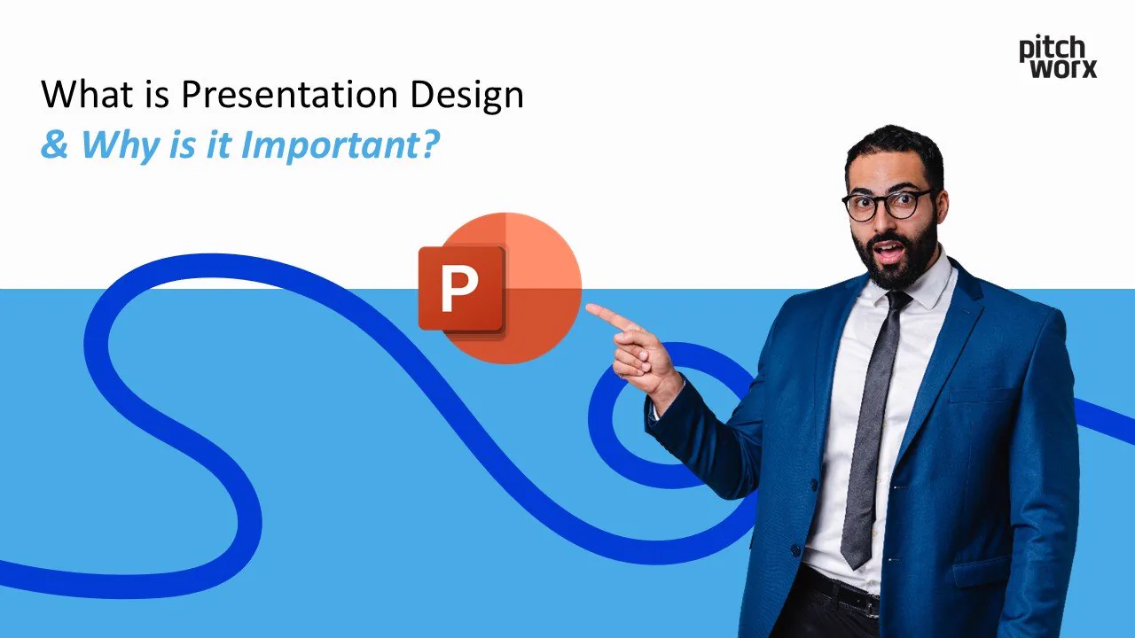
: The 4 Key Principles of Presentation Design in 2026 Why Presentation Design Mat
To remove a watermark in PowerPoint legally, you must either delete it from the Slide Master, remo
40 trending business presentation topics for corporate teams in 2026, spanning strategy, leadership, sales and digital growth.
The 10 most impactful technical presentation topics for 2026 are centered around AI Agents, Zero T
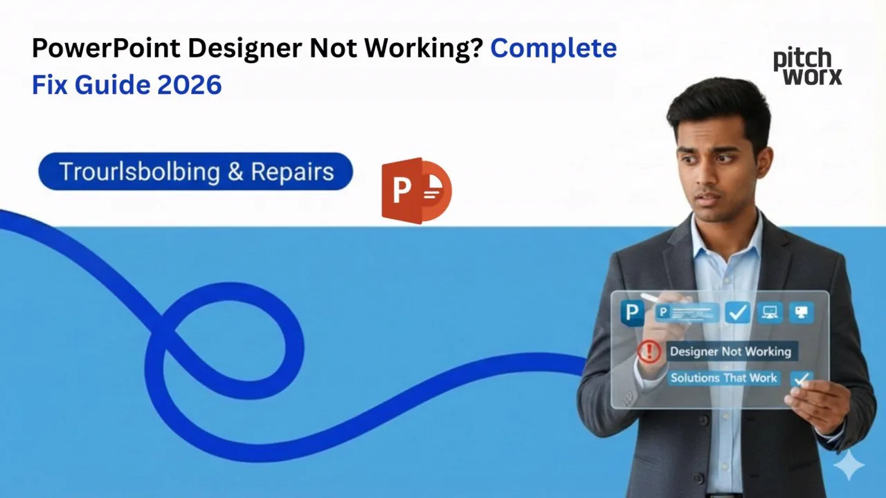
PowerPoint Designer not working? A complete 2026 fix guide with step-by-step solutions to get Design Ideas running again.
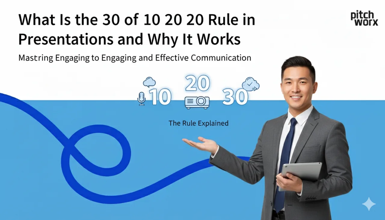
The 30 of 10 20 30 rule means use a minimum 30 point font size keep the main deck to 10 slides and

The best AI in healthcare presentation topics for 2026 include AI-powered diagnostic imaging, predi
Discover the best slide fonts for business in 2026. This guide covers top free fonts for legibility, pairing tips, and how to embed them for flawless presentations.
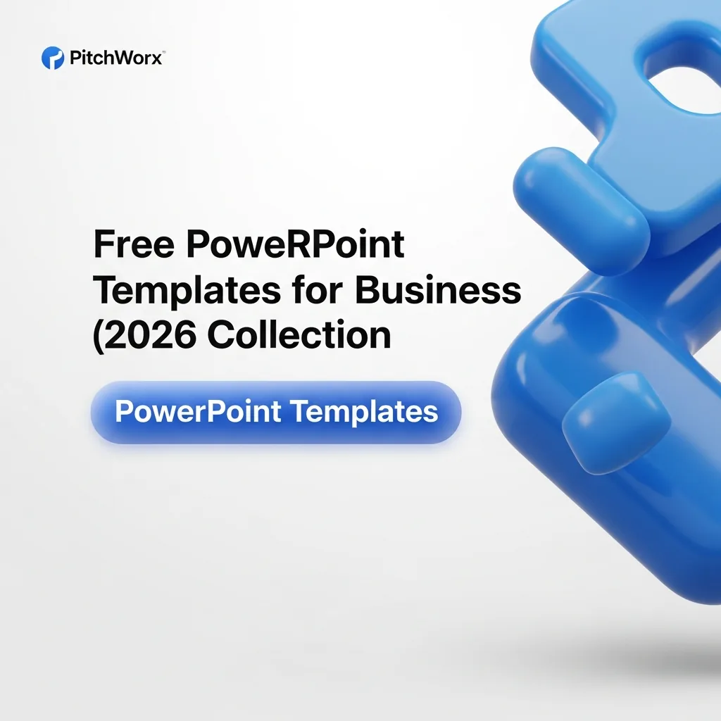
A strategic guide to selecting and customizing free PowerPoint templates for business in 2026. Learn how to transform stock slides into branded assets and avoid common design pitfalls.
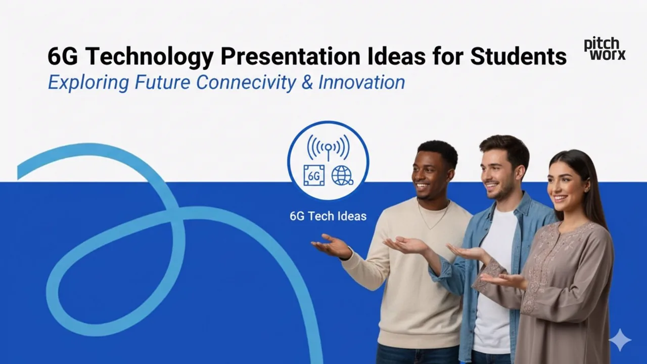
: The best 6G technology presentation ideas for students in 2026 focus on practical applications like AI integration in networks, holographic communication
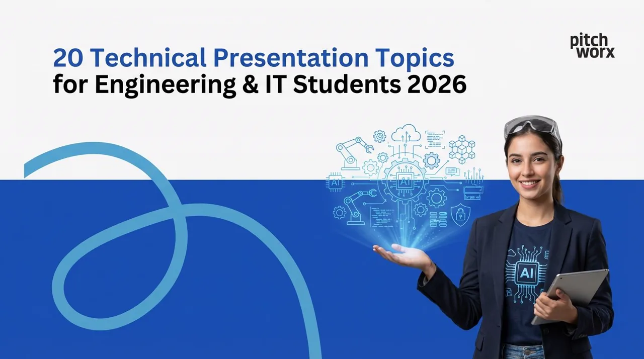
20 fresh technical presentation topics for engineering and IT students in 2026, from AI to cybersecurity, to help you pick a standout subject.
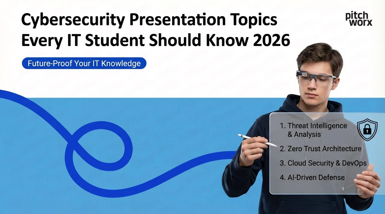
Cybersecurity presentation topics every IT student should know in 2026, from threats and ethical hacking to data privacy and defense.
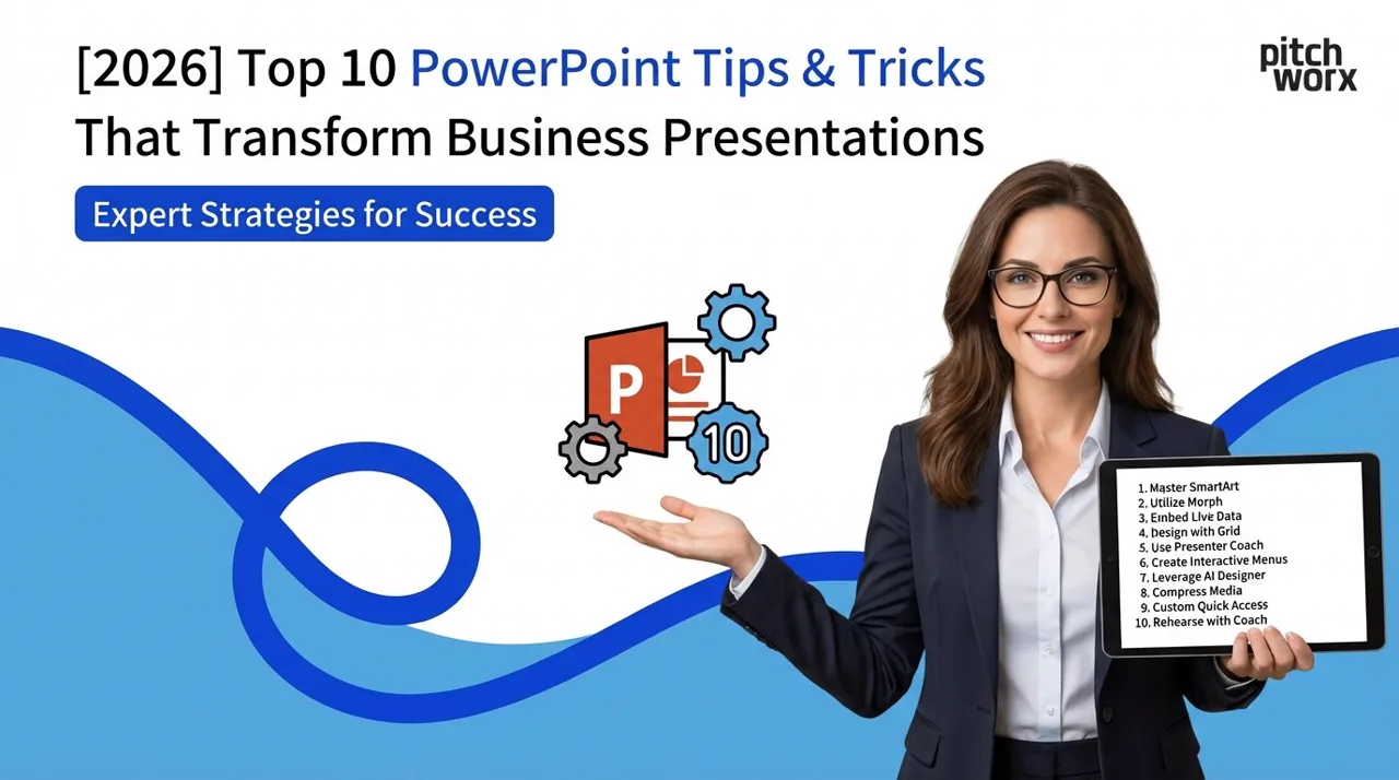
The 10 Most Effective PowerPoint Tips for 2026 that separate professional presentations from amateur slides: Start with strategic story architecture before
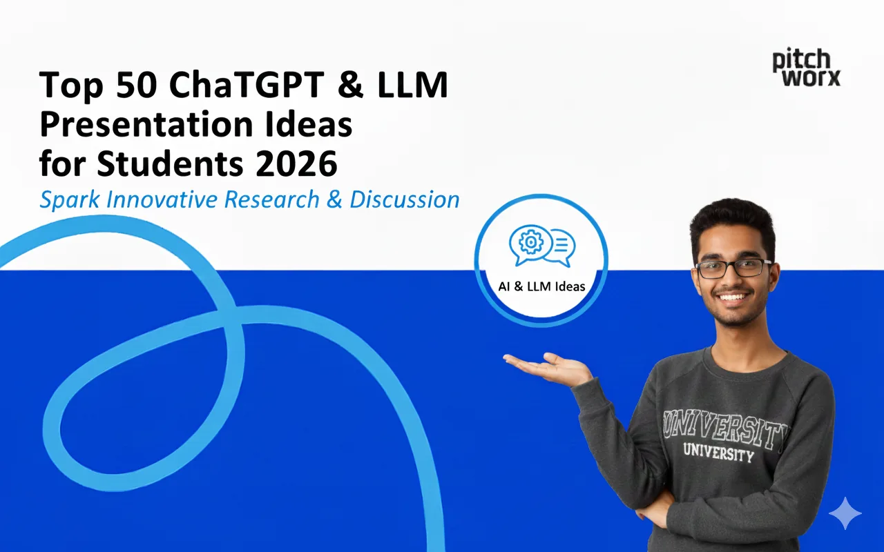
Students in 2026 can create compelling presentations on ChatGPT and LLMs covering: AI ethics and bias, prompt engineering techniques, educational applications
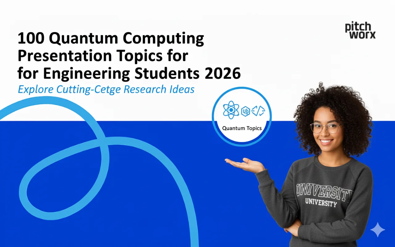
Quantum computing presentation topics for 2026 include: quantum algorithms (Shor’s, Grover’s), quan
Discover the best AI presentation tools ranked for 2025. This expert guide compares top software for US enterprises, focusing on efficiency, security, and brand control.
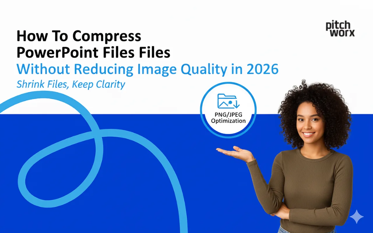
To compress PowerPoint files without losing image quality in 2026: Use PowerPoint’s built-in compress pictures feature (File Info Compress Media) with “HD
Upgrade your decks with professional Google Slides background ideas. Discover 2026 trends, expert design tips, and a step-by-step guide for business teams.
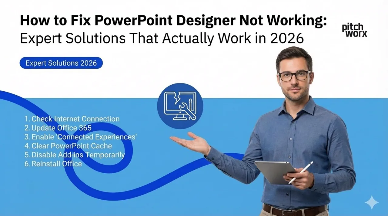
PowerPoint Designer not working? The most common fixes are: 1) Verify you have Microsoft 365 subscrip
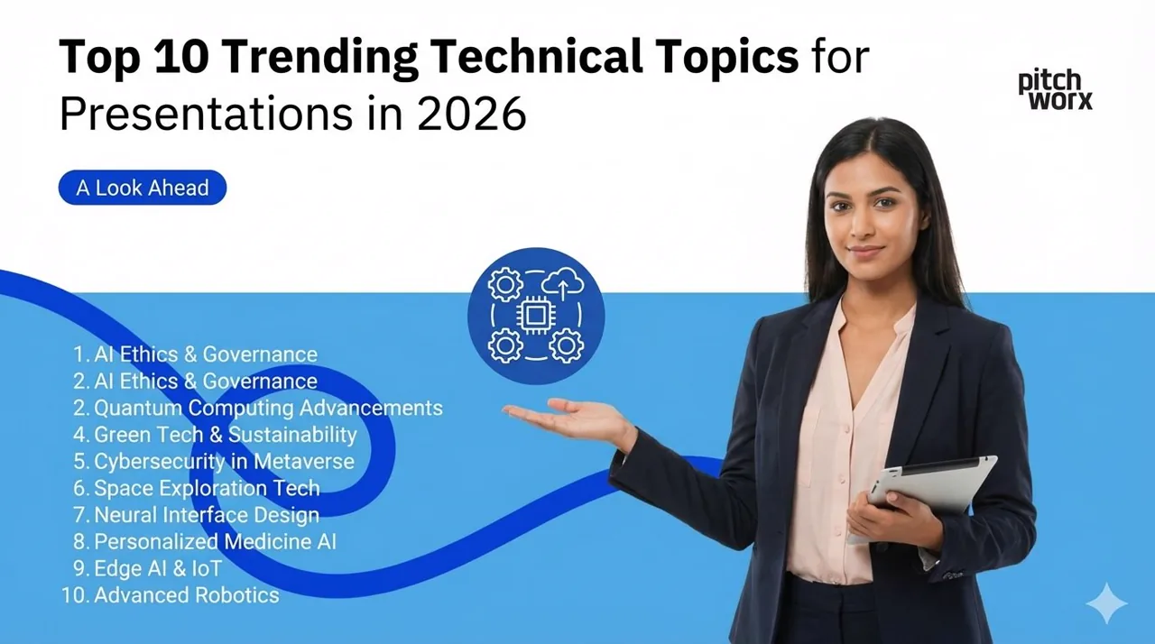
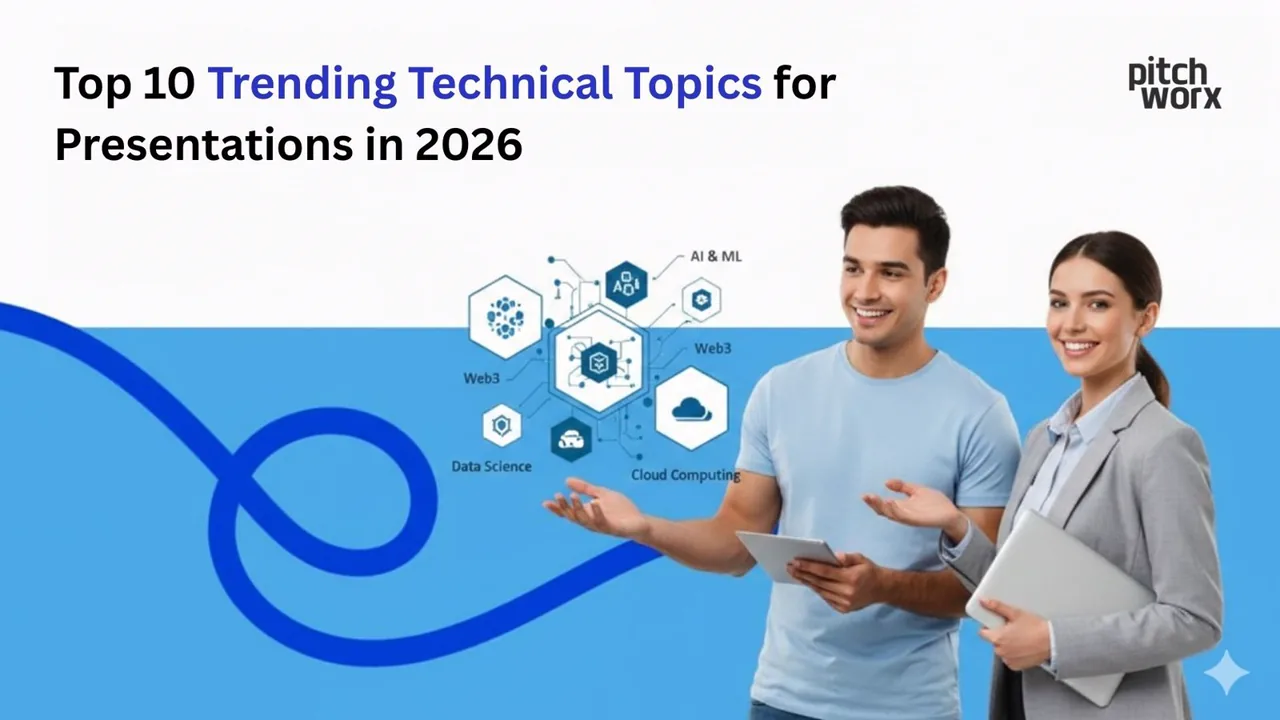
The top 10 trending technical topics for presentations in 2026 are: Artificial Intelligence & Machine
Discover the top Google Slides add-ons for 2026 that streamline design workflows and boost collaboration. Expert guide for teams.
Before opening PowerPoint, successful presenters follow a strategic storyboarding process that dramat
Learn the 2026 industry-standard methods for embedding video in Google Slides. Discover why 95% of professionals prefer the Drive method for reliability and how to avoid common playback failures.

Unsure whether to use 16:9, 4:3, or 1:1 for your next deck? This 2025 guide explains the exact use cases for every PowerPoint slide size, from boardrooms to iPads.
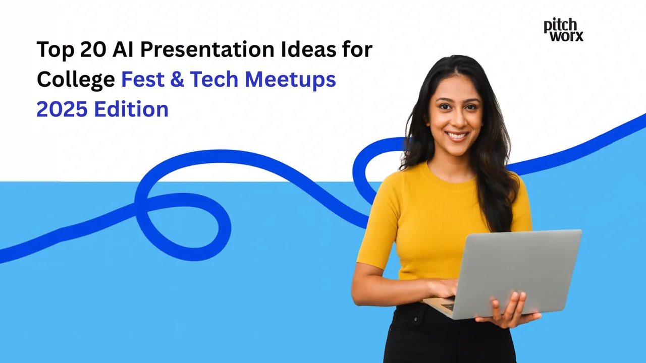
The top AI presentation ideas for 2026 college fests and tech meetups blend cutting-edge AI demonstr
Learn the exact steps to export PowerPoint slides as high-resolution 300 DPI images. A complete 2025 guide for designers and professionals.
Discover the 3 most effective methods to fix broken fonts in PowerPoint in 2025. Learn how to embed fonts, use global replacement, and leverage cloud fonts to ensure your presentation looks perfect on
Learn how to compress PPT without losing quality using native tools, master slide cleanup, and media optimization. A 2025 guide to reducing file size for easier sharing.
Fonts disappearing when converting PowerPoint to PDF is a common issue caused by embedding failures or licensing restrictions. Learn the 3 proven methods to lock your typography and ensure pixel-perfe
Learn the legal, technical methods to remove stubborn watermarks in PowerPoint. A step-by-step guide for 2025 using Slide Master and Selection Pane.
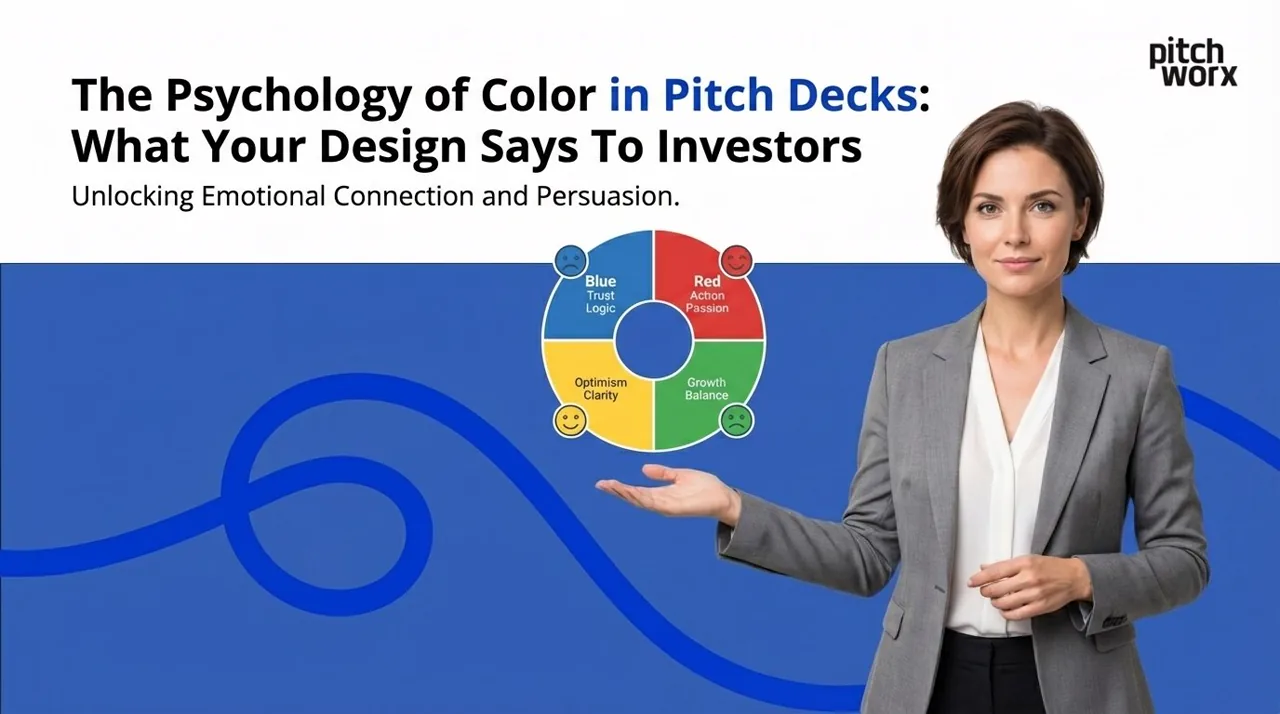
Color psychology in pitch decks profoundly influences investor perception and decision-making. Stra
Discover 100 creative presentation ideas to engage any audience in 2025. From interactive storytelling to immersive data visualization, learn how to transform boring slides into memorable experiences.
Discover 50 high-impact marketing presentation topics for 2025, covering strategy, digital trends, analytics, and internal culture. This guide helps marketers select the right narrative to engage stak
Discover 40 trending business presentation topics for 2025 designed to engage corporate teams. From hybrid work strategies to digital ethics, find the perfect subject for your next town hall.
Struggling to find the right seminar topic? We’ve curated 75+ cutting-edge technical presentation topics for CSE, IT, ECE, and Mechanical students, updated for the 2025 academic landscape in India.
Discover 100 curated AI presentation topics for 2025, categorized for technical teams, business leaders, and general audiences to ensure maximum engagement.
Struggling to find the perfect presentation idea? Explore our curated list of 150+ presentation topics for students, teachers, and business professionals, updated for 2025.
Learn how to design professional academic posters in Google Slides with this step-by-step 2025 guide. We cover custom page setup, grid layouts, typography rules, and export settings to ensure your res
Discover the top 5 free, professional fonts for 2025 that bring clarity, authority, and polish to your minimalist presentations. Elevate your message with typefaces designed for impact.
ChatGPT excels at creative storytelling, conversational presentations, and narrative-driven content
Discover three effective methods to remove image backgrounds in Google Slides for 2025. Learn how to use external tools for professional precision, integrated add-ons for convenience, and built-in opt
Tired of the ’file too large to send’ error? Learn the professional methods for embedding video in PowerPoint without creating a massive file. We’ll cover linking, pre-compression, and PowerPoint’s hi
Stop fumbling during your presentations. Learn the professional way to print PowerPoint with speaker notes, customize your layouts, and troubleshoot common issues. This 2025 guide covers everything fr
Learn the step-by-step technical setup and crucial design principles for creating a self-running, looping PowerPoint presentation that captivates audiences at trade shows, kiosks, and reception areas.
Tired of the same default Google Slides look? We’ve spent 13+ years designing presentations. Here are our top 10 concepts for cool Google Slides themes that make corporate decks look custom-built.
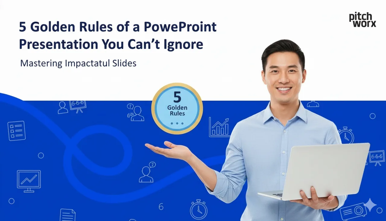
The 5 golden rules of PowerPoint design every presenter should follow, with simple tips to make slides clearer and more persuasive.
A bloated PowerPoint file is a barrier to communication. Learn our 2025 methods for compressing PowerPoint files without sacrificing visual quality. We cover built-in tools, proactive optimization, an
Why Silicon Valley Investors Reject 90% of Pitch Decks Understanding the 6-6-6 Ru
Learn the fastest ways to add superscript and subscript in PowerPoint and Word with our expert guide. We cover the essential keyboard shortcuts, ribbon commands, and pro tips to make your business doc
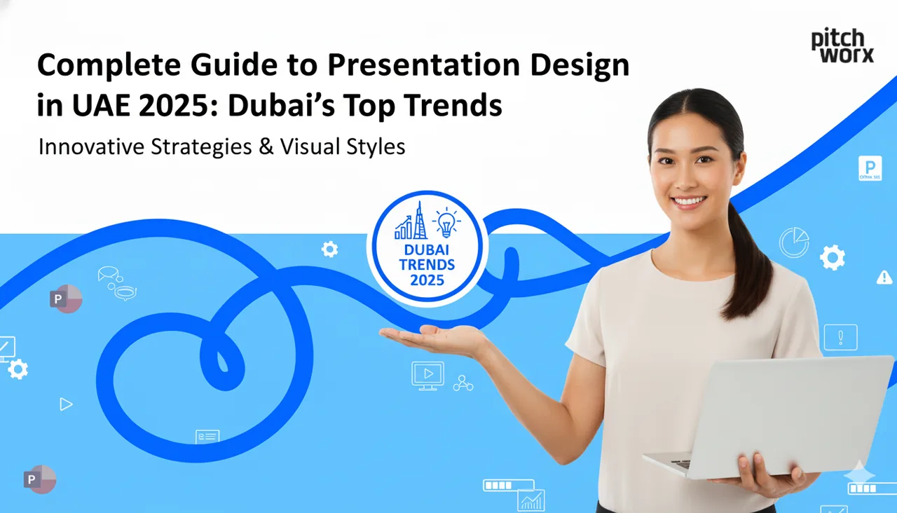
Introduction: Why Presentation Design Matters in UAE’s Competitive Market Underst
Struggling with PowerPoint slide sizes? Our guide explains the difference between 16:9 and 4:3 aspect ratios, helping you choose the right dimensions for any presentation. Learn why 16:9 is the modern
Struggling to choose a typeface for your next video or motion graphics project? Discover our top 7 modern fonts for animated presentations that ensure clarity and impact. Learn the key principles that
Learn the strategic and technical steps to export Google Slides as an MP4 video. This guide covers everything from the basic export process to optimizing your presentation for video formats on YouTube
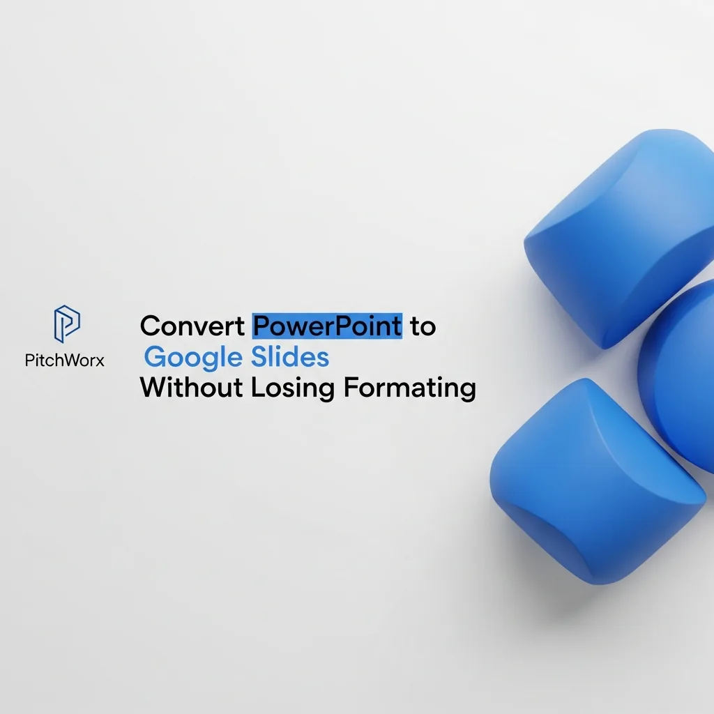
Tired of broken layouts, missing fonts, and blurry images? Learn the professional workflow for converting PowerPoint to Google Slides while preserving your design. We cover the common pitfalls and the
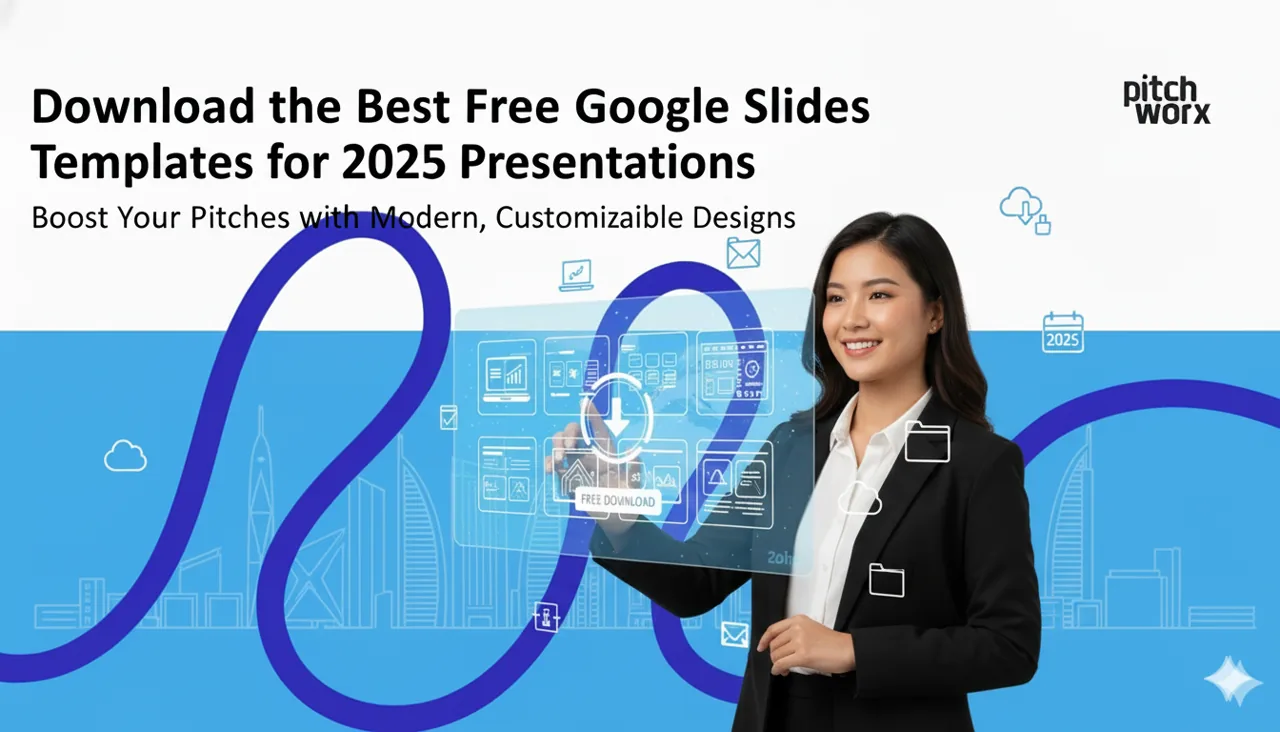
The best free Google Slides templates for 2025, hand-picked by category to help you design presentations faster and look professional.
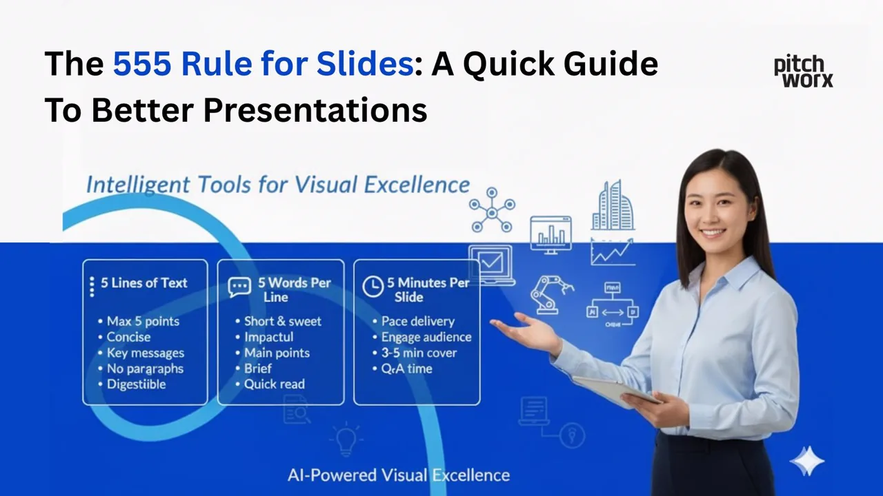
The 5-5-5 rule for slides explained: a quick guide to tighter text and clearer presentations your audience will actually follow.
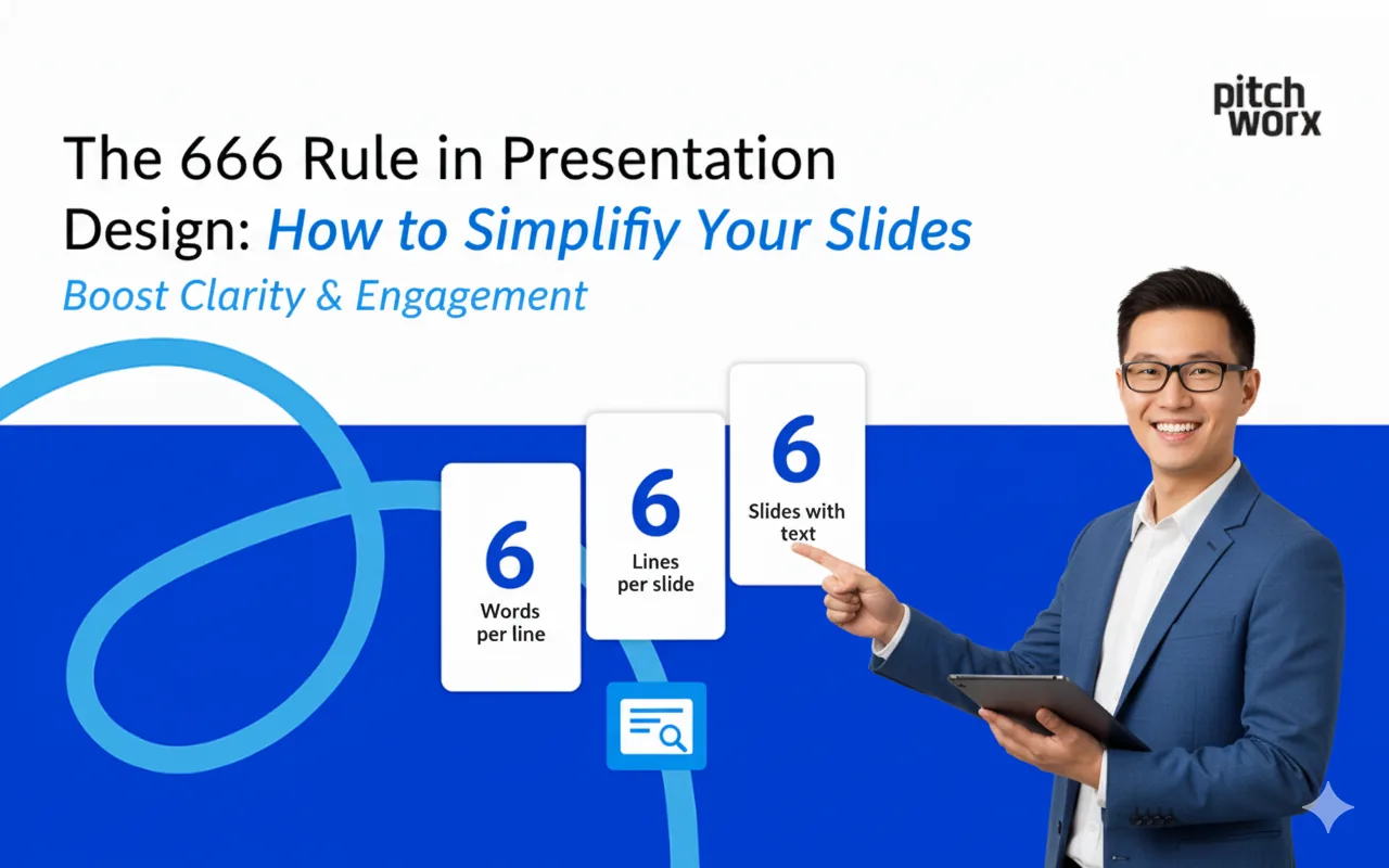
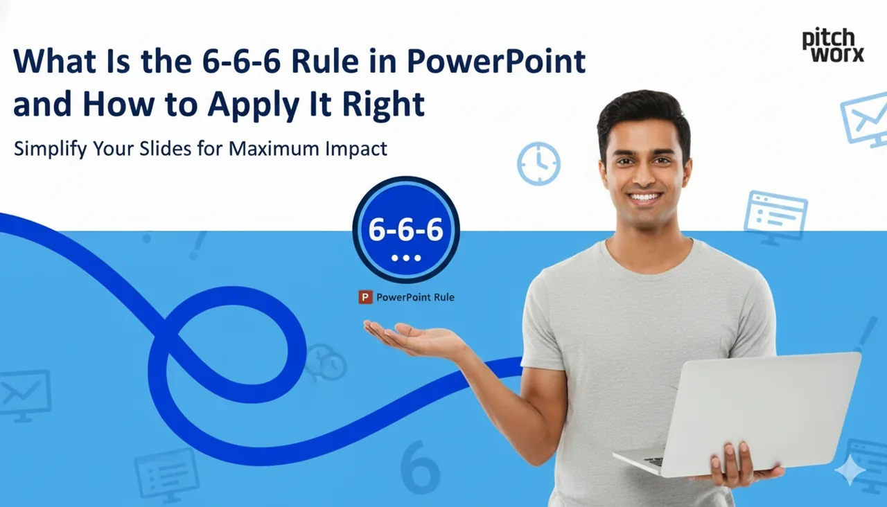
The 6-6-6 rule in presentation design: how to simplify your slides and cut clutter for clearer, more memorable decks.
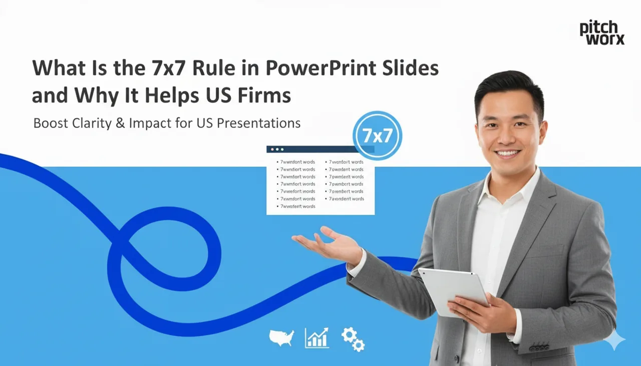
What the 7x7 rule in PowerPoint is and why it helps US firms build cleaner, more readable slides that hold attention.
Discover the top 9 presentation design trends for 2025. Move beyond static slides with AI, immersive 3D, and data storytelling to boost engagement and drive results.
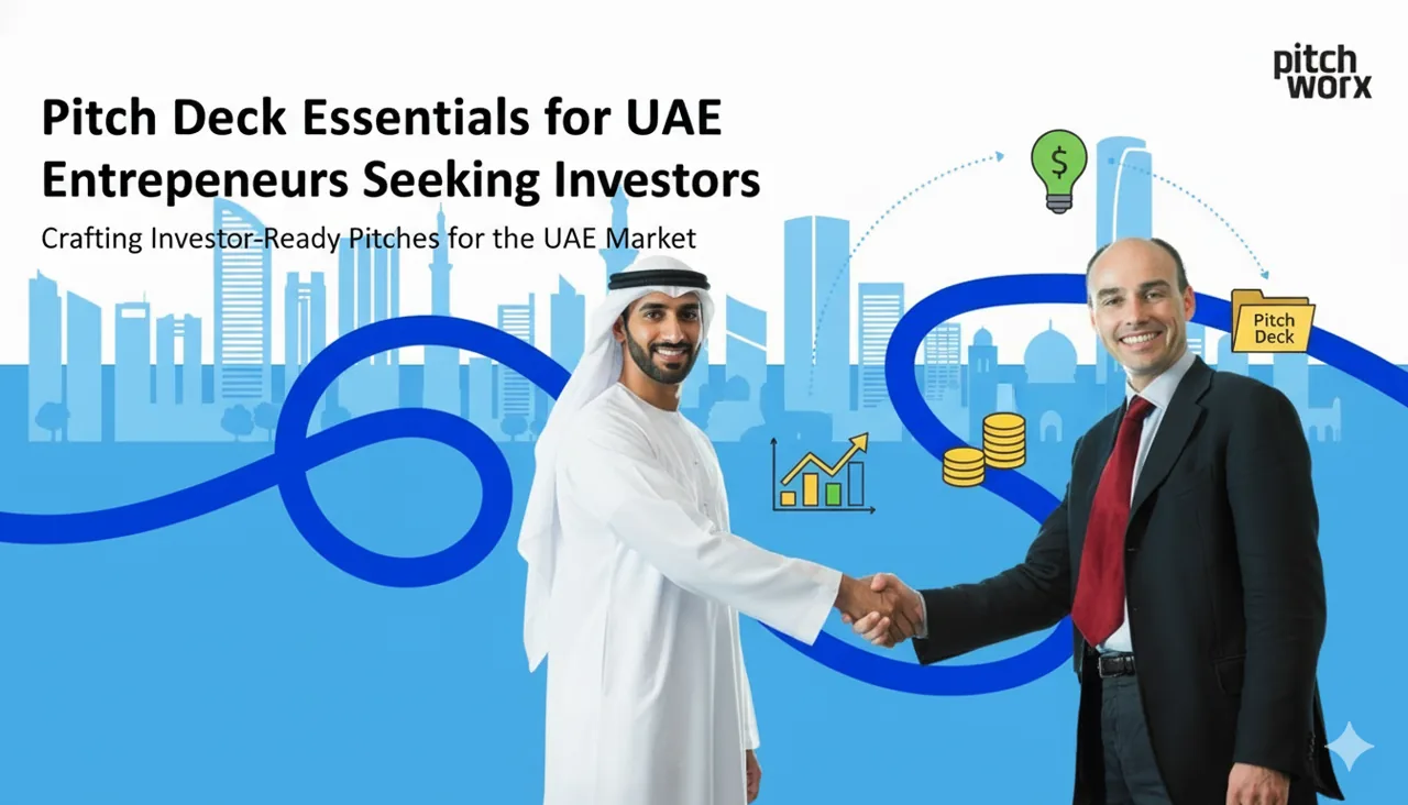
A winning pitch deck for UAE entrepreneurs requires 10-12 slides covering problem, solution, market
Tired of your data-heavy slides falling flat? This guide reveals 9 expert principles for effective data visualization in presentations. Learn to move beyond default charts and transform complex number
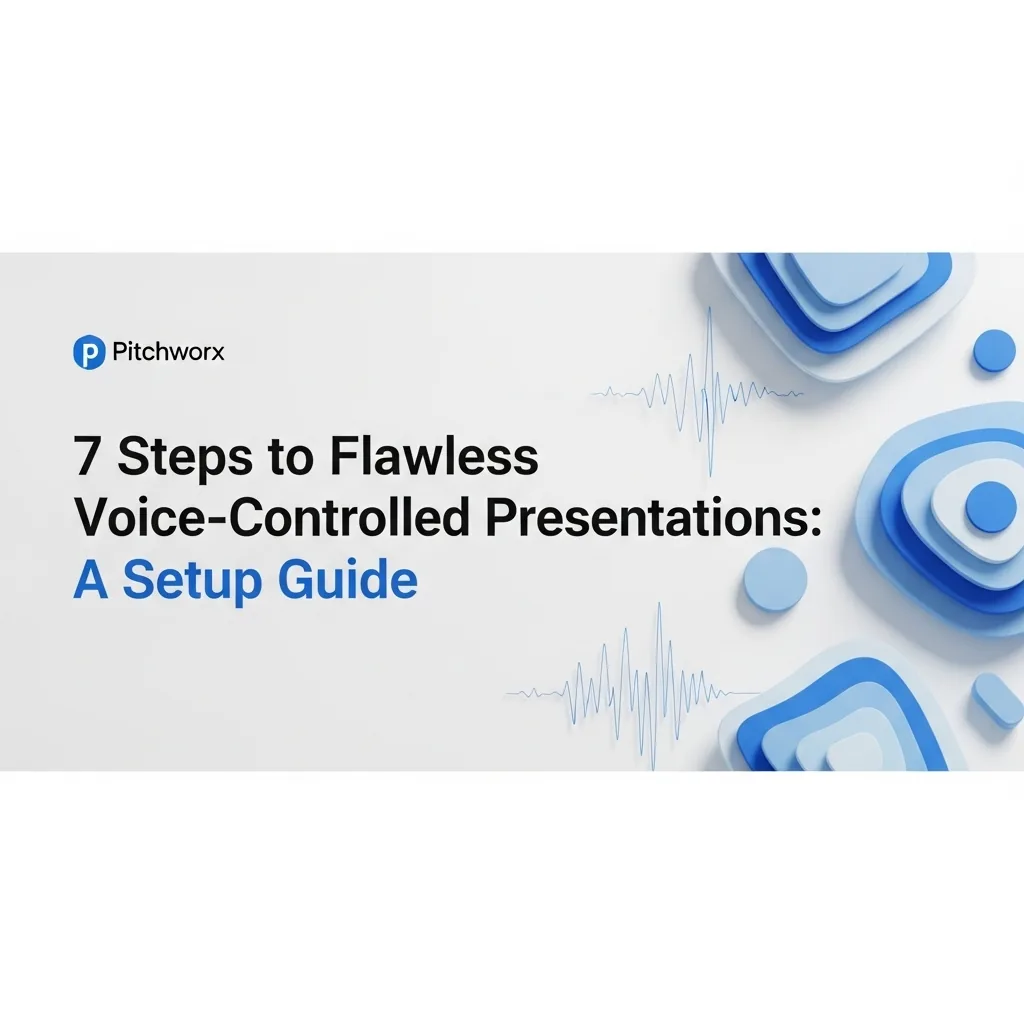
Master voice-controlled presentations with our 7-step setup guide. Learn to configure software, use commands, and engage audiences hands-free for a more dynamic and impactful delivery.
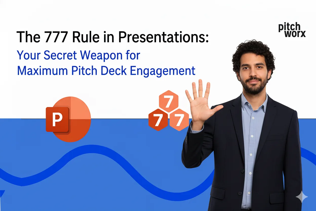
Introduction: The Pitch Deck Problem Every Founder Faces What Exactly Is the 777 R
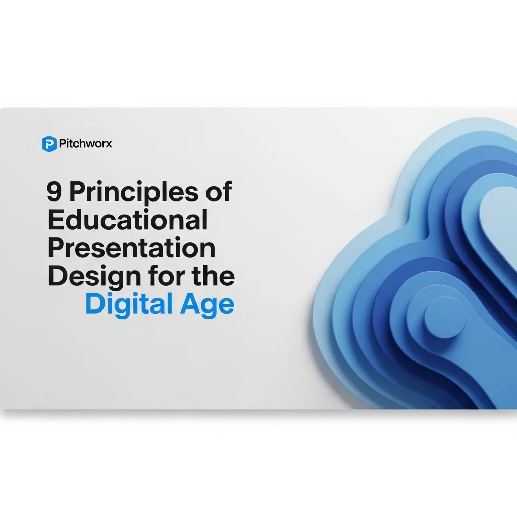
Master educational presentation design to captivate students in the digital classroom. Learn our 9 core principles to boost engagement, improve retention, and create truly interactive learning experie
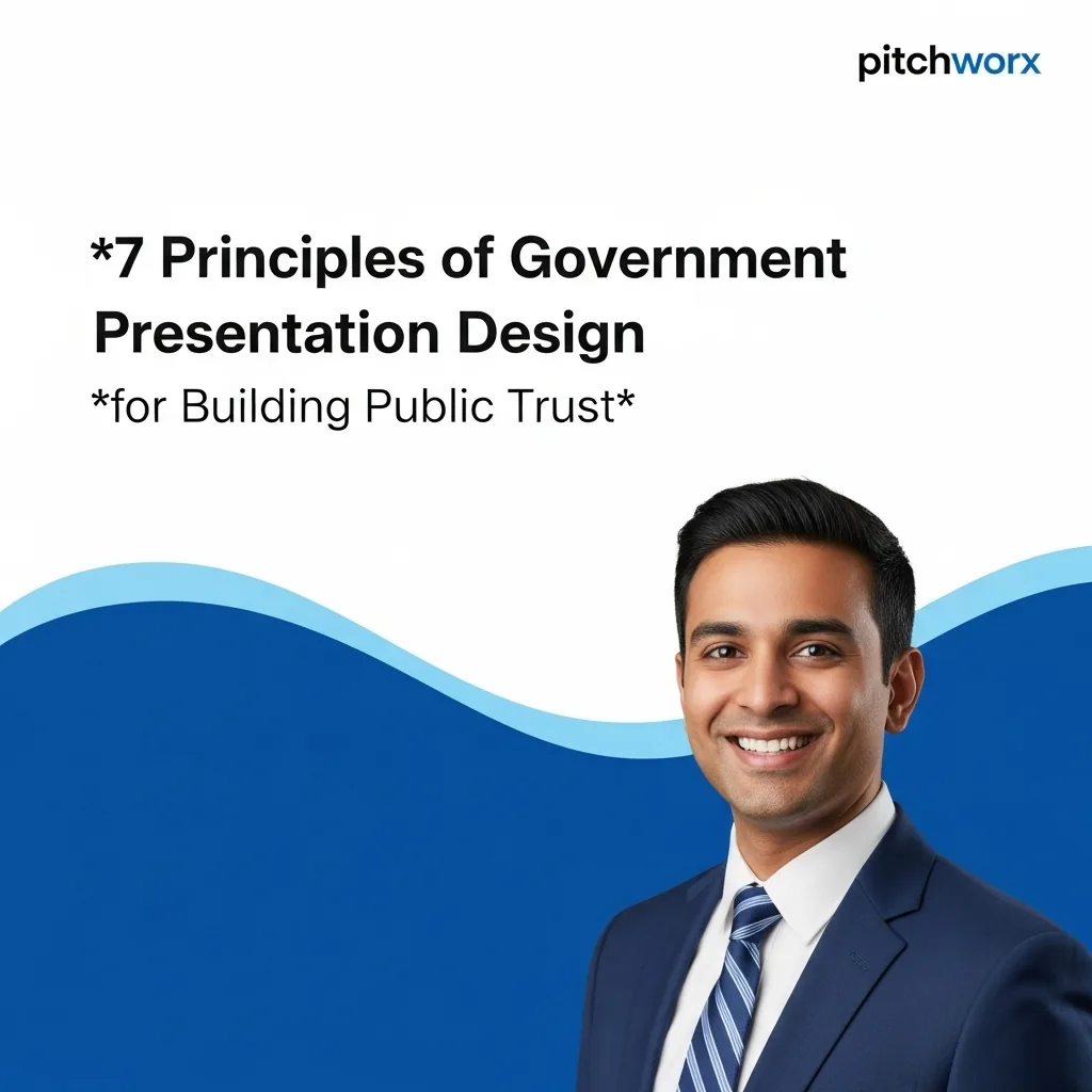
Master government presentation design with our expert guide. Learn to create accessible, transparent presentations that build public trust and ensure compliance. Start communicating more effectively t
Elevate your plant floor communication. Learn essential strategies for manufacturing presentation design to improve safety, clarify technical data, and boost training retention across your operations.
Transform your property showcases from static slides to immersive, deal-closing experiences. Learn 7 key strategies for modern real estate presentation design, integrating virtual tours, 3D models, an
Introduction Why Presentation Design Matters Principle 1: Visual Hierarchy Princip
Navigate the complex world of medtech presentations. Learn the 9 critical elements of medical device presentation design to ensure FDA compliance, secure investor confidence, and drive product adoptio
Peek behind the curtain at a top agency’s presentation design process. Learn our 5-stage framework for creating decks that do more than just look good—they drive action and deliver measurable ROI.
Learn the 4 core principles of corporate presentation design used by Fortune 500 companies. This guide breaks down their framework for creating presentations that drive decisions, ensure brand cohesio
10 trending technical presentation topics for 2025, from AI to sustainability, to help students and pros pick a standout topic.
Learn what makes a good presentation design with our 25-point expert checklist. Move beyond aesthetics to create presentations that clarify your message, engage your audience, and drive decisions. Our
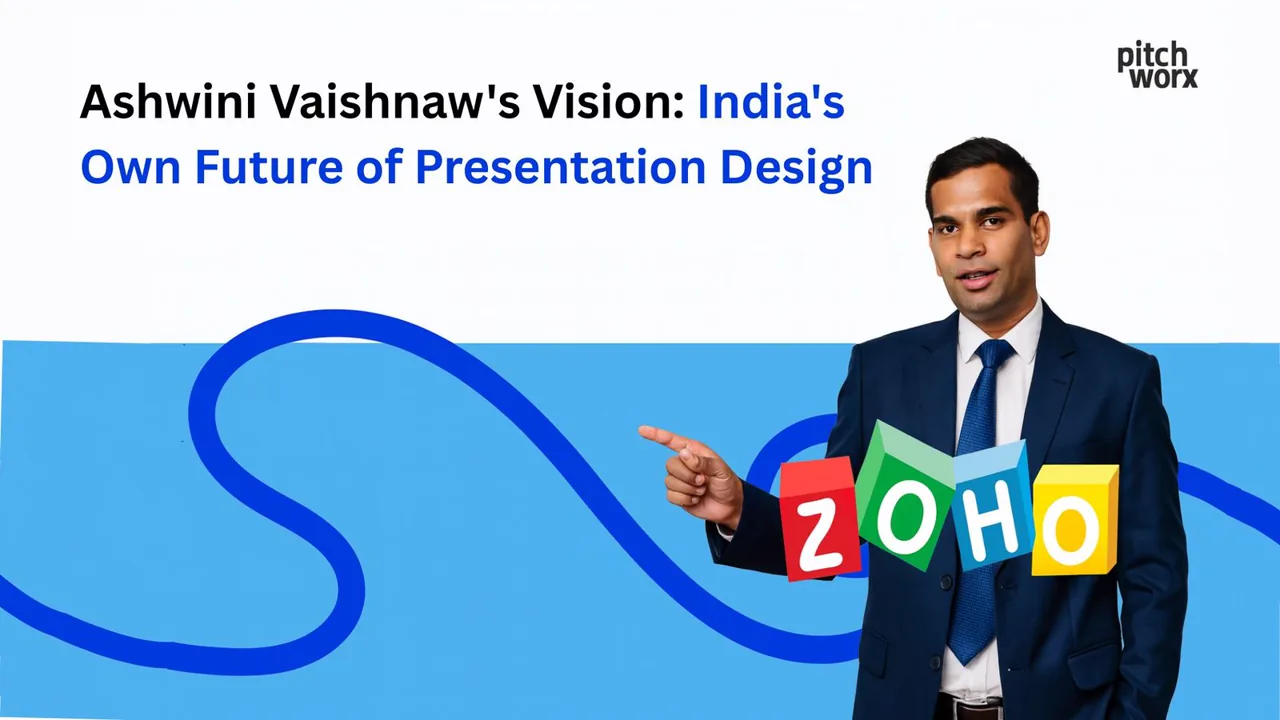
Ashwini Vaishnaw’s vision for India’s presentation design future centers on digital sovereignty, p
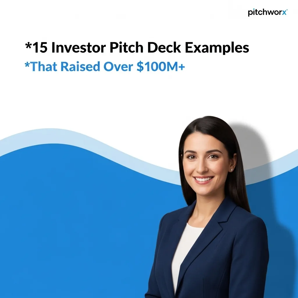
Explore 15 real-world investor pitch deck examples that secured billions. Learn the design strategies and storytelling secrets to craft a deck that captivates VCs and wins funding.
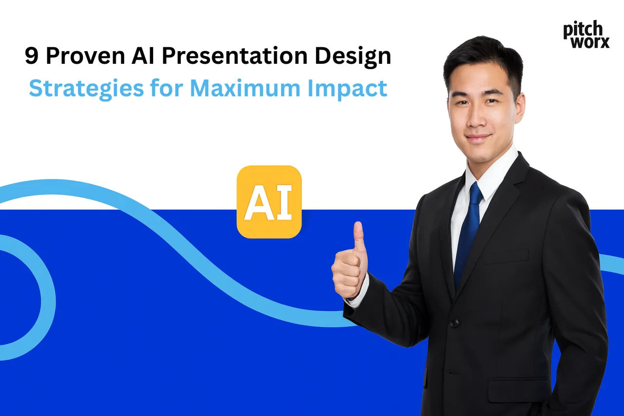
Master AI presentation design with our 2025 guide. Learn 9 proven strategies to choose the right tools, craft effective prompts, and integrate AI with expert human oversight. Create impactful presenta
The top AI presentation ideas for 2025 include AI in healthcare, autonomous vehicles, AI ethics, machine learning applications, AI art creation, personalized
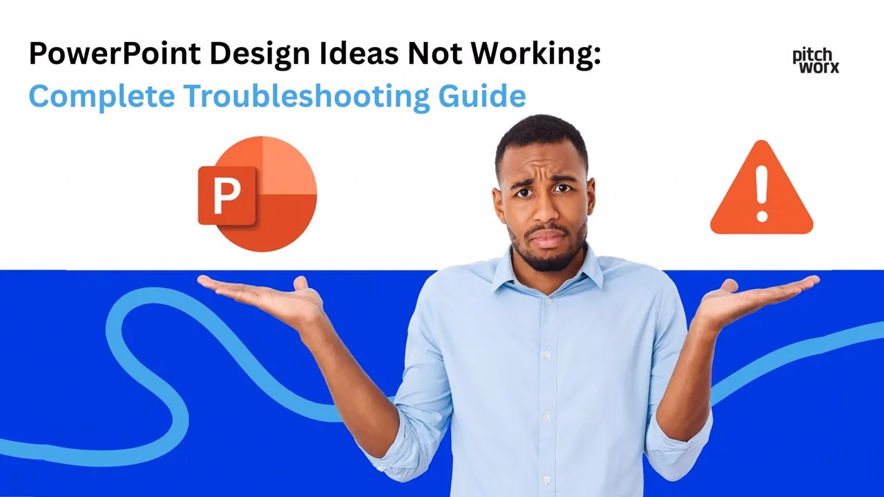
PowerPoint Design Ideas may not work due to disabled AI services, poor internet connectivity, unsu
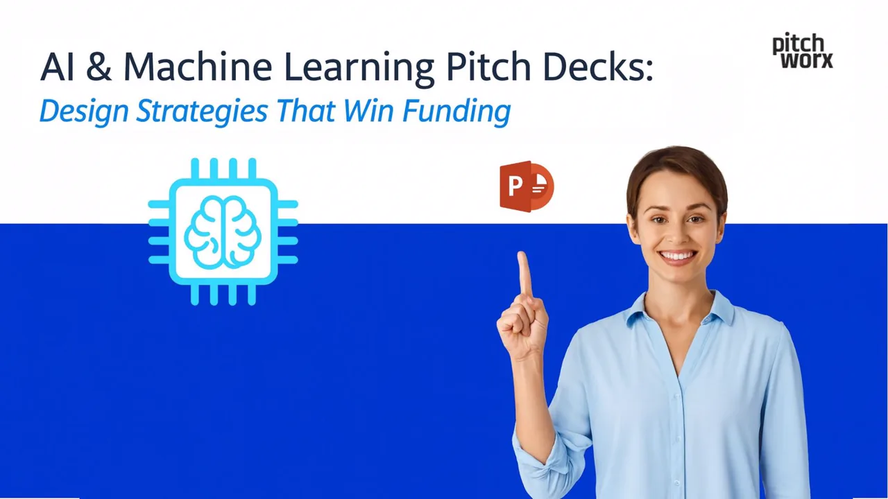
AI and ML pitch decks that win funding focus on clear problem-solution fit, demonstrate data-drive
Introduction The Critical Importance of Professional Pitch Deck Design Essential
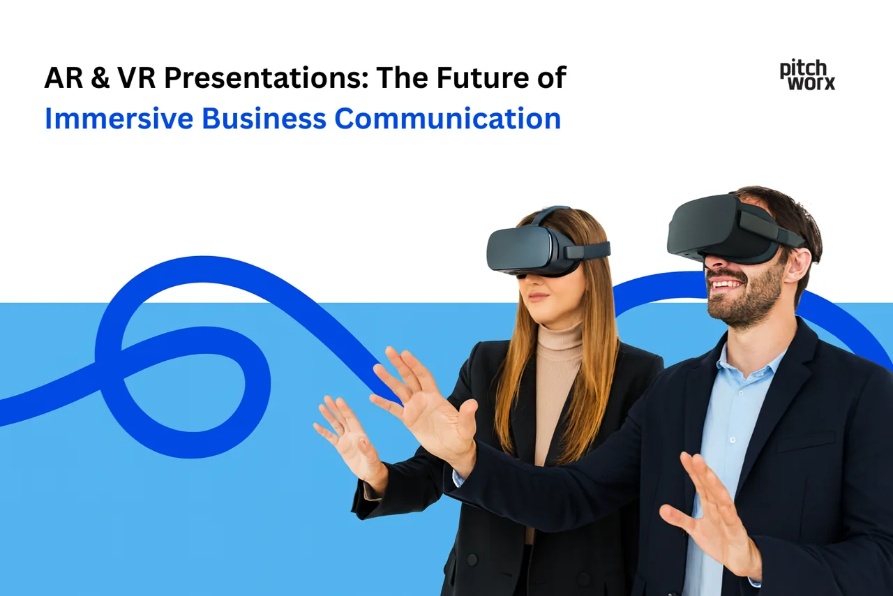
How AR and VR are reshaping business presentations, with real use cases and tips for building immersive, memorable communication.
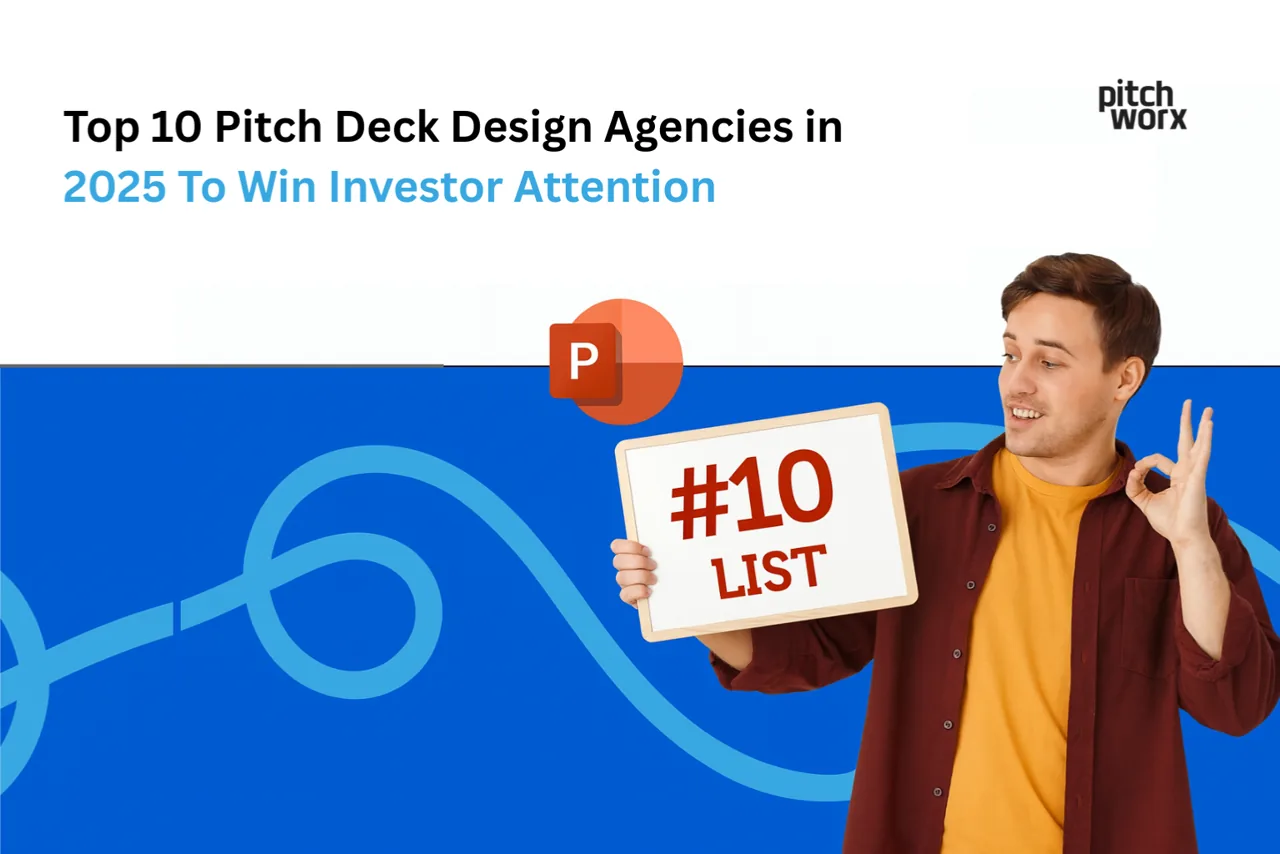
The top 10 pitch deck design agencies in 2025 to help startups win investor attention, compared by strengths and specialties.
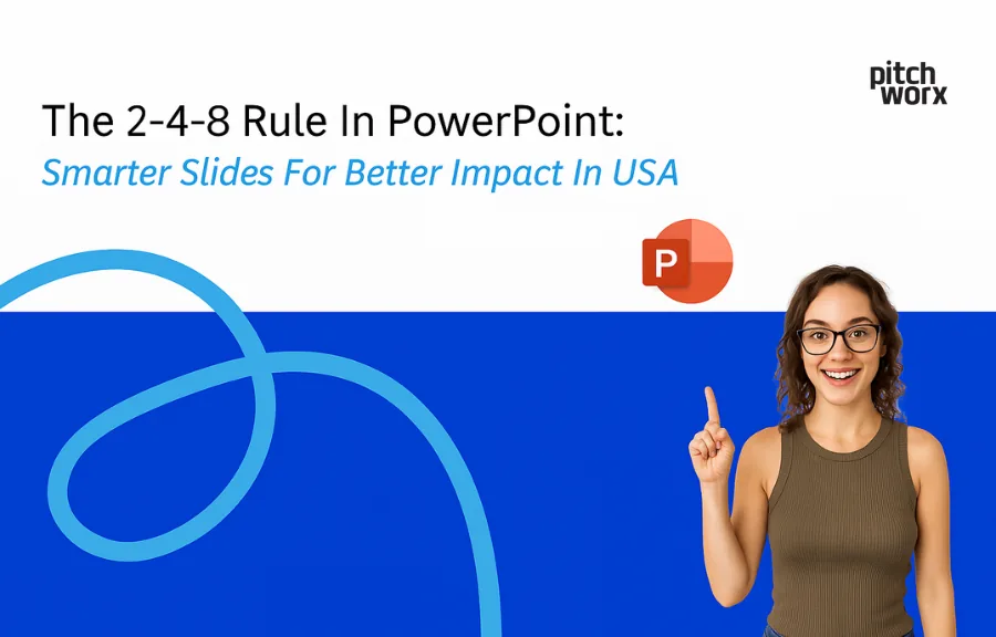
The 2-4-8 rule for PowerPoint: a simple formula for cleaner, higher-impact slides that keep your audience focused.
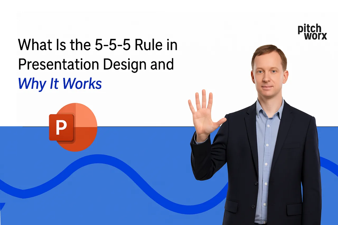
What the 5-5-5 rule in presentation design is and why it works, with tips to keep slides focused and easy to follow.
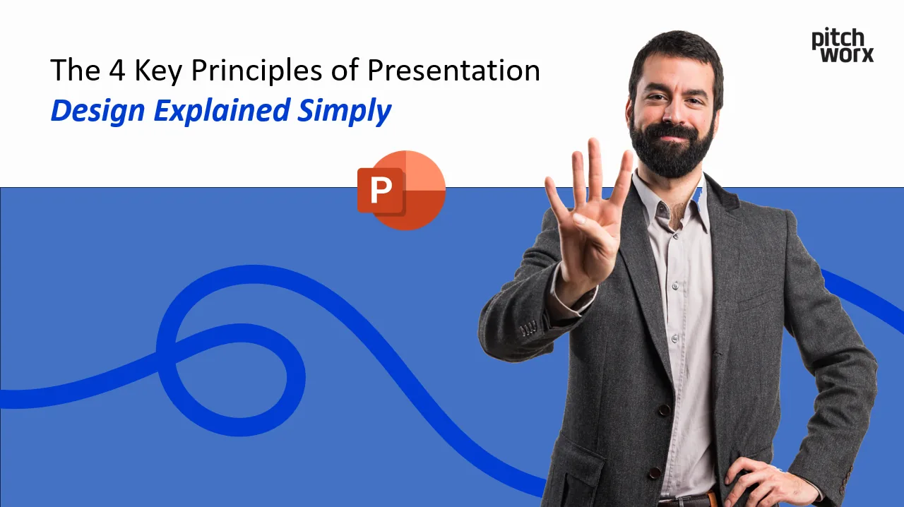
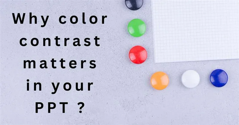
The 4 key principles of presentation design, contrast, hierarchy, alignment and balance, explained simply with practical examples.
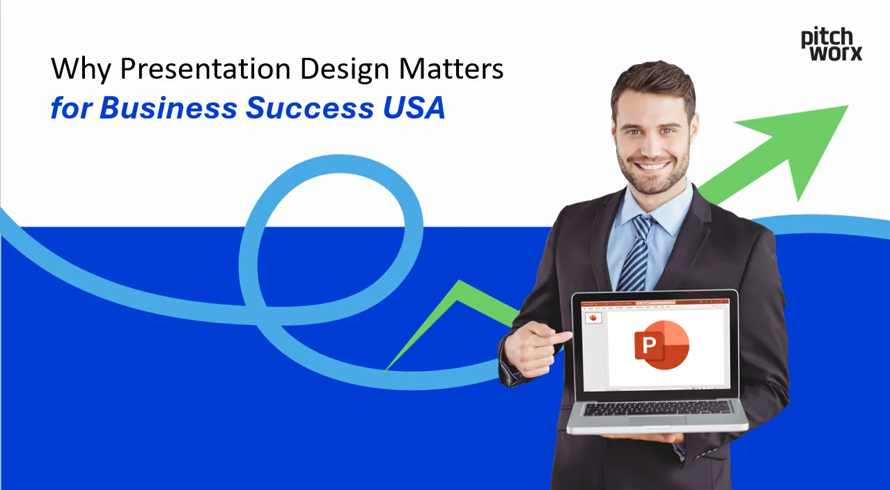
Why presentation design matters for business success: how strong slides build credibility, clarity and conversions for US teams.
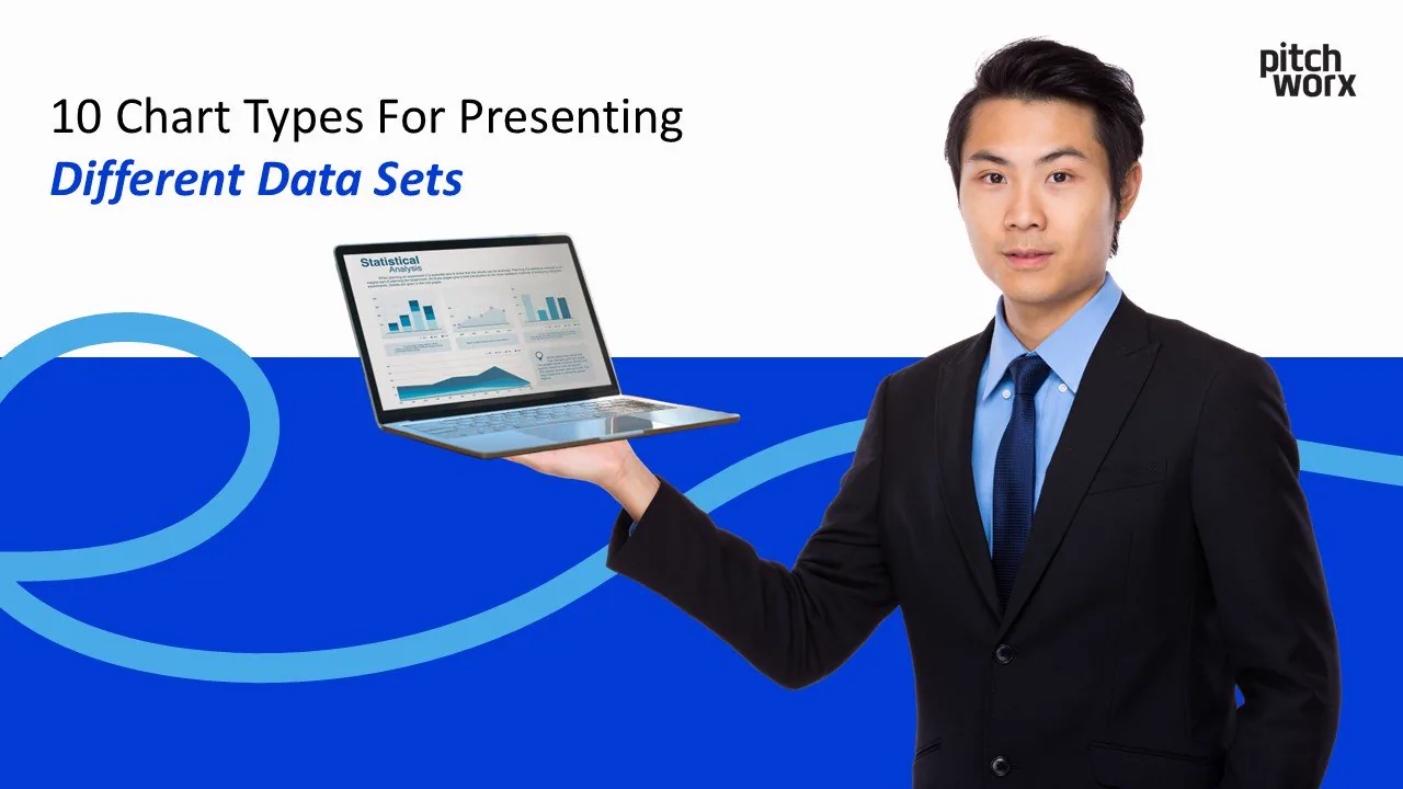
Pick the right chart for your data: 10 chart types, from bar and line to scatter and pie, with when-to-use tips for clearer presentations.
7 proven, quick ways to improve your PowerPoint slides instantly, covering layout, fonts, visuals and contrast.
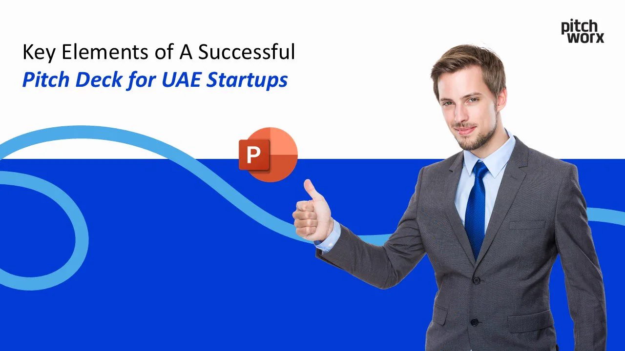
The key elements of a winning pitch deck for UAE startups, from story and traction to design, to help you secure investor attention.
Introduction We’ve all sat through presentations that have left us bored, confused, or simply wishing for the sweet release of the exit door. The truth is, in today’s information-saturated world, the

How to choose a presentation design style that fits your brand, with a practical framework for tone, visuals and consistency.
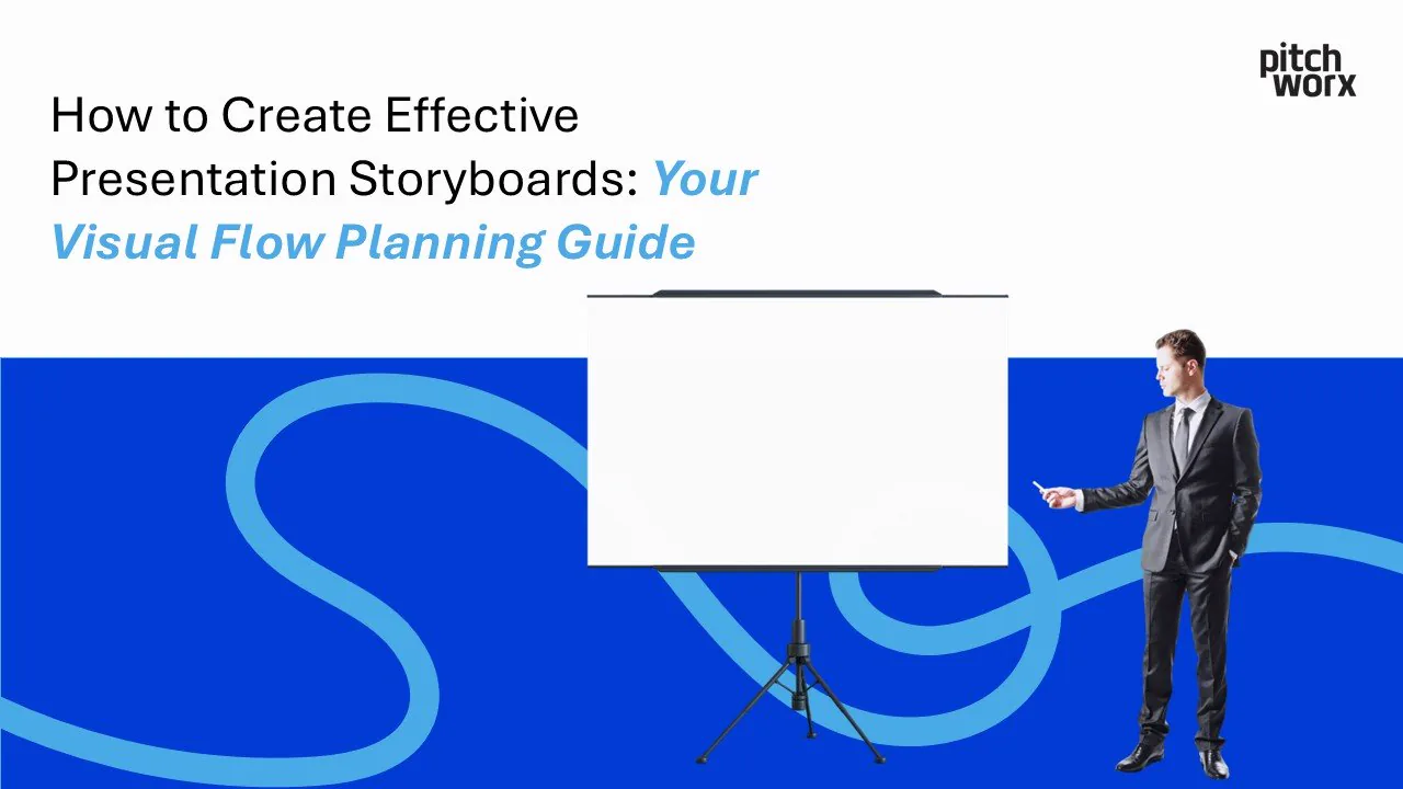
A step-by-step guide to presentation storyboards: plan your visual flow, structure your narrative and design slides that connect.
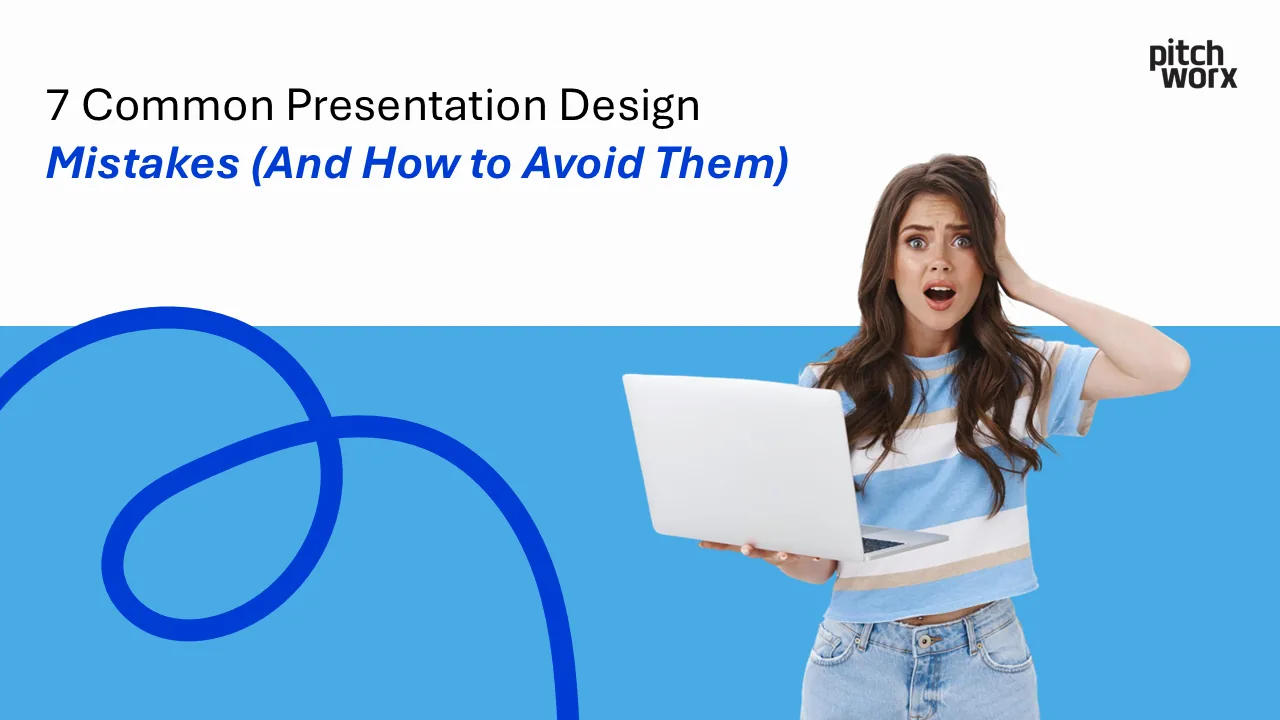
Transform your presentations from amateur to professional by avoiding these critical design pitfalls. Table of Contents Introduction Why Presentation Design Mistakes Cost You The 7 Most Common Design
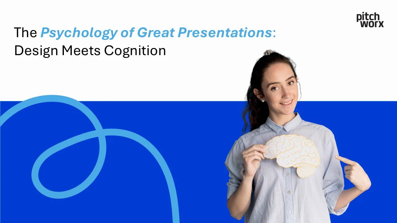
Have you ever wondered why some presentations captivate audiences while others fall flat? The answer lies not just in content or delivery, but in the fascinating intersection of psychology, neuroscien
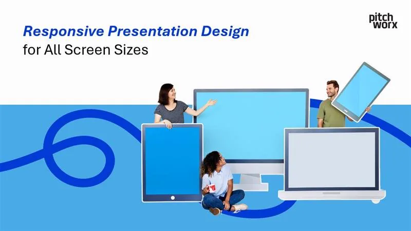
Creating presentations that captivate and inform your audience is no small feat. But in today’s world, where presentations are viewed on everything from laptops to smartphones and 4K projectors, respo

Presentations are everywhere—in boardrooms, conferences, classrooms, and beyond. Yet, they often fail to account for one critical factor: accessibility. Designing accessible presentations ensures that
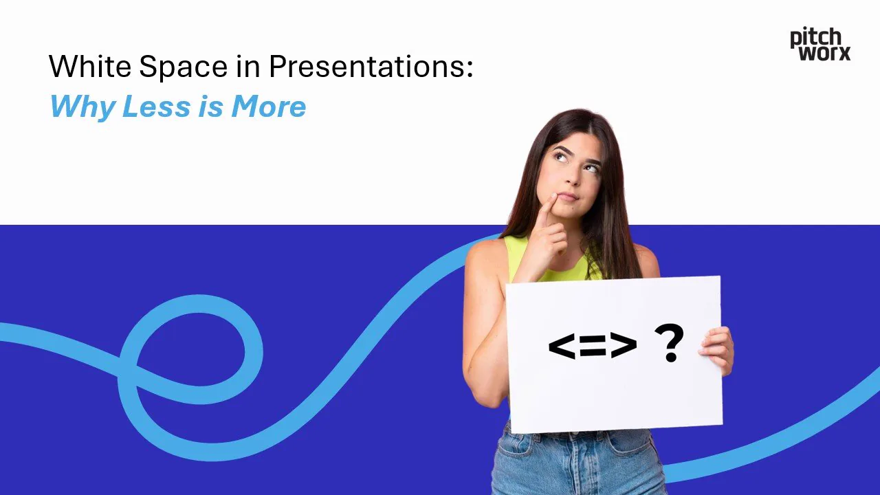
Have you ever found yourself overwhelmed by a cluttered slide deck, struggling to focus on its key message? You’re not alone. According to a 2022 study by ThinkWithGoogle, simple, visually clean desig
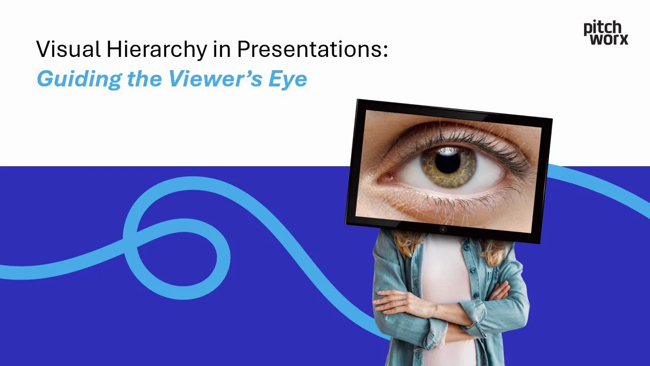
Discover how mastering one simple design principle can elevate your presentations from ordinary to extraordinary. Introduction Creating visually appealing presentations is no longer an optional skill—
You’ve likely heard the saying, “First impressions matter.” This is as true for presentations as it is for people. A poorly organized slide can distract or confuse your audience, while a well-designed
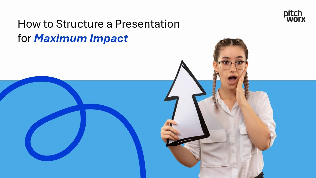
Creating a presentation that leaves a lasting impression isn’t just about dazzling visuals or great ideas. It’s about structure. A well-structured presentation ensures your message lands, your audienc
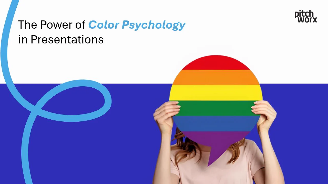
Color isn’t just a design choice; it’s a secret tool that can transform your message. Did you know that color increases brand recognition by up to 80% and drives 90% of product assessments? Used wisel
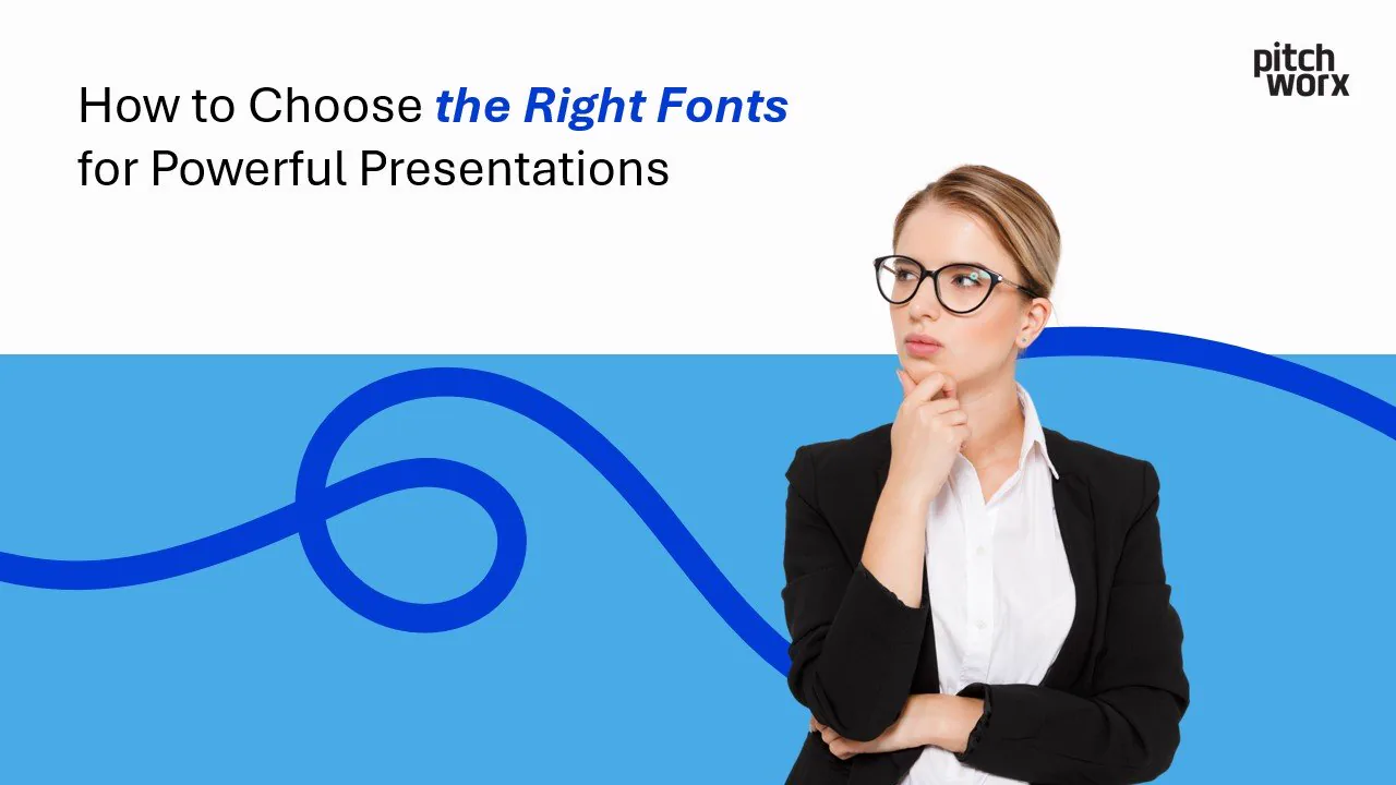
Great presentations do more than share information. They spark curiosity, drive decisions, and stay memorable long after the meeting ends. The secret behind many captivating slides? Typography. When y
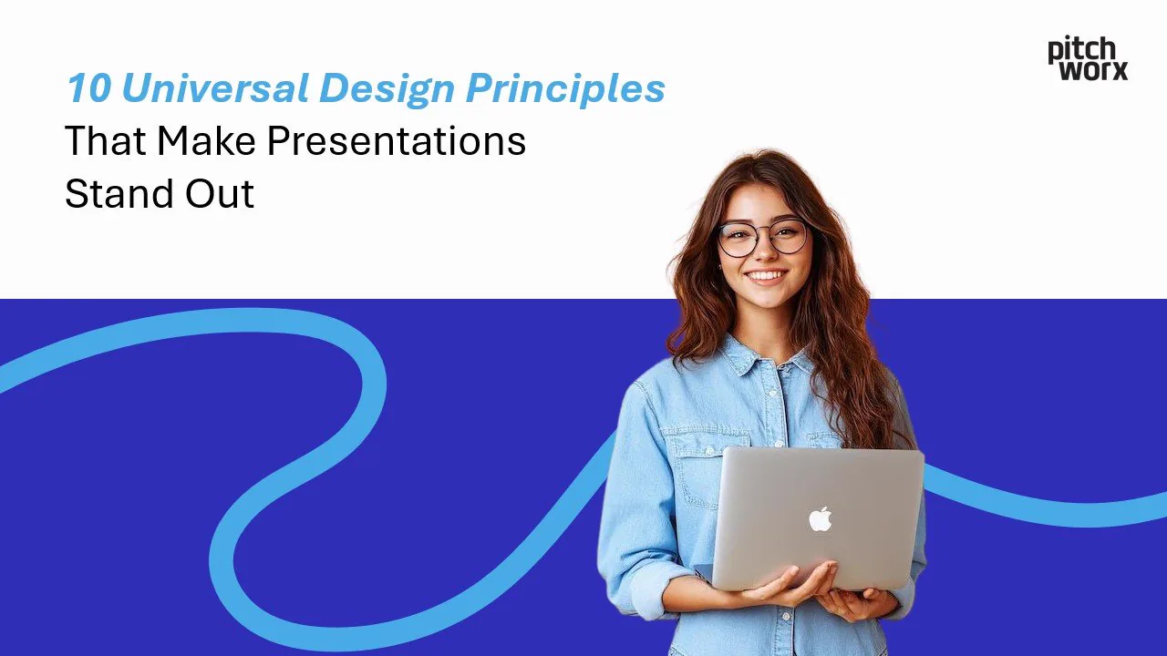
The visual design of a presentation significantly impacts how an audience perceives, processes, and retains information. Universal design principles, when properly implemented, transform ordinary slid
Creating impactful presentations has never been more important. Whether you’re impressing stakeholders, launching a product, or closing a sales deal, a strong presentation can be the difference betwee
Imagine this: You’ve got 7 seconds to hook an investor before they swipe past your pitch deck. Yep, just 7 measly seconds! And even if you clear that hurdle, investors typically spend a grand total of
Did you know humans process visual information 60,000 times faster than text? Many presentations still use simple charts that don’t grab anyone’s attention, despite our brain’s amazing visual capabili
Did you know that humans process visual information 60,000 times faster than text? Yet 68% of presenters struggle to choose the right chart types for presentations, often diminishing their message’s i
Did you know that investors spend an average of just 2 minutes and 41 seconds reviewing a pitch deck? Even more surprising, 90% of them make their initial investment decision in the first 3 slides. Th
PowerPoint presentations: love them or hate them, they’re a staple in business, education, and beyond. But how many times have you sat through a presentation that was visually uninspiring, confusing,
Tired of boring PowerPoint presentations? Want to add a little zing to your slides and keep your audience engaged? Then you’ve come to the right place! This easy-to-follow PowerPoint animation tutoria
Did you know that humans process visuals 60,000 times faster than text? This explains why PowerPoint’s visual appeal plays such a crucial role in presentations. PowerPoint Designer’s malfunction can m
Gone are the days of plain white slides with basic black text. Today, presentations are evolving into visually engaging stories, and gradient colors are at the forefront of this evolution. From sleek
Introduction: Your pitch deck. Think of it as your startup’s resume, its first date outfit, its elevator speech all rolled into one crucial presentation. It’s often the very first impression you make
Importance of Modern Presentation Design A compelling presentation can make all the difference in business communication. Whether you are pitching a new idea, delivering a sales proposal, or conductin
The Importance of Presentation Design A well-crafted presentation is a vital communication tool for businesses, startups, and corporate teams. Whether you’re pitching a new idea, closing a sales deal,
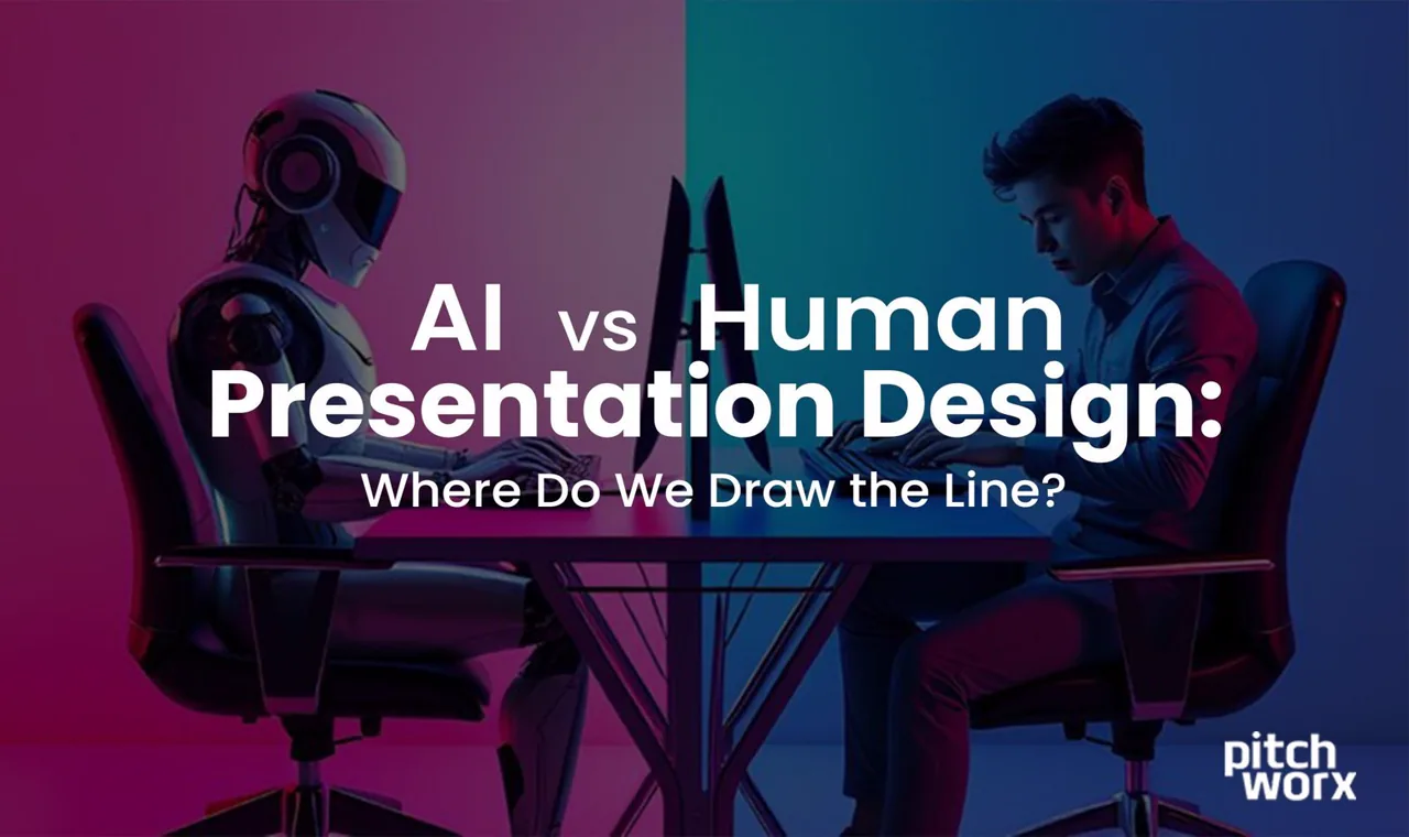
Great presentation design has the power to captivate, inform, and inspire—but who’s better at creating it, humans or artificial intelligence? This question has grown more pressing in recent years, as
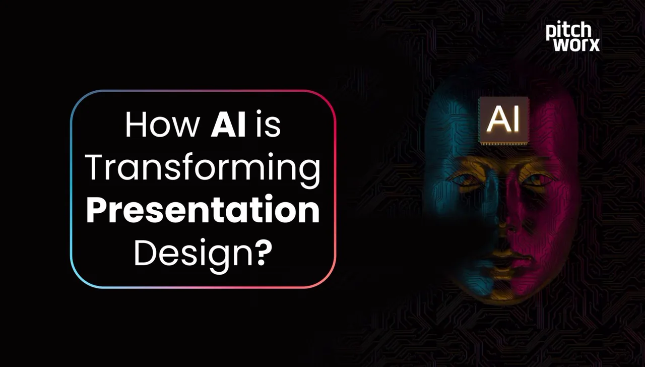
Designing impactful presentations used to be a time-consuming task requiring manual efforts, hours of formatting, and a keen eye for design. However, artificial intelligence (AI) is revolutionizing ho
When it comes to delivering impactful PowerPoint presentations or visually captivating decks, finding the right design agency is crucial. Whether you’re a small business owner preparing for an investo
Explore the strengths of two leading presentation tools, comparing features and updates to help you choose the best fit for your needs in 2025.
Learn the 10 crucial elements to include in a pitch deck that captivates investors and secures funding for your business.
When it comes to professional presentations, PowerPoint still reigns supreme. But in 2025, creating an impactful presentation requires more than just clicking “New Slide.” Whether you’re pitching to i
10 trending technical presentation topics for 2024, with ideas across emerging tech to help you choose a compelling subject.
Discover why PowerPoint Designer isn’t working and get expert fixes. Learn professional PowerPoint design ideas, troubleshooting tips, and creative alternatives for stunning presentations.
Discover why PowerPoint Designer isn’t working and get expert fixes. Learn professional PowerPoint design ideas, troubleshooting tips, and creative alternatives for stunning presentations.
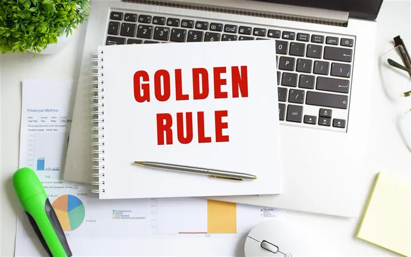
Master the art of presentation design with PitchWorx’s proven golden rules. Learn professional tips for creating stunning, persuasive presentations that captivate your audience. Free expert guide!
In today’s fast-paced American business landscape, the power of a well-designed presentation cannot be overstated. Whether you’re pitching to investors in New York, presenting at a conference in Silic
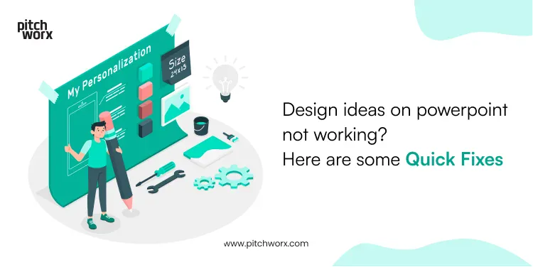
It’s no secret that the PowerPoint Designer is the perfect toolset to design compelling presentations, but if design ideas on powerpoint not working for you, this blog is for you to troubleshoot your
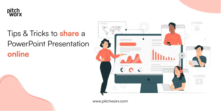
Gone are the days when one had to physically carry their laptop to share a PowerPoint presentation with someone. Luckily for us, with recent advancements in file sharing tech, one can now share a Powe
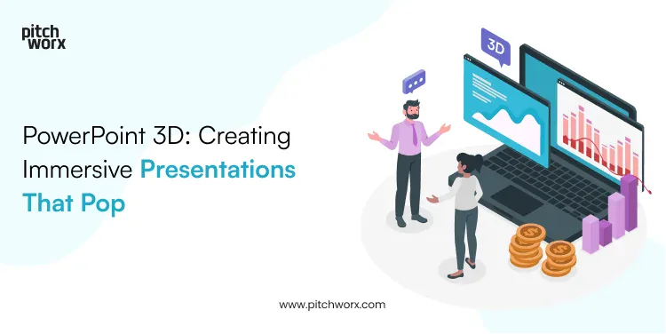
With the ever-evolving graphic designing world, Instagram reels and GIF sharing, viewers are no longer satisfied with 2D images and flat text presentations. They need something innovative to resonate
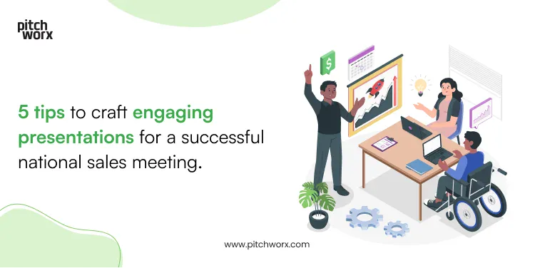
We all know that sales is an all-hands endeavor. That’s the reason the national sales meeting is an occasion for many companies to bring their teams from across the globe together. The meeting helps r
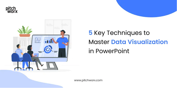
The world is increasingly becoming data driven. And as data continues to drive decisions, it also means that people are being constantly subjected to big numbers. But trying to make sense of the figur
No 'thought leadership'. No promotion. One short essay, one piece of recent work, and a couple of links worth clicking, straight to your inbox.
All the design thinking on this page applied to your brand, on a flat monthly fee. Most requests in 72 hours. Cancel any time.