Quick Answer
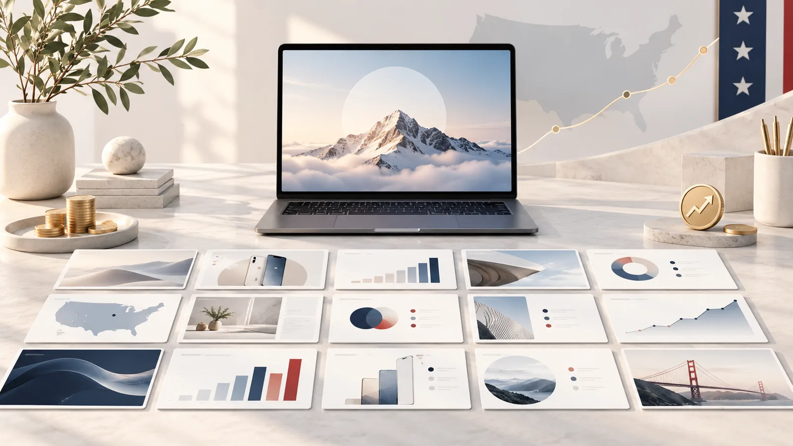
Look at the decks behind Airbnb, Uber, Square, Snapchat and eleven other funded US startups and the same design choices repeat. They run short, usually 10 to 25 slides. They put one idea on each slide. Headlines are full sentences that state the claim instead of naming a topic. They show the product in use rather than describing it. Charts carry one message with direct labels. And every slide sits inside one template. None of it is decoration. If you build decks often, a presentation design subscription keeps those choices consistent without you policing them.
Table of Contents
- Why study funded decks
- The 15 decks and the choice each one shows
- Six design choices they share
- What none of them did
- Case study
- How the PitchWorx subscription works
- Active vs unlimited requests
- Service categories covered
- Pricing compared
- Market growth and the PitchWorx vision
- FAQs
Why study funded decks
A funded deck is not proof that design closed the round. The business did that. What these decks prove is narrower and more useful: none of them lost the room before the business got a hearing.
Reported raise amounts vary between sources, so this piece sticks to the design choices, which are visible in the decks themselves and not in dispute.
The 15 decks and the choice each one shows
- Airbnb, seed. Ten slides, one idea each, plenty of empty space. Still the most copied structure in Silicon Valley.
- Uber, seed. Led with the problem of hailing a cab, then the city map. The vision slide came before any metric.
- Facebook, early round. Growth carried the deck. One chart, one line, no decoration.
- LinkedIn, Series B. Explained three revenue streams in plain words, with no jargon slide.
- YouTube, early round. Framed the category before the product, so investors knew what they were buying into.
- Dropbox, seed. Visual walkthroughs of the product working, instead of paragraphs about syncing.
- Square, Series A. The deck looked like the product: clean, white, minimal.
- Snapchat, Series A. Big visuals, a consistent mascot, youthful tone on every slide.
- Coinbase, seed. Blue palette throughout, with trust shown visually rather than claimed in text.
- DoorDash, Series A. Delivery zones drawn as maps and icon flows, red brand color throughout.
- WeWork, Series D. Photography of real spaces did the persuading, not spec lists.
- Peloton, Series C. Hardware and content shown together, recurring revenue as the headline.
- Warby Parker, Series A. Mission stated early, then the brand's own visual style throughout.
- Mixpanel, Series B. Ten slides on bold color backgrounds, typography doing the work.
- Tesla, Series C. One roadmap slide showing the path from niche car to mass-market.
Six design choices they share
1. They are short. Most run 10 to 25 slides, and Airbnb and Mixpanel both used ten. Short decks force a decision about what matters.
2. One idea per slide. Not one topic, one idea. Two arguments meant two slides.
3. Headlines state the claim. "Revenue model" is a label. "We earn on every transaction, with no monthly fee" is a headline. Funded decks use the second kind, so an investor skimming still gets the argument.
4. The product is shown, not described. Dropbox, Square and Peloton all put the product on screen. A screenshot answers "what is it" faster than a paragraph.
5. Data slides make one point. One chart, labeled directly, no legend to decode. Facebook's growth slide is the clearest case: a single line, nothing competing.
6. One template, start to finish. Same grid, two fonts, three colors. Snapchat, DoorDash and Warby Parker each carried brand color through every slide, so the deck felt like the company. Holding that line across dozens of decks is exactly what an unlimited design subscription is for.
What none of them did
No deck in this set used clip art, three fonts, paragraph text, or a chart with two y-axes. None opened with a company history slide.
Those habits are the most common reasons a deck looks amateur, and avoiding them costs nothing but the discipline to check before sending.
Case study
PitchWorx's published client results include:
- A 22-slide Series A deck, rebuilt from a content document into a story-led structure with a clear hook, evidence and ask. That round closed within nine weeks.
- A Boston medical device manufacturer recorded a 41% increase in sales conversion rate after rolling out redesigned product presentations.
- A New York investment firm reported client retention up 28% after its quarterly review decks were redesigned.
The Series A deck matches this article closely. The content existed before PitchWorx touched it. What changed was structure and design: one idea per slide, sentence headlines and a single template, applied through a Presentation design subscription rather than a one-off project.
How the PitchWorx subscription works
PitchWorx started in 2012 as a presentation design company and brings 13 years of experience in the design industry, with over 150,000 slides designed for more than 500 brands including Wipro, Samsung, Honeywell, PepsiCo and Caterpillar. It is ISO 27001:2022 certified, so this presentation design subscription carries enterprise process, not just output.
The plan is called Creative Assist:
- Start a 7-day free trial with a real deck brief.
- Onboarding week: the team builds your template, colors, type and masters.
- Submit requests through the dashboard, no limit on team members.
- Most requests return in about 72 hours, AI first pass, senior designer review.
- Unlimited revisions until it is right.
- You own the editable source files in PowerPoint, Keynote, Google Slides or Figma.
- Cancel anytime, no contract.
Active vs unlimited requests
This is the term small business owners misread most often in any unlimited design subscription.
Unlimited means no cap on how many requests you add to the queue each month. Active means how many the team works on at the same time.
PitchWorx runs two active requests. When one is delivered, the next starts, so 25 queued requests move through two at a time. The active number, not the word unlimited, tells you your real monthly output.
Service categories covered
One plan covers eight categories:
- Presentation design: pitch decks, sales decks, board and investor presentations, through a dedicated deck team
- Branding design: logos, brand identity, guidelines and refreshes
- Marketing design: social creatives, ads, email graphics, landing page visuals
- Creative design: illustration and infographics
- Web design and development: websites, landing pages, microsites
- Video and motion: explainers, logo animation, reels
- Print and outdoor: brochures, packaging, signage
- Books and magazines: layouts and annual reports
Because decks go to their own team, a presentation design subscription request never queues behind a social media banner. That separation is the main reason founders pick this Unlimited design subscription over a general one.
Pricing compared
Creative Assist is $699 per month, flat, for US and UK clients.
| Option | Starting monthly price (2026) |
|---|---|
| Penji | $899 |
| ManyPixels | $999 |
| PitchWorx Creative Assist | $699 |
| Flocksy | $1,199 |
| Kimp (Graphics) | $1,397 |
| Superside | about $5,000 |
| US in-house designer | $5,000+ (over $60,000 a year before benefits) |
Upwork lists presentation designers at $35 to $60 an hour, and 24Slides charges $43 per slide for a redesign. A 40-slide investor deck costs $1,720 at that rate, more than two months of the presentation design subscription.
Teams needing more output move to a custom plan, which adds active slots, a dedicated designer, multi-brand workflows and larger video or web production. Ownership terms are identical on both, and the unlimited design subscription covers every category either way.
Market growth and the PitchWorx vision
Mordor Intelligence values the global graphic design market at $59.29 billion in 2026, rising to $85.53 billion by 2031, a 7.6% annual growth rate, and credits AI-assisted production for making flat-fee plans viable.
Chart note: plot the market curve 2026 to 2031 at 7.6% CAGR ($59.3B, $63.8B, $68.6B, $73.9B, $79.5B, $85.5B) and a bar chart of the pricing table, PitchWorx highlighted.
PitchWorx runs its subscription and custom model across the USA, UK, UAE and India. The vision is one design partner, one flat price, files the client owns outright, and deck standards that hold whether you are raising a pre-seed in Austin or a Series B in London.
FAQs
How many slides should a pitch deck have?
Most decks in this set run 10 to 25 slides, and Airbnb and Mixpanel used ten.
What do funded pitch decks have in common visually?
Short length, one idea per slide, sentence headlines, product shown rather than described, single-message charts, and one consistent template.
Should my deck match my brand colors?
Yes. Snapchat, DoorDash and Warby Parker all carried brand color through every slide, which makes the deck feel like the company rather than a template.
Do investors actually care about design?
Design does not win the round, the business does. Poor design loses attention before the business gets a hearing, and that is the risk worth removing.
Can I copy the Airbnb deck structure?
The structure travels well: problem, solution, market, product, traction, team, ask. The content and the brand should be yours.
Who builds the deck if I have no designer?
An unlimited design subscription puts a senior team on it. PitchWorx Creative Assist is $699 a month, unlimited requests, no contract, with a 7-day free trial.
Does the plan cover more than decks?
Yes. The same unlimited design subscription covers branding, marketing, web, video, print and illustration alongside deck work.