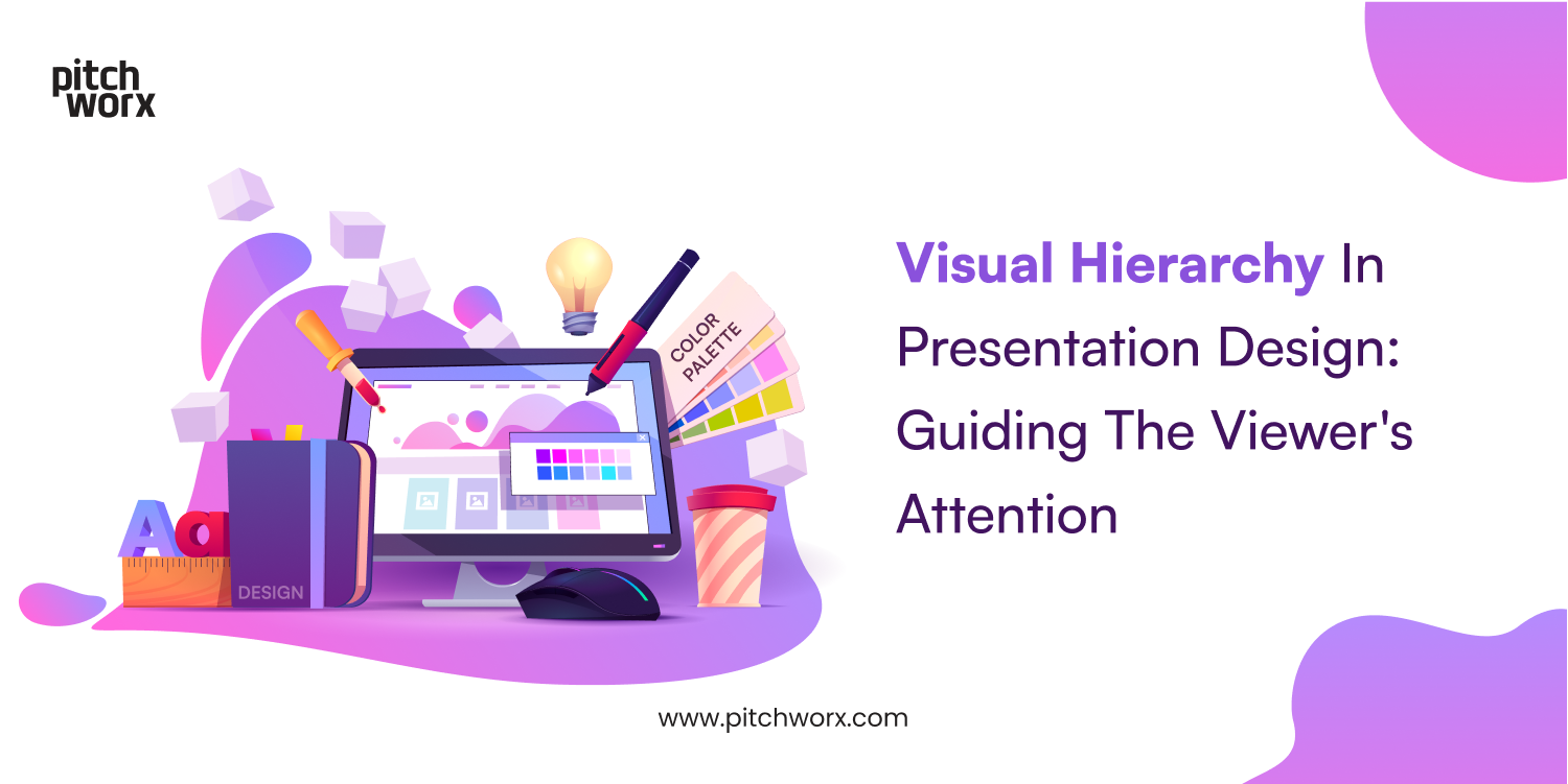
Often, when we talk about presentation design, we only think about the design aesthetics and the trendy designs and fail to think about how the audience will absorb the information you display with those designs. That’s exactly why it’s essential to talk about visual hierarchy. Visual hierarchy is a crucial aspect of presentation design, wherein the information and design elements are arranged in a way that guides the viewer’s attention effectively and helps them understand the slides more easily.
When visual hierarchy is done right, it increases the appeal of the deck and keeps the audience engaged in your presentation. Consequently, when the rules of visual hierarchy are broken, your slides become cluttered and you end up with a distracted audience that’s struggling to focus on the key points and your message. Having now understood how visual hierarchy is an essential process in presentation design which can drastically impact a presentation, let us now see some key elements that you can consider for a truly engaging presentation.
1- Size
When it comes to visual hierarchy in slides, size is an element that plays the simplest yet the most effective role. This is because the size of an element can immediately draw the viewer’s attention and emphasise what you’re trying to convey. Therefore, understanding that larger elements will always get noticed first is a good rule of thumb to bear in mind while designing a slide. This applies to all presentation design services. However, always keep in mind to scale the elements only to a particular degree so that it doesn’t detract from the importance of the other elements present on the slide. You don’t want an element that is in the face without it signifying an important message.
2-Typography
The best way to explain how typography affects visual hierarchy is to take the example of a newspaper. In a newspaper, the catchy headline is often in a font larger and bolder than the surrounding text, immediately setting it apart and making it stand out. This is followed by the subtitle that is distinguished with a smaller font but still in bold to give you a brief about the theme of the article. This is a sure shot way to keep the audience interested. Then, the rest of the story is in a much smaller font but with its own quotation at pivotal points to help highlight any important information. Similarly, in a presentation, different font sizes for headings and body text can help the audience differentiate between different types of content. The larger and bolder font can emphasise a key point, while a smaller and lesser prominent font for the not-so-important information. This allows the viewer to read without getting distracted from the more important elements on the slide. Besides the font size, the weight, and style can also help create emphasis and hierarchy.
3- Colour and contrast
Colours are a predominant part of any presentation design. In a business presentation design, colours provide a strong visual identity to the brand. But they can also show the significance of an element. Bright and vibrant colours can draw the audience’s attention at an instant. Therefore, they can signify the key points in a slide that needs to be focused on, while muted or dull colours can be used for the less essential information. This prevents the viewer from getting distracted by the lesser important details. Colour is also a great tool that helps differentiate elements or group similar elements together. By using colours right, you can emphasise key elements while also presenting an engaging and appealing deck.
Similarly, contrast helps distinguish elements and makes them stand out. For important elements, dark text on a light background or vice versa can create a contrast that makes it easier to view, while a more faded look can be given to elements that don’t require too much attention.
4- Alignment
Alignment is an important factor that helps the audience know where to begin and the path they can follow to read all the information presented on the slide. When elements are aligned along the same path, it associates them together and makes it easier for the audience to view the slide. Since the human brain loves symmetry, the general rule of thumb that most presentation design services employ is having the text margins aligned towards the left because most viewers scan a slide from left to right and top to bottom. Obviously, depending on other factors like font, colour and style, this might vary. Nevertheless, aligning elements can make a slide look clean, organised, easy to understand, and can define a clear visual hierarchy.
5- Proximity
When elements are placed closer together, they are perceived as being related, which urges the audience to delve deeper into the topic in an organised manner. This is a great way to group information and guide the audience’s attention. For example, when you have an image and a block of text that are related, placing them close together can create a visual connection for the audience to understand the relationship easily. With the right proximity of elements, scanning through the slide becomes easier and it helps the audience focus on the necessary information without getting too distracted, thus increasing the viewer engagement. This is a factor in business presentation design that is great to establish the importance and hierarchy of a topic without being too obvious.
6- White space
Serif fonts, which have those little lines and flourishes at the ends of their letters, have been around for a long time. They were replaced by the more modern looking Sans-serif font in recent years. But now, they are making a comeback! Serif fonts with their classy elegance and sophistication are gaining popularity again. Their use in presentation gives a more polished and refined look and we as a presentation design company are a fan of this trend! Whether you use a classic serif like Times New Roman or something more modern and stylized, like Georgia or Baskerville, serif fonts can add a touch of class and sophistication to any presentation.
Learning to consider and use these elements strategically during a presentation design can take time and effort. But once you get the hang of it, you can create a visual hierarchy that easily guides the audience’s attention through the presentation with the right emphasis on the most important points and highlighting the key message of the presentation. Thus, visual hierarchy serves the amazing purpose of conveying the message in the most effective way while also making the presentation visually appealing and engaging.


