Published: 24 March 2026 | Reading Time: 17 minutes | Author: Priyanshu Rajput
Table of Contents
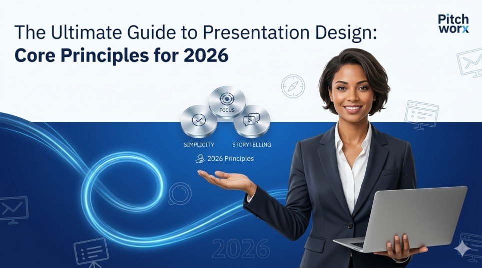
- Quick Answer: The 5 Core Principles of Presentation Design
- Why Presentation Design Is a Business Decision, Not a Creative One
- The 5 Core Principles Every Presentation Must Follow in 2026
- Real Case Study — Bengaluru Fintech Startup, 2025
- 5 Common Presentation Mistakes and Practical Fixes
- The “Cognitive Load” Problem: A Unique Angle
- What to Look For When Hiring a PPT Designer
- What Is Changing in Presentation Design in 2026
- Frequently Asked Questions
Quick Answer
Good presentation design in 2026 is built on five core principles: visual clarity, narrative structure, brand consistency, data storytelling, and audience-first thinking. Whether you are working with a professional PPT designer or using a PowerPoint slide design service, applying these principles is what separates presentations that drive decisions from ones that are simply forgotten.
Let me be direct: most presentations are not bad because of the content. The content is usually fine. They are bad because nobody gave enough thought to how that content should look, flow, and feel.
I have seen this pattern repeat itself — in Indian startup pitches at Delhi’s Demo Day, in corporate strategy reviews in Mumbai, in sales decks sent to enterprise buyers in Bengaluru. The idea is solid. The data is real. But the slides are cluttered, the fonts are inconsistent, and the flow jumps around like a nervous first-time presenter. And then the deal falls through, or the investor loses interest, or the buyer moves to a competitor.
Design is not decoration. It is communication. And in 2026 — with audiences more distracted, investors more demanding, and sales cycles more competitive — understanding the core principles of presentation design is not optional. It is strategic.
This guide walks you through everything that actually matters, with real numbers to back it up and practical advice you can apply today.
- 94% of first impressions are design-based (INK PPT research)
- 91% say a well-designed deck increases their confidence as a presenter
- 89% more likely to secure funding with professional pitch deck design (GVCA)
- 43% more persuasive when data is presented visually vs. text only (Wharton)
Why Presentation Design Is a Business Decision, Not a Creative One
There is a widespread belief that design is the final step — something you do after the content is “done.” That belief is costing businesses real money.
Research from the Wharton School found that presentations using strong visual data are 43% more persuasive than those using text alone. Stanford research shows that 75% of people judge a speaker’s credibility based on visual quality before they even hear the first sentence. And a 2025 study by the Global Venture Capital Association found that startups working with a professional PPT designer or formal pitch deck design services are 89% more likely to secure funding and achieve 156% higher valuations compared to DIY decks.
That last number stopped me the first time I read it. 156% higher valuations. Not because the business was different. Because the presentation was better. This is why the best founders, sales leaders, and enterprise teams treat design as a strategic investment — not a nice-to-have. When you hire a professional PPT designer or use a dedicated PowerPoint slide design service, you are not paying for pretty slides. You are paying for credibility, clarity, and conversions.
The 5 Core Principles Every Presentation Must Follow in 2026
1. One idea per slide — and mean it
This is the rule most people know and almost nobody follows. Every slide should carry exactly one idea. Not one topic. One idea. A single thought that your audience can absorb, process, and remember. When you put three ideas on a slide, your audience splits their attention between all three and remembers none of them clearly. When you put one idea — supported by one strong visual — they stay with you. Skilled pitch deck design services enforce this rule ruthlessly.
2. Visual hierarchy tells the audience where to look
Every slide has a hierarchy — intentional or not. Good visual hierarchy means: the most important thing is the biggest and boldest. Supporting information is slightly smaller and lighter. Context or source information is smallest and most subtle. The eye moves top to bottom, left to right, large to small. Your job is to use that natural path to guide the audience exactly where you want them to go.
3. Brand consistency across every slide
Inconsistency in a deck signals one thing to an audience: this person does not pay attention to detail. Consistent fonts, consistent colours, consistent spacing, consistent logo placement — these are not cosmetic choices. They are trust signals. A properly set up brand template, delivered by a good PowerPoint slide design service, eliminates this problem entirely.
4. Data must be visualised, not listed
A table of numbers is not a data story. It is an excel sheet wearing a suit. Real data storytelling means choosing the right chart for the right message — a bar chart for comparison, a line chart for trend, a single large number with context for impact. In 2026, data simplification has become one of the defining trends. There has been a 300% spike in demand for decks that use simplified, bold data visuals over traditional tables.
5. End with a decision, not a summary
Most presentations end with “Thank you” or “Questions?” Both are missed opportunities. Your final slide should tell the audience exactly what you want them to do next. Approve the budget. Schedule a follow-up. Sign the agreement. Make an introduction. A clear, specific call to action is one of the highest-impact changes you can make.
Real Case Study — Bengaluru Fintech Startup, 2025
A seed-stage fintech startup from Bengaluru was preparing to pitch to angel investors in Mumbai. Their previous deck — built in-house — had 28 slides, three different font families, and messy screenshots. They engaged a professional PPT designer through a pitch deck design service. The deck was rebuilt from scratch: 14 focused slides, one typeface family, and a clean data story on slide 9 showing growth from 0 to 42,000 active users.
At the event, three of the seven investors followed up within 48 hours. Two weeks later, the startup closed a ₹2.8 crore seed round. The lead investor noted the deck was “the clearest pitch I have seen this year.” The content had not changed. The design had. Result: ₹2.8 Cr seed round closed · 3 investor follow-ups within 48 hours.
5 Common Presentation Mistakes (and Their Practical Fixes)
Mistake: Wall-of-text slides
Practical Fix: Apply the 6x6 rule: max 6 bullets, max 6 words each. Move detail to notes.


Mistake: Mismatched fonts and colours
Practical Fix: Use a master slide template. Lock 2 fonts and 3 brand colours.

Mistake: No narrative arc
Practical Fix: Structure: Problem → Solution → Proof → Ask. Every slide must advance the story.

Mistake: Raw data screenshots
Practical Fix: Extract the single most important number and design a visual around it.

Mistake: Ending with "Thank you"
Practical Fix: Replace with a dedicated CTA slide with 2–3 specific asks.
The “Cognitive Load” Problem: A Unique Angle
Everyone talks about design aesthetics. Fewer people talk about cognitive load — the mental effort required to process information. Every unnecessary element on a slide — a decorative border, a secondary colour used once — adds cognitive load without adding value. By the time the audience reaches your key message, they are already tired.
Personal view: The best presentation designers do not think about what to add; they think about what to remove. Experts design by subtraction. This matters even more in India, where corporate culture historically equated thoroughness with credibility. The shift in 2026 is a move away from information-heavy slides toward message-heavy ones. Less is genuinely more.
What to Look For When Hiring a PPT Designer or PowerPoint Slide Design Service
- They ask about the audience first: Design serves communication. If the first question is “what colours do you like?” instead of “who is this for?”, that is a warning sign.
- They push back when you are wrong: Good designers have opinions. The best PowerPoint slide design service providers will challenge your slide count and narrative sequence firms.
- They have a visible portfolio of real business decks: A designer who has done beautiful posters may not understand how an investor reads a pitch deck. Portfolio evidence is non-negotiable.
Pro tip: When reviewing a portfolio, ask: “Does the visual hierarchy guide me clearly? Is there one obvious takeaway per slide?” If yes, you are looking at genuinely good work.
What Is Changing in Presentation Design in 2026
The biggest shift in 2026 is the rise of clarity-first design. Decks must work independently across live events, Zoom, PDFs, and mobile screens. A well-designed deck from a quality pitch deck design service should be understandable without a presenter.
2026 Design Trends Worth Knowing:
- Bold typography as the hero
- Bento grid layouts (modular card-based slides)
- Mobile-first vertical (9:16) formats for executive reviews
- Interactive presentations with non-linear navigation
Need a PPT Designer Who Gets It?
PitchWorx has helped 500+ businesses across India, UAE, UK, and the US create presentations that win pitches, close deals, and secure funding. 13+ years. 150,000+ slides. Real results.
Talk to a PitchWorx Designer →
Frequently Asked Questions
1. What exactly does a PPT designer do, and when do I actually need one?
A PPT designer takes your content and structures it into a presentation that communicates clearly. You need one whenever the stakes are high: investor pitches, major client proposals, or board presentations. If the presentation could make or break a deal, hire a professional.
2. How is a PowerPoint slide design service different from just using a template?
A template gives a visual framework, but a professional service gives a complete solution including narrative structure, content editing, and brand alignment built around your specific goal. Professional services deliver bespoke design that templates cannot.
3. What makes pitch deck design services worth the investment for Indian startups?
The Indian ecosystem is intensely competitive. Research shows startups with professionally designed decks are 89% more likely to secure funding. The ROI is clear: the cost is recovered in the first serious investor conversation it generates.
4. How many slides should a presentation actually have?
For investor pitch decks, 10–14 slides is the proven sweet spot. For sales presentations, 12–20 works well. The real question is: “does every slide advance the story?” If a slide is just filling space — cut it.
5. Can good presentation design actually help me present better?
Yes. A 2025 survey found 91% said a well-designed deck increases their confidence. When slides are clear and polished, you stop worrying about the visuals and focus on delivery. The slide does part of the work for you.