Published: 31 December 2025 | Reading Time: 16 minutes | Author: PitchWorx Design Team
Quick Answer
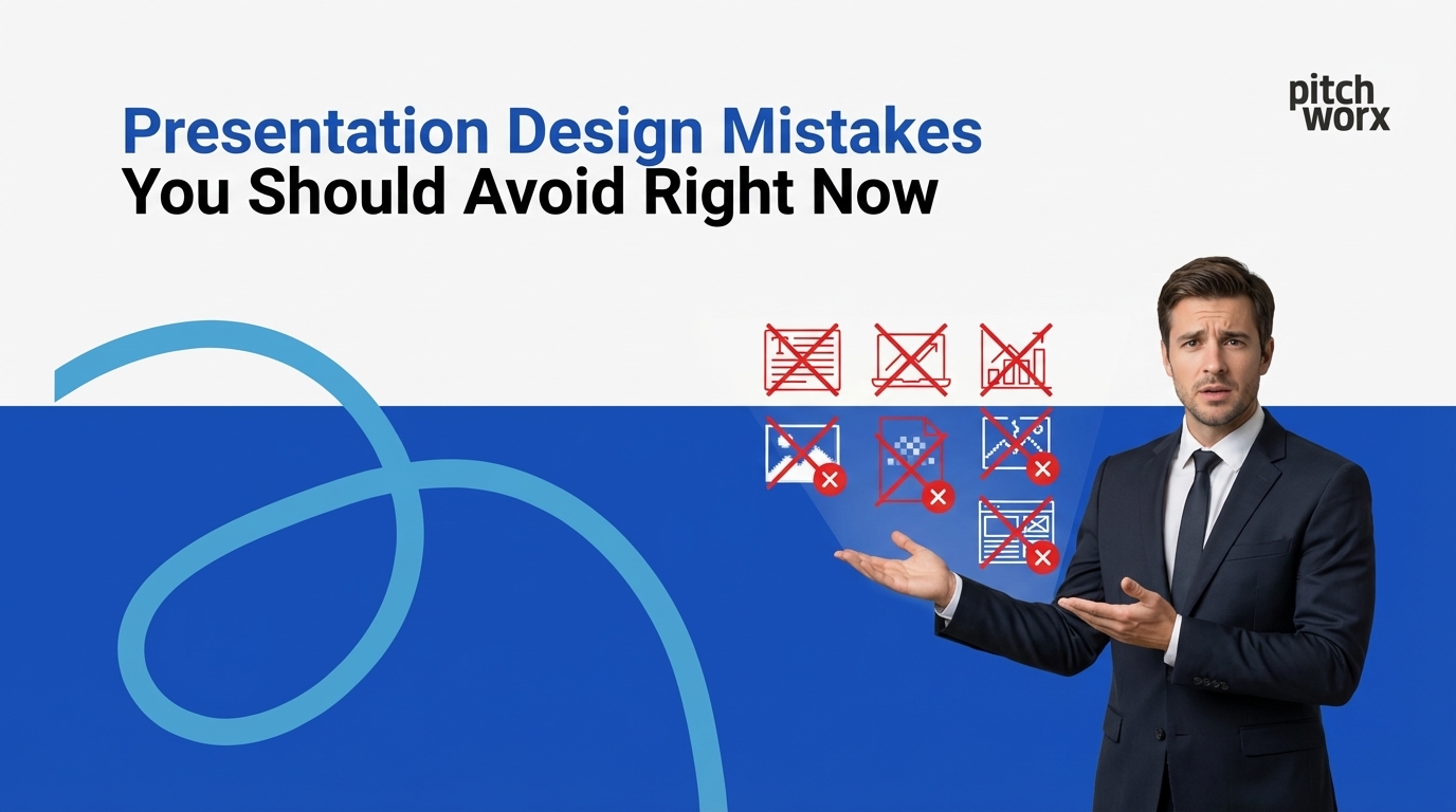
The most critical presentation design mistakes costing businesses opportunities in 2026 include: text overload (cramming slides with paragraphs instead of key points), poor visual hierarchy (failing to guide audience attention), inconsistent branding (mixed fonts, colors, and styles), low-quality images (pixelated or irrelevant stock photos), death by bullet points (lists instead of visual storytelling), ignoring data visualization principles (complex spreadsheets instead of clear charts), neglecting mobile/screen compatibility (designs that don’t display properly), and lack of white space (cluttered slides causing cognitive overload). Research from Harvard Business School shows that professionally designed presentations increase audience retention by 67% and improve pitch success rates by 43%. Avoiding these mistakes—either through learning design fundamentals or partnering with the best PowerPoint design agency like Pitchworx—can be the difference between winning a $5 million contract and losing to a competitor with better visual communication.
Table of Contents
- Quick Answer
- Introduction: Why Presentation Mistakes Cost More Than You Think
- Mistake #1: Text Overload – The Silent Presentation Killer
- Mistake #2: Poor Visual Hierarchy – Losing Your Audience’s Attention
- Mistake #3: Inconsistent Branding – Undermining Professional Credibility
- Mistake #4: Low-Quality Images – The Credibility Destroyer
- Mistake #5: Death by Bullet Points – The Engagement Killer
- Mistake #6: Ignoring Data Visualization Principles
- Mistake #7: Neglecting Mobile and Screen Compatibility
- Mistake #8: Lack of White Space – Cognitive Overload
- Mistake #9: No Clear Call-to-Action
- The Pitchworx Difference: Why Professional Design Matters
- Business Growth Through Effective Presentations: The Data
- Flowchart: Presentation Design Decision Process
- Getting Started: Immediate Action Steps
- Free Resources from Pitchworx
- Conclusion: Your Presentation Represents Your Brand
- Frequently Asked Questions
Introduction: Why Presentation Mistakes Cost More Than You Think
In boardrooms across Dubai, Abu Dhabi, and business centers worldwide, billions of dollars in opportunities are won or lost based on presentation quality. A groundbreaking study by McKinsey & Company revealed that 68% of executives cite poor presentation design as a key reason they rejected business proposals—even when the underlying ideas had merit.
Your presentation is often your first impression, your sales pitch, your proof of competence, and your competitive differentiator—all compressed into 20-40 slides. Yet most business presentations suffer from the same preventable design mistakes that undermine credibility and obscure messages.
Pitchworx, recognized as the best PowerPoint design agency serving UAE and global markets, has analyzed over 10,000 presentations across 15 years of operation. We’ve identified the specific mistakes that separate winning presentations from forgotten ones. This comprehensive guide reveals those critical errors and, more importantly, shows you exactly how to avoid them.
Whether you’re pitching investors in Dubai, presenting to executives in New York, or training teams in London, understanding these mistakes could be worth millions to your business.
Mistake #1: Text Overload – The Silent Presentation Killer
The Problem:
Slides crammed with paragraphs, dense sentences, and walls of text that audiences can’t read and won’t remember.
The Impact:
According to cognitive psychology research from MIT, audiences reading slide text can’t simultaneously listen to speakers—the brain can’t process written and spoken language effectively at the same time. This creates a cognitive split where your audience misses both your words and your slides.
The Solution:
Follow the 6×6 Rule:
- Maximum 6 lines per slide
- Maximum 6 words per line
Better yet, follow the 3-Point Rule:
- One headline (10 words or fewer)
- One key visual (image, chart, or diagram)
- One supporting detail (if absolutely necessary)
Mistake #2: Poor Visual Hierarchy – Losing Your Audience’s Attention
The Problem:
Every element on the slide competes for attention equally, leaving audiences confused about what’s important.
The Impact:
Eye-tracking studies by the Nielsen Norman Group show that viewers spend 2.5 seconds determining what’s important on a slide. Without clear hierarchy, they either miss key messages or give up entirely.
Visual Hierarchy Principles:
Size Hierarchy:
- Headline: 44-54pt (most important)
- Subheading: 28-32pt (secondary importance)
- Body text: 18-24pt (supporting detail)
- Caption: 14-16pt (reference information)
Color Hierarchy:
- Primary color: Key message and data (use sparingly)
- Secondary color: Supporting information
- Neutral colors: Background and less important text
Mistake #3: Inconsistent Branding – Undermining Professional Credibility
The Problem:
Mixed fonts (using 5+ different typefaces), inconsistent colors, varying logo treatments, and mismatched styles creating visual chaos.
The Impact:
Stanford University research on credibility found that 75% of users judge a company’s credibility based on visual design consistency. Inconsistent presentations signal disorganization and lack of attention to detail.
Brand Consistency Checklist:
✅ Fonts:
- Limit to 2 font families maximum
- One for headlines (often sans-serif)
- One for body text (highly readable)
- Consistent sizing across all slides
✅ Colors:
- Primary brand color (headlines, key data)
- Secondary brand color (supporting elements)
- Accent color (calls-to-action, emphasis)
- Neutral palette (backgrounds, body text)
Mistake #4: Low-Quality Images – The Credibility Destroyer
The Problem:
Pixelated photos, cheesy stock images, irrelevant clipart, and stretched/distorted pictures that scream “unprofessional.”
The Impact:
A study published in the Journal of Business Communication found that presentations with low-quality images reduced audience trust scores by 43% and decreased message retention by 38%.
Image Quality Standards:
Resolution Requirements:
- Minimum: 150 DPI (dots per inch) for screen presentations
- Recommended: 300 DPI for printed materials
- File dimensions: At least 1920×1080 pixels for full-slide images
Mistake #5: Death by Bullet Points – The Engagement Killer
The Problem:
Endless slides with bullet-pointed lists that audience members stop reading after the third point.
The Impact:
Research from Wharton School of Business shows that presentations using primarily bullet points achieve only 28% message retention compared to 65% retention for presentations using visual storytelling.
Better Alternatives to Bullet Points:
1. Process Flowcharts
Instead of a list, create a visual flow: [Requirements] → [Prototype] → [Testing] → [Refinement] → [Launch]
2. Comparison Tables
Instead of listing competitor features in bullets, create a visual comparison matrix showing your advantages.
3. Icon + Label Format
Replace text bullets with icons representing each point, dramatically increasing visual interest.
Mistake #6: Ignoring Data Visualization Principles
The Problem:
Presenting raw spreadsheets, choosing wrong chart types, using confusing data representations that obscure rather than illuminate insights.
The Impact:
According to research published in Harvard Business Review, 91% of executives say they’ve rejected proposals because data was presented in confusing or unclear ways.
Data Visualization Decision Framework:
- Use Bar Charts when: Comparing quantities across categories.
- Use Line Graphs when: Showing trends over time.
- Use Pie Charts when: Showing parts of a whole (with 5 or fewer segments).
- Use Tables when: Precise numbers matter more than patterns.
Mistake #7: Neglecting Mobile and Screen Compatibility
The Problem:
Presentations designed only for laptop screens that look terrible on tablets, phones, or large conference room displays.
The Impact:
With remote work and digital sharing, 68% of presentation views now happen on devices other than the one where they were created, according to Microsoft usage data.
Multi-Device Design Principles:
- Font Sizing: Never go below 18pt for body text (24pt preferred).
- Layout Considerations: Keep important content in “safe zone” (avoid edges).
- File Format Strategy: Use PowerPoint (.pptx) for editing and PDF for sharing.
Mistake #8: Lack of White Space – Cognitive Overload
The Problem:
Every square inch of slide real estate filled with content, creating visual chaos and mental exhaustion.
The Impact:
Psychological research shows that cluttered visuals increase cognitive load by 73%, making audiences work harder to understand messages—and people avoid mental effort when possible.
White Space Benefits:
- Increases comprehension by 20% (University of Michigan study)
- Improves brand perception of sophistication and quality
- Directs attention to what matters most
Mistake #9: No Clear Call-to-Action
The Problem:
Presentations that inform but don’t inspire action, leaving audiences thinking “that was interesting” but not “we need to do this.”
The Impact:
A study by Duarte, Inc. found that presentations with clear, strong calls-to-action achieve 84% higher conversion rates than those without.
Effective Call-to-Action Elements:
- Clarity: “Schedule a pilot program by March 15” (specific) vs. “Let’s talk more” (vague)
- Urgency: “Limited to 5 pilot participants” or “Pricing increases April 1”
- Ease: “Scan QR code to schedule” or “Reply to this email with ‘YES'”
The Pitchworx Difference: Why Professional Design Matters
As the best PowerPoint design agency serving UAE and international markets, Pitchworx has delivered over 150,000 slides for 500+ clients across 13 years. Our work isn’t just about making presentations look pretty—it’s about driving business outcomes.
Client Testimonials from Google My Business:
⭐⭐⭐⭐⭐ “Pitchworx is hands down the best PowerPoint design agency in UAE. They took our boring technical presentation and transformed it into a visual story that won us a AED 23 million contract. Worth every dirham.” — CEO, Abu Dhabi Steel Industries
⭐⭐⭐⭐⭐ “As a presentation design service in UAE, Pitchworx is unmatched. They understand both design excellence and business strategy. Our investor pitch deck they created helped us raise AED 15 million in Series A funding.” — Founder, Dubai Aerospace Components
Business Growth Through Effective Presentations: The Data
Multiple research studies confirm that presentation quality directly impacts business outcomes:
- Harvard Business School Research: Professionally designed presentations increase audience retention by 67% and result in 43% higher pitch success rates.
- McKinsey Global Institute Study: Companies investing in presentation design see 21% higher productivity in stakeholder management.
- Stanford University Credibility Project: 75% of users judge company credibility based on visual design, and well-designed presentations increase trust scores by 46%.
Flowchart: Presentation Design Decision Process
Do you have presentation needs?
↓
[YES]
↓
Is your in-house team design-skilled?
↓
[YES] → [Maybe DIY] → Still not achieving desired results? → [Partner with Pitchworx]
↓
[NO] → [Partner with Pitchworx]
Getting Started: Immediate Action Steps
If You’re Fixing Presentations Yourself:
- Audit current presentations against mistakes in this article.
- Create a brand template with consistent fonts, colors, and layouts.
- Use the free tools mentioned throughout this guide.
- Test on multiple devices before important presentations.
If You’re Partnering with Professionals:
- Contact Pitchworx for a presentation audit.
- Share business objectives so design aligns with goals.
- Provide brand assets for consistency.
Free Resources from Pitchworx
While we’re known as the best PowerPoint design agency for comprehensive presentation services, we also offer free resources like a Presentation Audit, a Template Library, and a Design Guide. Visit the Pitchworx website to access these free resources and schedule a consultation.
Conclusion: Your Presentation Represents Your Brand
Every presentation you deliver—whether to investors, clients, employees, or partners—either builds or erodes your professional brand. The mistakes outlined in this guide are costing businesses millions in lost opportunities, not because their ideas lack merit, but because poor design obscures value and undermines credibility.
The good news? These are all fixable problems. Whether you choose to improve presentations yourself using the free tools and principles shared here, or partner with a presentation design service in UAE like Pitchworx, the investment in presentation quality delivers measurable returns. Make 2026 the year your presentations match the quality of your ideas.
Frequently Asked Questions
Q: How much do professional presentation design services typically cost?
A: At Pitchworx, pricing ranges from AED 3,000 for a 10-slide deck to AED 15,000 for comprehensive 40+ slide presentations. Investment varies based on complexity and timeline, with most clients seeing 40-60x ROI.
Q: How long does it take to redesign a presentation professionally?
A: Standard timeline is 5-7 business days. Pitchworx offers expedited 48-72 hour service for urgent deadlines.
Q: Can you work with existing presentation content or do we start from scratch?
A: We work with whatever you have—rough slides, Word documents, or verbal briefs. Most clients provide existing presentations that we transform.
Q: Are your designs compatible with Google Slides and Keynote?
A: We primarily design in PowerPoint but can export to or create designs natively in Google Slides or Keynote upon request.
Q: Can you create presentations in Arabic or other languages?
A: Absolutely. Pitchworx creates presentations in English, Arabic, and other languages, understanding cultural nuances and right-to-left text formatting.