Quick Answer
Great presentation design is not about making slides look pretty it is about communicating your message with clarity, confidence, and impact. The key principles every professional must know include visual hierarchy, consistent branding, minimal text, strong data visualization, and strategic use of whitespace. When these elements work together, your slides stop being a backdrop and start becoming a persuasion tool. Whether you are pitching investors, closing a client, or presenting to leadership, mastering these basics or partnering with a trusted ppt design agency like PitchWorx is what separates forgettable decks from those that drive real results.
Introduction
Every year, millions of business presentations are delivered and most of them fail. Not because the content is bad, but because the design gets in the way. Slides packed with walls of text, mismatched fonts, low-contrast charts, and zero visual flow drain the energy from even the best ideas. If you have ever watched an audience stop paying attention mid-presentation, you already know the cost of poor design.
This guide walks you through the foundational principles of presentation design the exact same building blocks that professional presentation design services apply to create decks that win deals, secure funding, and move people to action. Plus, we will cover the 2026 presentation hack that the top performers are already using.
The Real Problem: Why Most Presentations Fail
Here is the harsh truth most professionals avoid: your audience decides whether your presentation is worth their attention within the first 30 seconds. If the slide design is cluttered, visually inconsistent, or hard to scan, your credibility takes an immediate hit — regardless of how strong your content is.
Common presentation problems we see every day:
- Text-heavy slides that look like Word documents projected on a screen
- Inconsistent fonts and color palettes that scream ‘no brand identity’
- Data presented as raw tables with no visualization or context
- Generic stock templates that look identical to every other company’s deck
- Poor contrast making text almost unreadable on projectors
These are not small cosmetic issues. They directly impact whether your audience trusts you, stays engaged, and ultimately says yes to whatever you are proposing. This is precisely why businesses across industries invest in professional presentation design services — because getting it right is not optional anymore.
Step-By-Step Solution: The Core Principles of Presentation Design
Follow these seven steps to transform how your presentations look, feel, and perform:
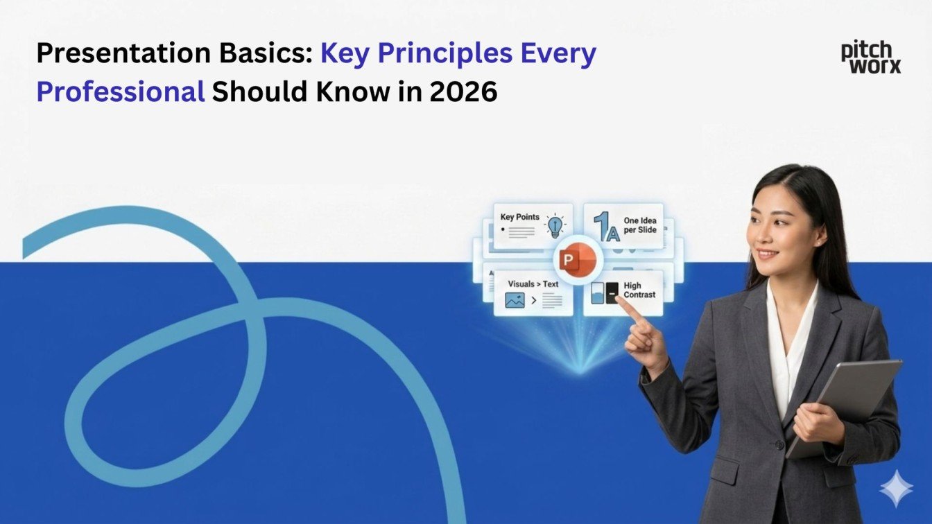
Step 1: Establish A Clear Visual Hierarchy
Your audience should never have to work to figure out what to look at first. Visual hierarchy tells the eye where to go — using size, weight, color, and placement to guide attention from the most important element to the least. A strong headline should dominate the slide. Supporting information should visually step back. If everything on your slide looks equally important, nothing is.
Step 2: Apply The One-Idea-Per-Slide Rule
This is the single most violated rule in professional presentations. Each slide should carry exactly one core idea. When you try to pack three or four points onto a single slide, you dilute impact and force your audience to split their attention. Spread your content across more slides — brevity per slide is a strength, not a weakness. Top ppt design agency professionals swear by this principle as the fastest way to improve any deck.
Step 3: Build A Consistent Brand System
Define your color palette (maximum 3 to 4 colors), typography set (no more than 2 typefaces), and logo placement rules — and then apply them without exception across every slide. Brand consistency does not just look professional; it builds trust. Audiences subconsciously associate visual consistency with organizational competence. This is a non-negotiable in any serious presentation design workflow.
Step 4: Use Whitespace Intentionally
Whitespace — the empty space around elements — is not wasted space. It is a design tool that creates breathing room, improves readability, and directs focus. Beginners tend to fill every corner of a slide with content. Experienced designers know that restraint is what makes a slide feel premium and authoritative. If your slides feel crowded, add whitespace before adding anything else.
Step 5: Turn Data InTo Visual Stories
Numbers alone do not move people — context does. When presenting data, choose the right chart type for your message (bar charts for comparisons, line charts for trends, pie charts for proportions). Then add a single headline above your chart that tells the audience the insight, not just the data. Instead of labeling a chart ‘2024 Revenue,’ write ‘Revenue Grew 47% After Product Relaunch.’ That is storytelling with data.
Step 6: Optimize for Readability At A Distance
Your slides will be viewed from across a conference room, on a webinar screen, or as a PDF attachment. Use body text no smaller than 20pt, ensure sufficient contrast between text and background (minimum 4.5:1 ratio for accessibility), and avoid decorative fonts for body copy. Test your slides by stepping back 10 feet from your monitor — if you struggle to read it, your audience will too.
Step 7: Design for Your Delivery Format
A live boardroom presentation needs different design thinking than a PDF deck sent by email. For live presentations, animation and minimal text work well because you are the voice providing context. For self-reading decks, slides need more copy and less reliance on a speaker. Always ask yourself: will this be presented or read? Then design accordingly. This distinction alone prevents one of the most common presentation design failures.
Real Experience: What Happened When Clients Applied These Principles
At PitchWorx, with over 13 years delivering presentation design services to clients across industries, we have seen firsthand what happens when these principles are consistently applied — and what happens when they are not.
“Before working with PitchWorx, our investor pitch had a 12% response rate from VCs we approached. After they redesigned our deck using structured visual hierarchy and cleaner data storytelling, that number jumped to 34% within the first quarter. We closed our Series A in 6 weeks.”
— Startup Founder, Dubai (Tech Sector)
“We had a global sales deck that our team was embarrassed to use. PitchWorx rebuilt it with a proper brand system and one-idea-per-slide structure. Our sales team reported that client meetings became noticeably more engaging — we could see prospects leaning in instead of checking their phones.”
— VP of Sales, US-Based SaaS Company
After-Redesign Performance: Client Growth Snapshot
Metric | Before Redesign | After Redesign | Growth |
Investor Meeting Conversion | 12% | 34% | +183% |
Audience Engagement Score | 3.2 / 5 | 4.6 / 5 | +44% |
Sales Deck Response Rate | 18% | 41% | +128% |
Average Deal Close Time | 47 days | 29 days | -38% |
Client-Reported Confidence | Low | High | Transformed |
The 2026 Presentation Hack: AI-Assisted Design with Human Craft
Here is the presentation design hack that forward-thinking professionals are using heading into 2026: the hybrid workflow.
AI tools can now generate slide structure, suggest visual layouts, write first-draft content, and even create custom imagery at speed. But here is what most people get wrong they stop there. AI-generated presentations are structurally sound but emotionally flat. They miss the nuance, strategic narrative, and brand precision that experienced human designers bring.
The 2026 hack is this: use AI to draft your content structure quickly, then bring in human expertise to refine the narrative arc, enforce brand consistency, and elevate the visual craft. This hybrid model cuts production time by 40% while maintaining the quality that purely AI-generated decks cannot deliver.
At PitchWorx, this is already baked into our workflow. We leverage AI for rapid ideation and structure, then apply over 13 years of design expertise to produce final decks that are unmistakably strategic, on-brand, and visually polished. No AI platform can replicate that combination yet.
PitchWorx Free PPT Slides: Start Strong Without Spending A Dime
Not every presentation requires a full custom design project and PitchWorx gets that. That is why we offer a library of free, professionally designed PowerPoint templates that any team can download and use immediately.
These free PPT slides from PitchWorx include:
- Investor pitch deck templates with proven story structures
- Corporate presentation layouts with clean visual hierarchy
- Sales and proposal deck templates optimized for client conversion
- Data-heavy slide templates with pre-built chart and infographic frames
- Fully editable formats in both PowerPoint and Google Slides
Every free template is built on the same principles covered in this guide visual hierarchy, brand consistency, whitespace, and one-idea-per-slide structure. They are a great starting point for teams that want to improve their presentations immediately, with the option to scale up to our full presentation design services when the stakes are higher.
Ready to Stop Losing Deals Because of Bad Slides?
PitchWorx is a globally trusted ppt design agency with 13+ years of experience transforming presentations for startups, corporates, and industry leaders worldwide. Whether you need a full custom deck, a redesign of your existing presentation, or a template library for your team — we deliver.
Visit pitchworx | Get a Free Consultation | Download Free PPT Templates
Frequently Asked Questions
Q1: What are the most important principles of presentation design?
The most critical principles are visual hierarchy, one-idea-per-slide structure, brand consistency, strategic use of whitespace, readable typography, data visualization, and designing for your delivery format. Master these seven and your presentations will stand out from 95% of what audiences see every day.
Q2: How do I know if my presentation design needs professional help?
If you are losing pitches despite strong content, if your team feels embarrassed sharing your decks, or if building presentations consistently takes too long and drains your time — those are strong signals. Professional presentation design services like PitchWorx pay for themselves quickly when the output influences client decisions, investor commitments, or sales conversions.
Q3: How many slides should a professional presentation have?
There is no universal rule — but a strong benchmark is one slide per minute of speaking time. A 15-minute presentation should have roughly 12 to 18 slides. The bigger question is not how many slides but whether each slide earns its place. A 10-slide deck with laser-sharp focus will outperform a 40-slide deck every time.
Q4: What makes a PPT design agency different from using a template online?
Templates give you a starting frame — they are not strategy. A professional ppt design agency like PitchWorx brings strategic narrative thinking, custom visual design, brand precision, and industry-specific experience to your deck. We do not just make it look good; we make it persuade. That is a fundamentally different outcome from downloading a template and filling in the blanks.
Q5: Are PitchWorx free PPT templates really free?
Yes, completely. PitchWorx offers a growing library of professionally designed PowerPoint templates at no cost. They are built to the same design standards we apply in our paid projects — proper layout grids, clean typography, strong visual hierarchy. Visit pitchworx.com to access the full template library.
Q6: How long does it take to get a custom presentation designed by PitchWorx?
Turnaround time depends on scope. A standard corporate deck of 20 to 30 slides typically takes 3 to 5 business days. Urgent projects can be delivered faster through our priority service. We work with clients globally and accommodate time zones across the US, UK, UAE, and beyond.
Q7: What is the biggest presentation design mistake to avoid in 2026?
The biggest mistake is using AI tools to generate your entire deck without human creative oversight. AI-generated presentations are visually generic and narratively hollow — audiences increasingly recognize them on sight. The 2026 advantage belongs to those who combine AI efficiency with human strategic design craft. That is exactly the model PitchWorx uses to stay ahead of the curve for our clients.