Published: 27 february 2026 | Reading Time: 16 minutes | Author: PitchWorx Strategy Team
Quick Answer
The best PowerPoint slide size for most presentations in the USA is Widescreen (16:9) because it matches modern laptops, TVs, Zoom screens, and most new projectors. Use Standard (4:3) only when you’re presenting on older projectors or when you need a more “document-like” layout for heavy text. If you’re unsure about the venue setup, design in 16:9 and keep safe margins so nothing gets cut off. PowerPoint lets you switch between sizes anytime, but changing after designing can crop images—so choose the format first.
Table of Contents
- Quick Answer
- Introduction
- Why Slide Size Matters More Than People Think
- The 3 Most Common Slide Sizes (and When to Use Them)
- What Slide Size Is Best for Different Business Presentation Types?
- The Most Practical Slide Size Rule (Use This Every Time)
- How to Set Slide Size in PowerPoint (Without Messing Up Your Design)
- Real Designer Experience: Anita from PitchWorx
- Research-Backed Reason Visuals Matter
- Case Study (USA-Style, Realistic Example)
- Best Slide Size for Print vs Screen (Important USA Business Detail)
- Common Mistakes That Kill Professionalism (and How to Avoid Them)
- The Best Format Recommendation for Most USA Audiences (Simple)
- When You Should Hire Help (and What You Get)
- Conclusion
- Quick FAQs
Introduction
Choosing slide size sounds small, but it changes how your message is seen, how clean your layouts feel, and even how professional your brand looks on screen. In the USA market, where a lot of presentations happen on widescreens (conference rooms, webinars, and investor Zoom calls), slide size directly affects clarity, confidence, and conversions.
If you’re building a sales deck, training deck, pitch deck, or corporate update, this guide will help you choose the right slide size—and avoid the most common mistakes that make slides look “cropped,” stretched, or awkward.
Why Slide Size Matters More Than People Think
Slide size controls:
- How much space you have for visuals and text
- How your slides display on screens, projectors, and video calls
- How your charts and images scale
- Whether content gets cut off (especially on unknown screens)
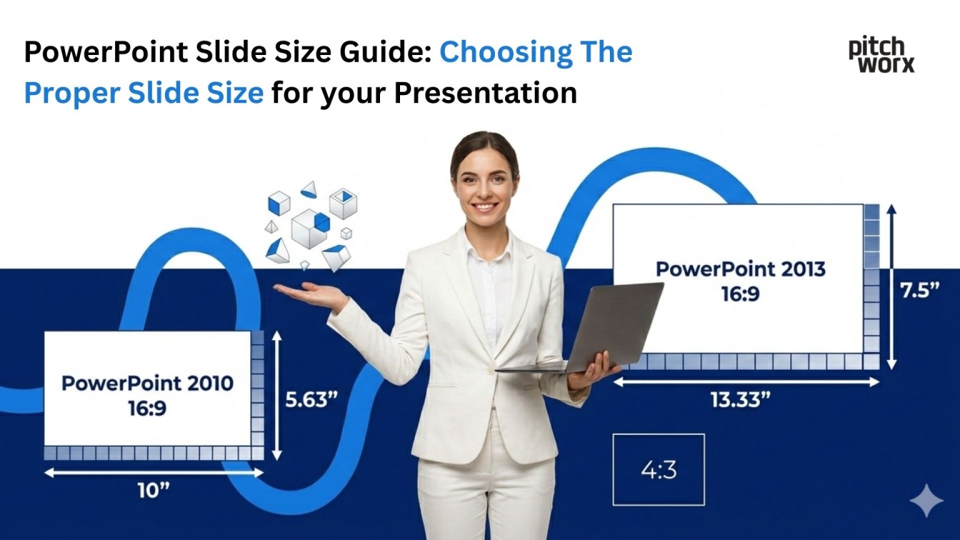
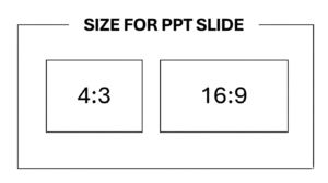
PowerPoint itself highlights two core options—Standard (4:3) and Widescreen (16:9)—and that’s where most decisions start.
The 3 Most Common Slide Sizes (and When to Use Them)
1) Widescreen (16:9) — the USA Default for Modern Business
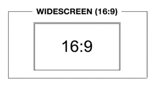
Best for: Zoom/Meet, laptops, LED screens, modern meeting rooms, webinars, YouTube-style presentations. This is the most common format today. It matches modern displays and gives more horizontal space—great for timelines, comparisons, dashboards, and visual storytelling. PowerPoint prominently supports Widescreen (16:9) in slide size settings.
When 16:9 wins:
- You’re presenting on a TV/monitor
- You’re running webinars or online demos
- You want a modern, cinematic layout
- You’re using lots of images, charts, and clean white space
What to watch out for:
- If the venue uses older projectors, 16:9 may show black bars or cropped edges
- If you convert a deck later from 4:3 to 16:9, images can get weirdly stretched or require recropping
- If you want safe results on unknown screens, design 16:9 and keep “safe margins” (don’t push text all the way to the edges).
This is exactly where a Presentation Design Agency can make a big difference—we design with safe zones, adaptive layouts, and consistent spacing so your deck stays clean on any screen.
2) Standard (4:3) — the Classic Format for Old Projectors
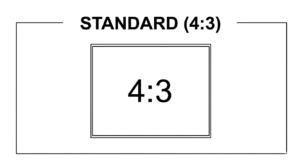
Best for: older conference rooms, legacy decks, classroom projectors, print-like layouts. Standard (4:3) is still useful when hardware is old or you’re working with a legacy template that a company refuses to change. PowerPoint supports Standard (4:3) as a core option.
When 4:3 wins:
- You know the projector is 4:3
- You’re using a legacy corporate template
- Your slides are text-heavy and structured like a document
What to watch out for:
- Looks dated on modern widescreens
- Less horizontal space for visuals
- Can feel cramped for modern “minimal” design styles
A smart approach: if you must use 4:3, increase font sizes and simplify layouts so it still feels premium.
3) 16:10 — the “In-Between” for Certain Laptops
Some laptops and older widescreens use 16:10. You’ll see this more in certain professional monitors. If your company or client uses a lot of 16:10 screens, custom sizing can help—but most teams still choose 16:9 because it’s broadly compatible.
What Slide Size Is Best for Different Business Presentation Types?
Sales Presentations (Most Effective for Business)
If your goal is to close deals, sales presentations are usually the most effective business topic because they directly impact revenue—especially in the USA where decision-makers expect crisp visuals, fast clarity, and confident storytelling.
For sales decks, 16:9 is the strongest choice because:
- It looks modern on large screens
- It supports side-by-side comparisons (problem vs solution, before vs after)
- It handles product screenshots and dashboards beautifully
This is why many teams partner with a Presentation Design Agency when sales decks are high-stakes—because the format, spacing, and visual hierarchy need to be perfect.
Pitch Decks (Startups + Funding)
Pitch decks are often presented on Zoom to investors, accelerators, and partners—so 16:9 is again the safest choice. If you’re working with a pitch deck design agency, they’ll almost always build in 16:9 unless your investor explicitly requests a printed handout version.
Training and Internal Ops Decks
Training decks can be either: 16:9 if training is on-screen (webinars, onboarding calls) or 4:3 if it’s classroom + old projectors.
Conference Speaking (Unknown Screens)
If you don’t know the screen setup, your best move is:
- Use 16:9
- Keep safe margins
- Avoid tiny text near edges
- Test on your laptop + another external screen
Projectors in business settings often need to handle multiple aspect ratios (including 4:3 and 16:9), so adaptability matters.
The Most Practical Slide Size Rule (Use This Every Time)
Ask one question: Where will this be viewed most of the time?
- Mostly screens/web calls → 16:9
- Mostly old projectors → 4:3
- Mixed/unknown → 16:9 + safe margins
How To Set Slide Size in PowerPoint Without Messing Up Your Design
PowerPoint makes it simple: Design tab → Slide Size → choose Widescreen (16:9) or Standard (4:3).
When you switch sizes, PowerPoint may ask:
- Maximize (fills the space; can crop content)
- Ensure Fit (shrinks content; may leave extra spacing)
For business decks, “Ensure Fit” is usually safer, then you manually adjust key slides.
Real Designer Experience: Anita from PitchWorx What She Does in Real Client Work
Anita (PitchWorx’s one of the best designer) has a simple rule in client calls:
“If the deck will be presented on Zoom or a modern conference room screen, we lock 16:9 first, then design the grid and spacing. If we choose the size later, the deck always takes longer because images need recropping.”
She also suggests a quick workflow:
- Confirm where it’s presented (Zoom, boardroom, projector)
- Lock slide size
- Choose typography scale (title/body sizes)
- Build a repeatable layout system
If you want to follow her work style, you can check Anita’s LinkedIn account by searching: “Anita PitchWorx LinkedIn” and reviewing her design posts and portfolio highlights there. This kind of process is why teams hire a Presentation Design Agency instead of trying to “fix the deck later.”
Research-Backed Reason Visuals Matter & Why Size Supports Visuals
Even when the topic is complex, visuals can improve understanding—research on learning and explanation shows visual approaches can support comprehension and integration of concepts.
Slide size doesn’t create value by itself—but it creates the space where visuals can do their job:
- Clear charts
- Readable labels
- Simple layouts
- Comfortable spacing
If your layout feels cramped, your visuals lose impact.
Case Study (USA-Style, Realistic Example), How Slide Size Improved Results
A U.S.-based B2B SaaS team was presenting a sales deck weekly on Zoom and in modern conference rooms. Their old deck was built in 4:3 and looked boxed-in on widescreens. They updated to a 16:9 deck with cleaner spacing, larger charts, and stronger “one idea per slide” layouts.
What changed:
- Product screenshots became larger and easier to understand
- Comparison slides fit better side-by-side
- The deck looked more “enterprise-ready” on big screens
Outcome: They reported smoother demos and fewer “can you zoom in?” interruptions—plus better engagement during pricing and ROI sections. This is exactly the type of change a Presentation Design Agency handles quickly: format correction, grid rebuild, visual hierarchy, and brand consistency—without breaking the content.
Best Slide Size for Print vs Screen (Important USA Business Detail)
Many USA businesses want both: On-screen deck for meetings and Printable handout for stakeholders. Instead of forcing one format to do both, use this approach:
- Design in 16:9 for presenting
- Export a handout version as PDF with smart margins
- Or create a separate “handout deck” layout if it’s high-stakes
Trying to make one deck perfect for both is where most teams waste time.
Common Mistakes That Kill Professionalism (and How to Avoid Them)
Mistake 1: Choosing size after designing
Always choose slide size first. PowerPoint allows resizing, but it can distort layouts.
Mistake 2: Tiny text to “fit more”
If you’re shrinking text to fit content, the problem isn’t text size—it’s slide design strategy.
Mistake 3: Using random templates with mixed sizes
Some teams copy slides from different decks and end up with inconsistent look and spacing. Fix it by standardizing layout and grid.
Mistake 4: Ignoring screen safe areas
Keep content away from edges. Some projectors crop a bit or add borders.
The Best Format Recommendation for Most USA Audiences (Simple)
If you want one clear default:
- Use 16:9 for 90% of business presentations in the USA.
- Use 4:3 only when you have a clear reason.
When You Should Hire Help (and What You Get)
If your deck impacts sales, funding, executive decisions, or partner deals then professional design isn’t “decoration.” It’s business leverage.
A strong Presentation Design Agency will:
- Choose the right format
- Fix layout systems and master slides
- Optimize typography scale for readability
- Build premium charts and visuals
- Ensure the deck looks perfect on-screen and in PDF
If you need fast, high-impact outcomes, PitchWorx offers ppt design services and also supports powerpoint design services for sales decks, reports, and leadership presentations—especially for USA-focused audiences. We also collaborate with founders who need investor-ready decks similar to what a pitch deck design agency delivers, but with brand-first storytelling.
Conclusion
Slide size is not just a technical setting—it’s the foundation of readability, layout clarity, and modern visual storytelling. Choose the right format first, design with safe margins, and make visuals the hero. If your presentation is business-critical, a Leading Leading Presentation Design Agency can turn the same content into a cleaner, more confident deck that performs better on real screens.
Quick FAQs
1) What’s the best PowerPoint slide size for Zoom presentations?
Widescreen 16:9 is best because it matches most modern displays and video call layouts.
2) Should I use 4:3 for conferences?
Only if the venue uses older projectors. If unsure, use 16:9 with safe margins.
3) Can I change slide size after designing?
Yes, but resizing can cause cropping or scaling issues, so it’s better to lock size first.