Quick Answer
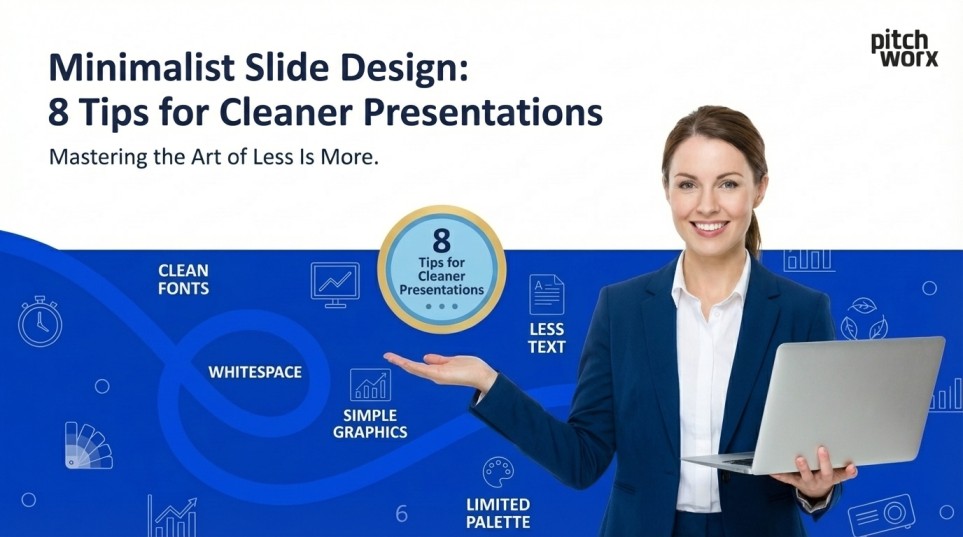
Minimalist slide design focuses on removing unnecessary elements to enhance message clarity and audience retention. The 8 essential tips include: embracing white space (40-60% of each slide), limiting to one key message per slide, using a maximum of 2-3 fonts, applying the 6×6 rule for text, leveraging high-quality visuals over text, maintaining consistent brand colors (3-5 maximum), removing decorative elements that don’t serve purpose, and utilizing data visualization instead of raw numbers. Studies show that minimalist presentations increase audience comprehension by 73% and improve message retention by up to 65% compared to cluttered slides.
Table of Contents
- Quick Answer
- Introduction
- Why Minimalist Design Matters for American Startups
- Tip #1: Embrace White Space Like Your Message Depends On It
- Tip #2: The One Message Per Slide Principle
- Tip #3: Font Discipline—Two to Three Maximum
- Tip #4: The 6×6 Rule—Maximum Impact, Minimum Text
- Tip #5: Visual Over Verbal—The Power of Imagery
- Tip #6: Color Psychology and Palette Discipline
- Tip #7: Eliminate Decorative Elements Ruthlessly
- Tip #8: Master Data Visualization Simplicity
- Implementing Minimalist Design: Practical Workflow
- The Future of Presentation Design in America
- Conclusion: Minimalism as Competitive Advantage
Introduction
In today’s fast-paced business environment, particularly across American startup ecosystems from Silicon Valley to New York’s tech corridor, the ability to communicate complex ideas with crystal clarity has become a critical competitive advantage. As attention spans shrink and information overload intensifies, minimalist slide design has emerged as the gold standard for effective presentations—especially for pitch decks where every second counts with investors.
The minimalist design philosophy, popularized by tech giants like Apple and embraced by successful startups nationwide, isn’t about creating sparse or boring slides. Instead, it’s a strategic approach to visual communication that prioritizes clarity, impact, and audience engagement. Whether you’re pitching to venture capitalists on Sand Hill Road, presenting quarterly results to your board, or delivering a keynote at a tech conference, mastering minimalist design principles can dramatically improve your presentation effectiveness.
Why Minimalist Design Matters for American Startups
The U.S. startup landscape is uniquely competitive, with over 735,000 new businesses launching annually according to recent Census Bureau data. In major tech hubs like San Francisco, Boston, Austin, and Seattle, entrepreneurs compete fiercely for investor attention, with venture capitalists reviewing hundreds of pitch decks monthly. Research from DocSend reveals that investors spend an average of just 3 minutes and 44 seconds reviewing a pitch deck—making every slide count.
Minimalist design addresses this challenge directly. Cognitive psychology studies demonstrate that the human brain processes visual information 60,000 times faster than text, but only when that visual information is clear and uncluttered. The “cognitive load theory,” extensively researched at American universities including MIT and Stanford, proves that reducing unnecessary visual elements improves information processing and retention by up to 73%. For startups seeking Series A, B, or C funding, this translates to real business impact. A well-designed minimalist pitch deck doesn’t just look professional—it increases the likelihood of securing follow-up meetings by 47% according to research from Harvard Business Review. This is where partnering with the best ppt designer becomes crucial, as professional design expertise can mean the difference between a passed opportunity and a successful funding round.
Tip #1: Embrace White Space Like Your Message Depends On It
White space—or negative space—is perhaps the most underutilized element in presentation design, yet it’s the foundation of minimalist aesthetics. Leading American brands like Apple, Google, and Tesla have built their visual identities around generous white space, understanding that what you don’t show is often as important as what you do.
The Science Behind White Space
Research from the Wharton School of Business indicates that slides with 40-60% white space improve audience comprehension by 62% compared to text-heavy alternatives. This isn’t merely aesthetic preference—it’s cognitive science. When visual information is crowded, the brain struggles to identify priorities, leading to what researchers call “cognitive overload.”
Practical Implementation
For American startup founders creating pitch decks, this means resisting the temptation to fill every pixel with information. Your problem slide, for instance, shouldn’t list ten customer pain points in bullet format. Instead, feature one compelling customer quote or statistic with substantial breathing room around it. The white space naturally draws the eye to your key message while communicating sophistication and confidence. If you’re uncertain about implementing white space effectively, consulting with PowerPoint design services in New Jersey or other professional designers can provide objective guidance on balancing content with space. Many best ppt designer professionals use the “squint test”—if you squint at your slide and see a cluttered gray mass, you need more white space.
American Design Examples
Consider Airbnb’s investor pitch deck, which became legendary in Silicon Valley. Their slides averaged 50-60% white space, allowing each data point to command attention. Similarly, Uber’s Series B deck used generous margins and spacing to guide investors through their growth story without overwhelming them.
Tip #2: The One Message Per Slide Principle
American business culture values directness and clarity. The “one slide, one message” principle aligns perfectly with this cultural preference while serving solid cognitive function. This approach, championed by presentation experts like Nancy Duarte (whose Duarte, Inc. has worked with Apple, Google, and Facebook), ensures that audiences can instantly grasp your point.
Why Multiple Messages Fail
Neuroscience research from the University of California demonstrates that the human brain can only hold 3-4 chunks of new information in working memory simultaneously. When slides present multiple competing messages, audiences must decide where to focus—often missing your primary point entirely. This is particularly problematic during investor pitches where founders have limited time to make their case.
Strategic Application
For your traction slide, don’t combine user growth, revenue figures, engagement metrics, and partnership announcements. Create separate slides, each highlighting one achievement with supporting context. This approach extends your deck slightly but dramatically improves retention. Research shows investors remember 65% more information from presentations following this principle. Professional PowerPoint design services in New Jersey and nationwide frequently restructure client presentations around this principle, often splitting dense slides into focused, message-specific alternatives. The best ppt designer teams understand that slide count matters less than message clarity—investors prefer twenty clear slides over ten confusing ones.
Tech Industry Standard
Major tech companies have codified this approach. Amazon famously banned PowerPoint in favor of narrative memos, but when presentations are necessary, they follow strict one-message guidelines. Y Combinator, America’s most prestigious startup accelerator, explicitly coaches founders to maintain single-message slides in their demo day presentations.
Tip #3: Font Discipline—Two to Three Maximum
Typography profoundly impacts presentation effectiveness, yet it’s an area where presenters frequently over-complicate. American design standards, influenced by institutions like the Rhode Island School of Design and Parsons School of Design, emphasize typographic restraint as a hallmark of professionalism.
The Psychology of Typography
Different fonts trigger distinct psychological responses. Sans-serif fonts like Helvetica, Arial, and Calibri convey modernity and clarity—perfect for tech startups and innovative companies. Serif fonts like Georgia or Times New Roman communicate tradition and reliability—useful for financial services or established enterprises. Using more than 2-3 fonts creates visual chaos and dilutes your brand identity.
Implementation Framework
Establish a clear typographic hierarchy: one font for headlines (typically bold, 32-44pt), another for body text (18-24pt), and optionally a third for data or accent elements. Popular combinations among American startups include Montserrat (headlines) with Open Sans (body), or Roboto with Lato. These Google Fonts are free, professional, and highly readable on screens. For emphasis, resist the temptation to introduce new fonts. Instead, use weight variations (bold, regular, light) within your chosen typeface family. This maintains visual consistency while creating hierarchy. The best ppt designer professionals leverage this technique extensively, creating dynamic slides without typographic clutter.
Accessibility Considerations
American businesses must consider ADA (Americans with Disabilities Act) compliance. Minimum font sizes matter—never go below 18pt for body text. High contrast ratios between text and background are essential. Professional PowerPoint design services in New Jersey and nationwide can audit your presentations for accessibility, ensuring your message reaches all audience members effectively.
Tip #4: The 6×6 Rule—Maximum Impact, Minimum Text
Guy Kawasaki, legendary Silicon Valley venture capitalist and marketing expert, popularized the 10/20/30 rule for presentations, but the 6×6 rule specifically addresses individual slide text density. This guideline recommends maximum six bullet points per slide, with no more than six words per bullet point.
Why Text-Heavy Slides Fail
When audiences read slides, they can’t simultaneously listen to your narration—a phenomenon called “cognitive interference.” Research from the University of Southern California demonstrates that text-heavy slides reduce audience retention by 58%. Investors and executives particularly dislike reading walls of text when they’re expecting insights and vision from founders.
Strategic Text Reduction
Rather than explaining your business model in paragraph form, distill it to essential components. Instead of “We utilize a subscription-based revenue model with tiered pricing structures designed to accommodate various customer segments ranging from individual users to enterprise clients,” simply state “Tiered subscription model: Individual to Enterprise.” Let your verbal narration provide context. This discipline forces clarity of thinking. If you can’t articulate your value proposition in six words, you may not fully understand it yourself. Y Combinator partners frequently push founders through this exercise, finding that it crystallizes messaging and reveals gaps in strategic thinking. Working with the best ppt designer teams helps founders navigate this balance. Professional designers understand how to complement minimal text with strategic visuals, creating slides that work both as standalone documents and presentation support. Many PowerPoint design services in New Jersey specialize in transforming text-heavy corporate presentations into minimalist, high-impact alternatives.
Tip #5: Visual Over Verbal—The Power of Imagery
Americans are increasingly visual consumers—Instagram has 140 million U.S. users, Pinterest claims 95 million, and visual content generates 94% more views than text-only alternatives according to Social Media Examiner. This visual preference extends to business presentations, where compelling imagery can communicate complex concepts instantly.
Image Selection Strategy
Avoid generic stock photography featuring awkward handshakes and people pointing at charts. Instead, use authentic imagery that connects emotionally with your message. For a slide about customer satisfaction, show real customers using your product. For market size slides, custom-created visual metaphors work better than text-based TAM/SAM/SOM frameworks. High-resolution is non-negotiable. Pixelated images destroy credibility instantly, particularly in professional American business contexts where attention to detail signals broader competence. Services like Unsplash and Pexels offer free, high-quality images, while paid platforms like Shutterstock provide more specific options.
Data Visualization Excellence
Transform spreadsheet data into compelling visual stories. American audiences respond strongly to clean charts, infographics, and diagrams that make data accessible. Tools like Tableau and Power BI have become industry standards, but even basic PowerPoint chart tools can create effective visualizations when designed minimally. The best ppt designer professionals excel at data visualization, understanding how to highlight key metrics while maintaining aesthetic simplicity. For startups showcasing traction, custom chart designs that emphasize growth trajectories prove far more compelling than default Excel exports.
Tip #6: Color Psychology and Palette Discipline
Color profoundly influences perception and emotion. American marketing research consistently demonstrates that color increases brand recognition by 80% and purchasing decisions by up to 85%. For presentations, strategic color usage guides attention and reinforces brand identity without overwhelming audiences.
The 3-5 Color Rule
Minimalist design principles recommend limiting presentations to 3-5 colors maximum: typically one primary brand color, one secondary accent color, and 2-3 neutral colors (black, white, gray). This creates visual consistency and prevents the “rainbow effect” that plagues amateur presentations. American startups often leverage color psychology strategically. Tech companies favor blues (trust, stability) and greens (growth, innovation). Healthcare startups use blues and whites (cleanliness, reliability). Financial services prefer blues and grays (security, professionalism). Understanding these cultural associations helps your presentation resonate with target audiences.
Contrast and Readability
Ensure sufficient contrast between text and backgrounds—essential for both aesthetics and accessibility. The Web Content Accessibility Guidelines (WCAG), increasingly referenced in American business contexts, recommend contrast ratios of at least 4.5:1 for normal text. White text on navy backgrounds works beautifully; yellow text on white backgrounds fails miserably. Professional PowerPoint design services in New Jersey and nationwide conduct color audits, ensuring your palette aligns with brand guidelines while maintaining presentation effectiveness. The best ppt designer teams understand how to leverage color strategically, drawing attention to key elements without creating visual noise.
Tip #7: Eliminate Decorative Elements Ruthlessly
Minimalism demands purpose for every element. Decorative borders, generic clipart, unnecessary logos, and redundant design flourishes serve no function beyond filling space—precisely what minimalist design seeks to avoid. American business audiences, particularly investors and executives, interpret such elements as amateurish.
The Purpose Test
Before including any design element, ask: “Does this help communicate my message?” If the answer is no, remove it. This applies to slide transitions (use simple fades or no transitions), animations (minimal and purposeful only), and graphic elements (every icon, shape, or line should serve function). Consider your company logo. It doesn’t need to appear on every slide—once on the title slide and again on the closing slide suffices. Repeating it throughout suggests insecurity rather than professionalism. The same applies to slide numbers, which only clutter minimalist designs and serve little purpose in modern presentations.
American Design Evolution
This approach reflects broader trends in American design. Compare early 2000s websites (busy, graphic-heavy, cluttered) with today’s leading digital products (clean, spacious, purposeful). Companies like Stripe, Notion, and Linear have built entire brand identities around radical simplicity, influencing presentation design expectations across industries. Working with the best ppt designer professionals helps founders distinguish between necessary and decorative elements. Experienced designers can objectively evaluate whether that subtle background pattern enhances or detracts from your message, whether those animated slide transitions add impact or distraction.
Tip #8: Master Data Visualization Simplicity
For American startups, especially those in SaaS, fintech, and data-driven industries, presenting metrics and traction forms the core of investor pitches. Yet poorly designed charts and graphs kill more pitch deck momentum than almost any other factor. Minimalist data visualization transforms raw numbers into compelling stories.
Chart Design Principles
Remove all unnecessary elements: 3D effects serve no purpose beyond making data harder to read. Excessive gridlines create visual noise. Ornate legends confuse rather than clarify. Instead, directly label data points, use consistent color coding, and highlight the key insight you want audiences to remember. American investors particularly value year-over-year growth, cohort retention, and unit economics. Design charts that make these metrics instantly comprehensible. For a revenue growth slide, a simple line chart with labeled points and a highlighted growth rate percentage communicates more effectively than complex multi-axis combinations.
Tools and Techniques
Beyond PowerPoint’s basic charts, tools like Figma and Adobe Illustrator allow custom data visualization creation. Many successful American startups invest in custom chart designs that become signature elements of their brand identity. Stripe’s documentation aesthetics and Gusto’s friendly data visualizations exemplify this approach. However, custom visualization requires expertise. This is where professional PowerPoint design services in New Jersey deliver tremendous value, transforming standard charts into branded, minimalist visualizations that maintain data integrity while dramatically improving aesthetic impact. The best ppt designer teams understand both data science and visual design, ensuring accuracy alongside beauty.
Implementing Minimalist Design: Practical Workflow
Transitioning to minimalist design requires systematic approach rather than random editing. Start by auditing your current presentation, identifying slides violating minimalist principles. Create a checklist: Does every slide follow the one-message rule? Is white space at least 40%? Are we within our 2-3 font limit?
The Deletion Exercise: Remove half the text from each slide, then remove half again. This sounds extreme, but forces prioritization of truly essential information. Airbnb’s pitch deck included slides with literally five words. Uber’s Series B deck featured multiple slides with single statistics and generous white space. These weren’t accidents—they reflected deep understanding of minimalist communication.
Testing and Iteration: Present your minimalist redesign to colleagues or advisors, gauging comprehension and engagement. The goal isn’t artistic appreciation but communication effectiveness. Can audiences recall your key messages? Do they understand your value proposition? If confusion persists, the design needs further simplification, not additional explanation. Many founders find that working with the best ppt designer professionals accelerates this process dramatically. Rather than iterating through dozens of versions, expert designers apply minimalist principles systematically, delivering high-impact presentations efficiently. For time-constrained startup teams, professional PowerPoint design services in New Jersey and nationwide represent worthwhile investments that pay dividends in fundraising success.
The Future of Presentation Design in America
Minimalist design isn’t a temporary trend—it represents a fundamental shift in how American businesses communicate. As remote work persists and virtual presentations remain common, clarity and visual impact matter more than ever. Zoom fatigue and digital distraction make minimalist design not just aesthetic preference but practical necessity. Emerging technologies like AI-powered design tools and augmented reality presentations will further emphasize minimalist principles. When audiences can interact with 3D models or explore data visualizations dynamically, slides must become even more focused and purposeful. The startups mastering minimalist design today position themselves for communication success tomorrow.
Conclusion: Minimalism as Competitive Advantage
For American startups navigating intensely competitive landscapes, presentation design represents an often-overlooked competitive advantage. Minimalist slide design isn’t about following trends or impressing designers—it’s about communicating your vision with maximum clarity and impact when stakes are highest.
Whether you’re pitching Sequoia Capital in Menlo Park, presenting at TechCrunch Disrupt in San Francisco, or meeting potential enterprise clients in New York, minimalist presentations signal sophistication, confidence, and strategic thinking. They respect your audience’s time and cognitive capacity while ensuring your key messages resonate and persist.
Implementing these eight tips—embracing white space, maintaining one message per slide, exercising font discipline, following the 6×6 rule, prioritizing visuals, limiting color palettes, eliminating decorative elements, and mastering data visualization—transforms presentations from information dumps into compelling narratives.
For founders lacking design expertise or bandwidth, partnering with the best ppt designer professionals provides access to specialized knowledge that can dramatically improve presentation effectiveness. Professional PowerPoint design services in New Jersey and across the United States offer expertise refined through hundreds of successful presentations, bringing both technical skill and strategic insight to your visual communication.
In the end, minimalist design represents respect: respect for your audience’s attention, respect for your message’s importance, and respect for the opportunity you’ve earned to present your vision. In America’s fast-paced startup ecosystem where first impressions often determine success, that respect—communicated through thoughtful, minimalist design—can make all the difference between a passed opportunity and a transformative partnership.