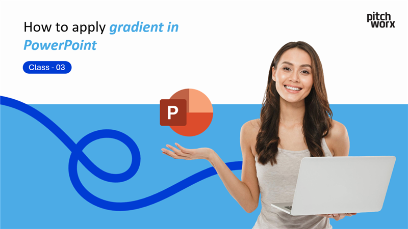
How to Apply Gradient Background in PowerPoint – Complete Guide | PowerPoint Mastery 2025 Class 3
Posted on Jun 09, 2025
Written by PitchWorx
Read Time 14 min read
Transform your presentations with stunning gradient backgrounds that captivate audiences and elevate your professional image.
Table of Contents
Introduction
Why Gradient Backgrounds Matter
Video Tutorial
Step-by-Step Gradient Tutorial
Advanced Gradient Techniques
Design Best Practices
Common Gradient Scenarios
Troubleshooting Guide
Professional Tips
Next Steps
Frequently Asked...
No posts found
How to Apply Gradient Background in PowerPoint – Complete Guide | PowerPoint Mastery 2025 Class 3
Posted on Jun 09, 2025
Written by PitchWorx
Read Time 14 min read
No posts found
Transform your presentations with stunning gradient backgrounds that captivate audiences and elevate your professional image.
Gradient backgrounds are the secret weapon of professional presentation designers. These subtle color transitions add depth, sophistication, and visual interest to your slides without overwhelming your content. Whether you’re creating business presentations, educational materials, or marketing decks, mastering gradient techniques will instantly elevate your design game.
In this comprehensive guide from our PowerPoint Mastery 2025 series, you’ll discover how to create stunning gradient backgrounds that make your presentations stand out while maintaining professional credibility and visual appeal.
Why Gradient Backgrounds Matter in Modern Presentations
Gradient backgrounds have become a cornerstone of contemporary presentation design, and understanding their impact can transform your visual communication strategy:
Visual Enhancement Benefits
Adds depth and dimension to flat slide designs
Creates subtle visual interest without distraction
Enhances text readability with proper contrast
Modernizes outdated presentation templates
Professional Advantages
Demonstrates design sophistication and attention to detail
Aligns with current design trends in business communication
Increases audience engagement through appealing visuals
Builds brand recognition with consistent color schemes
Psychological Impact
Guides viewer attention naturally across the slide
Creates emotional connection through color psychology
Establishes presentation hierarchy with visual flow
Enhances message retention through memorable design
🎥 Watch the Complete Tutorial
Watch our step-by-step video tutorial to see these gradient techniques in action
Step-by-Step Gradient Background Tutorial
Method 1: Basic Gradient Application
Step 1: Access Background Settings
Right-click anywhere on your slide where there’s empty space (not on text or objects). From the context menu that appears, select “Format Background”.
Step 2: Open Gradient Options
In the sidebar panel that opens on the right side of your screen, locate and click on “Gradient Fill”. This activates the gradient customization options.
Step 3: Choose Your Colors
Click on the color dropdown menu to select your gradient colors:
Start with preset colors for quick results
Use custom colors for brand-specific designs
Select complementary colors for professional appearance
Step 4: Adjust Gradient Direction
Use the Direction dropdown to control gradient flow:
Linear gradients: Top to bottom, left to right, diagonal
Radial gradients: Center outward, corner outward
Path gradients: Follow shape contours
Step 5: Fine-Tune Transparency
Adjust the Transparency slider to control gradient opacity:
0% transparency: Full color intensity
50% transparency: Balanced blend with background
80% transparency: Subtle color wash effect
Step 6: Apply Across Presentation
Click “Apply to All” to use your gradient background across all slides in your presentation for consistency.
Method 2: Preset Gradient Selection
For quick professional results:
Right-click on slide and select “Format Background”
Choose “Gradient Fill” from the options
Click “Preset gradients” dropdown menu
Select from professional options like:
Light Gradient – Accent 1
Medium Gradient – Accent 2
Dark Gradient – Accent 3
Apply to current slide or all slides
Method 3: Advanced Custom Gradients
Creating Multi-Color Gradients:
Access Format Background → Gradient Fill
Click “Gradient stops” to add color points
Add up to 10 color stops for complex transitions
Position each stop precisely on the gradient bar
Adjust transparency for each color point individually
Gradient Stop Management:
Add stops: Click on gradient bar
Remove stops: Select and press Delete
Move stops: Drag along the gradient bar
Color stops: Double-click to change colors
Advanced Gradient Techniques
Creating Professional Color Schemes
Monochromatic Gradients:
Use different shades of the same color for sophisticated, cohesive designs:
Light to dark blue: Perfect for corporate presentations
Warm gray transitions: Ideal for minimalist designs
Brand color variations: Maintains brand consistency
Complementary Color Gradients:
Combine opposite colors on the color wheel for dynamic effects:
Blue to orange: Creates vibrant, energetic feel
Purple to yellow: Generates creative, innovative atmosphere
Green to red: Produces natural, organic impression
Analogous Color Gradients:
Use adjacent colors for harmonious, pleasing transitions:
Blue to green: Evokes calm, trustworthy feelings
Orange to red: Creates warm, energetic atmosphere
Purple to blue: Suggests creativity and professionalism
Gradient Direction Psychology
Top-to-Bottom Gradients:
Lighter top, darker bottom: Creates stability and grounding
Darker top, lighter bottom: Suggests growth and aspiration
Best for: Title slides, conclusion slides
Left-to-Right Gradients:
Light to dark: Implies progress and movement
Dark to light: Suggests revelation and clarity
Best for: Process slides, timeline presentations
Radial Gradients:
Center light, edges dark: Creates focus and attention
Center dark, edges light: Suggests expansion and growth
Best for: Highlighting key concepts, call-to-action slides
Use fewer gradient stops: Reduce complexity for smoother transitions
Adjust color differences: Smaller color jumps create smoother gradients
Problem: Text Becomes Unreadable
Causes:
Insufficient contrast between text and gradient
Gradient colors too similar to text color
Overly complex gradient patterns
Solutions:
Increase contrast: Use darker text on light gradients
Add text effects: Drop shadows, outlines, or backgrounds
Simplify gradient: Reduce color variation for better readability
Test accessibility: Use contrast checking tools
Problem: Gradient Doesn’t Print Correctly
Causes:
Printer color limitations
Gradient complexity exceeding print capabilities
Color profile mismatches
Solutions:
Simplify gradients: Use fewer colors and stops
Test print preview: Check appearance before printing
Adjust printer settings: Use highest quality print mode
Convert to images: Rasterize complex gradients for printing
Problem: Gradient Appears Different on Various Devices
Causes:
Monitor calibration differences
Color profile variations
Display technology limitations
Solutions:
Use standard color profiles: sRGB for general compatibility
Test on multiple devices: Verify appearance across platforms
Provide viewing guidelines: Specify optimal display settings
Create device-specific versions: Customize for known display types
Professional Tips from PitchWorx Experts
Brand Consistency Strategies
Template Development:
Create gradient templates for different presentation types
Document color codes for brand consistency
Establish gradient guidelines for team use
Regular brand audits: Ensure ongoing compliance
Team Training:
Gradient best practices education
Brand guideline adherence protocols
Quality control processes for presentation review
Feedback mechanisms for continuous improvement
Efficiency Techniques
Template Reuse:
Save custom gradients as presentation templates
Create gradient libraries for quick access
Standardize directions for visual consistency
Document settings for future reference
Batch Application:
Apply to all slides for presentation consistency
Use slide masters for automatic gradient application
Create themed variations for different content types
Automate repetitive tasks with PowerPoint macros
Quality Assurance
Pre-Presentation Checklist:
Test on presentation equipment before events
Verify readability at viewing distance
Check color accuracy on different displays
Prepare backup versions with simplified gradients
Feedback Integration:
Collect audience feedback on visual effectiveness
Monitor engagement metrics for gradient impact
Iterate based on results for continuous improvement
Document successful combinations for future use
Integration with PowerPoint Mastery Series
This gradient background tutorial builds perfectly on your previous PowerPoint skills:
From Class 1 (Image Compression): Use optimized images that complement your gradient backgrounds without overwhelming them.
From Class 2 (Object Alignment): Apply perfect alignment techniques to position content beautifully over your custom gradient backgrounds.
Preparing for Class 4 (Color Matching): Use gradient colors as the foundation for creating consistent color schemes with the eyedropper tool.
Gradient-Alignment Synergy:
Perfect object alignment becomes even more important with gradient backgrounds, as the visual flow of the gradient should enhance, not compete with, your content positioning.
Real-World Application Examples
Fortune 500 Corporate Presentation
Gradient: Subtle navy to light blue (brand colors)
Direction: Top-to-bottom for stability
Transparency: 70% for content focus
Result: Professional, trustworthy appearance
Startup Pitch Deck
Gradient: Vibrant orange to yellow
Direction: Radial from center
Transparency: 40% for energy
Result: Dynamic, innovative impression
Educational Workshop
Gradient: Calming green to light mint
Direction: Left-to-right progression
Transparency: 80% for readability
Result: Engaging, learning-focused environment
Marketing Campaign Launch
Gradient: Brand purple to complementary pink
Direction: Diagonal for movement
Transparency: 30% for impact
Result: Memorable, brand-aligned presentation
Accessibility and Inclusive Design
Color Blindness Considerations
Testing Methods:
Use color blindness simulators to test gradient visibility
Provide high contrast alternatives for accessibility
Include text descriptions of color-coded information
Offer alternative format options for visual impairments
Inclusive Color Choices:
Avoid red-green combinations problematic for colorblind viewers
Use blue-yellow gradients for broader accessibility
Include texture or pattern with color for information
Use semantic heading structures regardless of gradient design
Provide text alternatives for color-dependent information
Next Steps in PowerPoint Mastery
Congratulations! You’ve mastered professional gradient background techniques. You’re now ready for Class 4 of our PowerPoint Mastery 2025 series: “How to Match Colors Using Eyedropper Tool in PowerPoint.”
What You’ll Learn Next:
Professional color matching techniques
Creating consistent color schemes across slides
Using the eyedropper tool effectively
Building brand-compliant presentations
How Gradients Connect to Color Matching:
Your gradient backgrounds will provide the perfect foundation for learning advanced color matching, allowing you to create harmonious color schemes that tie your entire presentation together.
Frequently Asked Questions (FAQ)
Q: Can I use gradients in older versions of PowerPoint?
A: Yes, gradient functionality is available in PowerPoint 2007 and later. Older versions may have fewer customization options but still support basic gradient creation.
Q: How many colors can I use in a single gradient?
A: PowerPoint supports up to 10 gradient stops, allowing for complex multi-color transitions. However, 2-3 colors typically create the most professional results.
Q: Will gradients slow down my presentation?
A: Modern versions of PowerPoint handle gradients efficiently. Complex gradients with many stops may slightly impact performance on older hardware.
Q: Can I save custom gradients for future use?
A: Yes, you can save presentations as templates to preserve custom gradient settings, or save gradients as part of custom themes.
Q: How do I ensure my gradients look good when printed?
A: Test print preview before final printing, use simpler gradients with fewer color stops, and ensure your printer supports high-quality color printing.
Q: What’s the difference between linear and radial gradients?
A: Linear gradients transition colors in straight lines (horizontal, vertical, diagonal), while radial gradients transition from a center point outward in circular patterns.
Key Takeaways
✅ Right-click slide → Format Background → Gradient Fill for basic gradient creation
✅ Choose colors strategically based on presentation purpose and audience
✅ Adjust direction and transparency to enhance content readability
✅ Use “Apply to All” for consistent presentation-wide backgrounds
✅ Test accessibility and readability across different devices and conditions
✅ Save successful combinations as templates for future use
✅ Balance visual impact with content focus for professional results
Adobe Accessibility Checker: Comprehensive testing suite
About This Tutorial Series
This guide is part of PowerPoint Mastery 2025 – Complete Tutorial Series by PitchWorx, designed to transform your presentation skills from beginner to professional level.
Series Progress:
✅ Class 1: Image Compression Mastery
✅ Class 2: Perfect Object Alignment
✅ Class 3: Gradient Background Creation (Current)
⏭️ Class 4: Color Matching with Eyedropper Tool
⏭️ Class 5: Custom Template Creation
⏭️ Class 6: Advanced Animation Techniques
Complete Learning Path:
Each class builds upon previous skills, creating a comprehensive foundation for professional presentation design that rivals agency-quality work.
About PitchWorx
PitchWorx is a professional presentation design agency specializing in creating impactful business presentations. Our gradient background techniques are used by Fortune 500 companies worldwide to enhance their visual communication.
Our Gradient Expertise:
Corporate brand integration and gradient design
Custom gradient template development
Multi-platform gradient compatibility
Accessibility-compliant gradient solutions
Ready to elevate your presentations? Contact PitchWorx for expert presentation design services that combine stunning gradients with strategic communication.
Educational slide: Calming green gradient, left-to-right
Intermediate Exercise:
Design a 5-slide presentation using:
One primary gradient theme throughout
Varying transparency levels for different content types
Consistent color scheme with gradient variations
Advanced Exercise:
Create a brand presentation featuring:
Custom gradient incorporating exact brand colors
Multiple gradient directions for visual hierarchy
Accessibility-compliant contrast ratios
Print-optimized gradient settings
Share Your Results: Post your gradient creations on social media and tag @PitchWorx to showcase your new skills!
Social Sharing
Found this tutorial helpful? Share it with your network:
📧 Email this guide to colleagues who want to improve their PowerPoint skills
🔖 Bookmark for quick reference during presentation creation
📺 Subscribe to our YouTube channel for more professional PowerPoint tutorials
📱 Follow PitchWorx on social media for daily presentation design tips
Social Media Copy:
“Just learned to create stunning gradient backgrounds in PowerPoint! 🎨 Clean, professional, and modern. Check out this comprehensive tutorial from @PitchWorx #PowerPointTips #PresentationDesign #GradientBackgrounds”
Comments and Community
Join the Conversation:
Share your gradient background creations, ask questions, or suggest topics for future tutorials in the comments below. Our PitchWorx community loves seeing how these techniques transform presentations across different industries.
Community Guidelines:
Share constructive feedback and tips
Ask specific questions about gradient techniques
Showcase your best gradient background designs
Suggest improvements or additional techniques
What gradient style works best for your industry? Tell us in the comments, and we might feature industry-specific tips in upcoming tutorials!