Quick Answer
Free pitch deck templates for startups serve as structural foundations, but investor readiness in 2026 requires customization beyond generic layouts. According to DocSend, the average investor spends less than 2 minutes and 20 seconds reviewing a deck, meaning your template must prioritize visual hierarchy over decoration.
- Structure First: Adopt the standard 10-12 slide sequence (Problem, Solution, Market, Business Model).
- Data Visualization: Use templates with pre-built charts for Traction and Financials, not just text bullets.
- Narrative Flow: Ensure the template allows for a “tease and reveal” storytelling arc common in successful US seed rounds.
Founders often view the pitch deck as a design hurdle, but it is primarily a communication challenge. In the competitive US startup ecosystem, a visually chaotic or poorly structured deck is an immediate red flag to VCs in Silicon Valley or New York. The problem isn’t a lack of ideas; it’s the inability to distill complex business models into digestible slides.
This guide provides a curated approach to utilizing free resources effectively. You will learn how to select templates that align with 2026 investor expectations, avoiding the “cookie-cutter” look that signals inexperience. Whether you are bootstrapping a SaaS platform or launching a consumer product, the goal is to secure that second meeting.
The Anatomy of an Investor-Ready Template in 2026
When browsing for resources, it is crucial to look for structural integrity rather than flashy graphics. In 2026, the trend has shifted back to minimalism. Investors want to scan information quickly without parsing through heavy animations or decorative elements.
A robust template must accommodate the standard narrative arc validated by firms like Sequoia Capital. If a free template forces you to merge your “Problem” and “Solution” into one slide due to layout constraints, it is not investor-ready. You need distinct, breathing room for each key message.
Essential Slides Checklist
Before downloading any asset, verify it contains specific layouts for these core slides. Missing one often necessitates hiring a designer later to patch the gap.
- The Hook (Title Slide): Must allow for a high-res product shot or strong value proposition.
- Problem Statement: Needs a layout that supports emotional connection (images) and logic (text).
- The Solution: Should showcase the product UI or physical prototype clearly.
- Why Now: A dedicated slide for market timing (often missing in generic packs).
- Market Size (TAM/SAM/SOM): Requires concentric circle graphics or clear bar charts.
- Competition: Must include a 2×2 matrix or feature comparison table.
- Business Model: Needs to clearly show unit economics or pricing tiers.
- Financial Projections: 3-5 year forecast table is mandatory.
Common Pitfalls When Using Free Templates
The most significant risk with free templates is the “Lorem Ipsum” trap. Founders often feel compelled to fill every text box provided in the design. If the template has three bullet points, they write three, even if they only have two strong arguments. This dilutes the message.
Furthermore, many free resources are not optimized for legibility. According to the Nielsen Norman Group, users scan content in an F-shaped pattern. Templates that center-align large blocks of text disrupt this natural reading flow, causing cognitive strain for the investor. Always choose layouts that align text to the left and use strong headers.
Step-by-Step: Customizing for the US Market
To turn a generic file into a compelling US presentation design asset, follow this adaptation process:
- Master Slide Cleanup: Open the Master Slide view and delete unused layouts to reduce file size.
- Brand Injection: Replace the template’s default color palette with your brand hex codes immediately. Consistency builds trust.
- Font replacement: Ensure the fonts are standard (Arial, Roboto, Open Sans) or embedded properly. Missing fonts on an investor’s computer look amateur.
- Image Swap: Remove all stock photography. Real photos of your team, office, or product beat high-quality stock images every time in terms of authenticity.
- Footer Management: Add a confidential disclaimer and page numbers to the footer. This is standard practice in US fundraising.
Case Example: The “Cluttered” Series A Deck
We recently reviewed a Series A deck for a fintech startup in New York. They had used a popular free template that featured heavy sidebar graphics on every slide. While it looked “designed,” the data showed a problem.
The Issue: The sidebar consumed 20% of the screen real estate. On mobile devices (where many VCs first open the link), the actual financial charts were rendered too small to read.
The Fix: We stripped the template back to a white background, removed the sidebars, and increased the font size of the axis labels on their charts. The result was a clean, focused narrative.
The Outcome: The readability score improved, and the founder reported significantly more engagement during the Q&A portion of their pitch, as investors weren’t squinting at the screen.
Where to Find High-Quality Resources
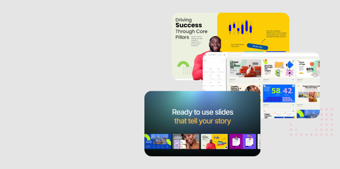
While many sites offer freebies, quality varies. For founders looking for a head start, utilizing professionally crafted bases is key. You can access various layouts specifically designed for business impact through our presentation templates directory.
Frequently Asked Questions
What is the ideal number of slides for a 2026 pitch deck?
Aim for 10 to 15 slides for an initial email introduction. A comprehensive deck for a live partner meeting can extend to 20 slides, including an appendix for deep dives into data.
Should I use PowerPoint, Keynote, or Google Slides?
In the US market, PDF is the standard for emailing. For live presenting, use whatever tool you are most comfortable with, but PowerPoint remains the enterprise standard for compatibility.
Do I need a “Thank You” slide?
Avoid a generic “Thank You” slide. End with a “Contact” slide that includes your email, phone number, and a clear call to action, such as “Let’s discuss the Series Seed.”
How much text should be on each slide?
Follow the “glance test.” An investor should understand the slide’s main point within 3 seconds. Use headlines to carry the narrative and limit body text to supporting evidence only.
Turn Your Complex Ideas into a Captivating Presentation
PitchWorx helps founders and enterprise teams convert raw content into high-impact visual stories.


