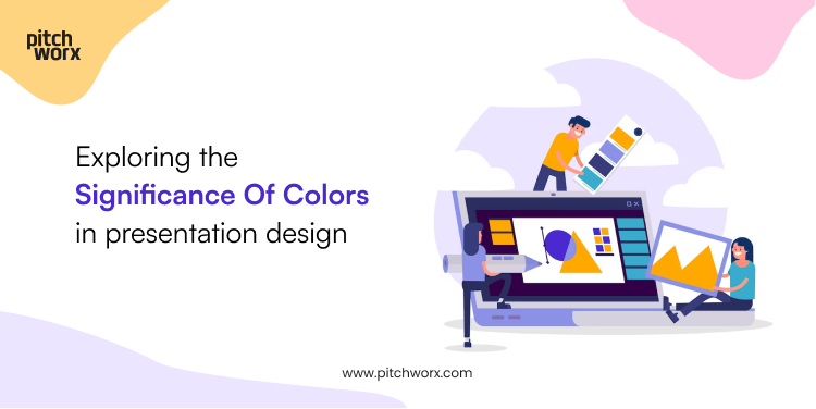
Colors are much more than just a visual stimulus. They are a powerful communication tool that can evoke emotions, signal actions and influence mood. That’s why the strategic use of colors by a presentation design company can shape perceptions, enhance brand recognition, and even influence audience engagement. In this blog, let us learn the significance of colors in the realm of presentation design, understand their psychological impact, and explore how to use them effectively to achieve our desired outcomes.
The psychology of colors
Understanding the psychology behind different colors is vital for PowerPoint presentation designers to create impactful presentation designs that drive people to action. By understanding the symbolic meanings of colors, you can strategically select and combine them to enhance your presentations.
Red: Power, Passion, and Attention-Grabbing
Red is a color that commands attention and evokes powerful emotions. A PPT agency might use the color to represent energy, passion, or urgency in a deck. Red can be also used to highlight critical information or draw attention to key points. However, it’s important to use red sparingly, as an excessive amount can overwhelm the audience or convey a sense of danger.
Blue: Trust, Stability, and Professionalism
Blue is a color associated with trustworthiness, stability, and professionalism. It creates a sense of calmness and reliability. When used in presentation design, blue can instill confidence in the audience and project a professional image. It is commonly used by PowerPoint presentation designers to craft corporate presentations or when conveying information that requires a sense of credibility.
Yellow: Optimism, Creativity, and Positivity
Yellow is a vibrant color that symbolizes optimism, creativity, and positivity. It captures attention and stimulates mental activity. Incorporating yellow into a presentation design can evoke a sense of enthusiasm and engagement from the audience. It is particularly effective when presenting innovative ideas or content that is meant to inspire creativity.
Green: Harmony, Growth, and Freshness
Green represents harmony, growth, and freshness. It is closely associated with nature and sustainability. In presentation design, green can be used to convey a sense of balance and a focus on growth and well-being. It is often utilized when a presentation design company has to create presentations related to environmental issues, health, and wellness.
Purple: Royalty, Luxury, and Creativity
Purple is a color that exudes a sense of royalty, luxury, and creativity. It represents elegance and sophistication. When incorporated into presentation design, purple can add a touch of exclusivity and inspire creative thinking. It is suitable for presentations that aim to convey a sense of high-end products, services, or artistic concepts.
Orange: Energy, Warmth, and Enthusiasm
Orange is a color that combines the energy of red and the vibrancy of yellow. It represents warmth, enthusiasm, and friendliness. When used in a deck designed by a PPT agency, orange can create a sense of excitement and capture the audience’s attention. It is also effective for presentations related to entertainment, food, and events.
Colors have a profound impact on presentation design, influencing emotions, perception, and engagement. No matter what you want to convey, your color choice should align with the message and objectives of your presentation. So, embrace the language of colors, experiment with their meanings, and create visually stunning presentations with the help of a presentation design company to captivate your audience’s attention and leave a lasting impression.