


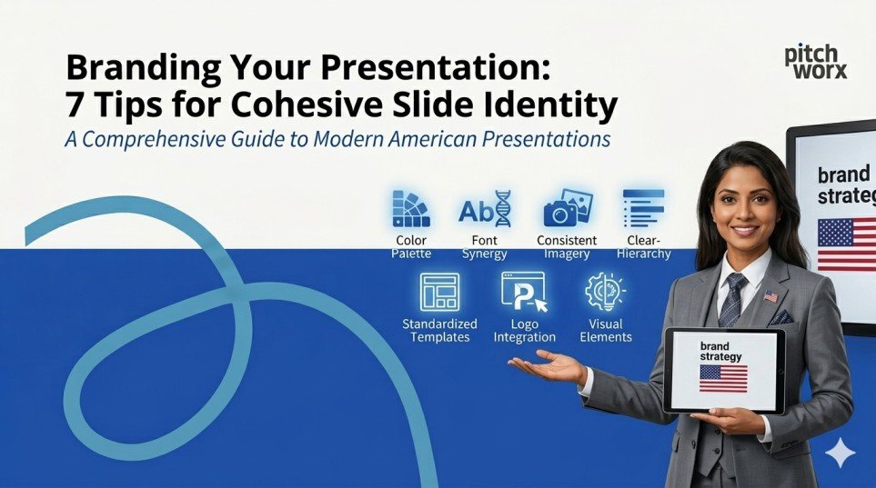
Quick Answer
To brand your presentation cohesively, maintain a consistent color palette, typography, and logo placement across every slide. Use a master slide template, stick to 2–3 brand colors, pair 2 complementary fonts, and integrate branded icons and imagery. Every design decision should reflect your company’s identity — making your slides instantly recognizable and reinforcing audience trust from the very first frame.
Table of Contents
- Quick Answer
- Introduction
- TIP 01: Build Your Master Slide Template First
- TIP 02: Establish a Brand Color Palette — and Stick to It
- TIP 03: Typography: Use Brand Fonts, Not Default Fonts
- TIP 04: Logo Placement: Visible, Consistent, Non-Intrusive
- TIP 05: Visual Consistency: Icons, Images and Illustration Style
- TIP 06: Data Slides: Brand Your Charts and Graphs
- TIP 07: Maintain a Consistent Tone of Voice Across All Slides
- Why Work with a Professional Presentation Design Agency?
- Conclusion
- Frequently Asked Questions (FAQs)
Introduction
Your presentation is more than a collection of slides — it is a direct extension of your brand identity. Whether you are pitching to investors, presenting to a boardroom, or delivering a keynote at an industry event, the way your slides look and feel communicates volumes before you say a single word.
Research consistently shows that consistent brand presentation can boost revenue by up to 23% (Harvard Business Review), and that audiences form lasting impressions within the first seven seconds of seeing a visual. In an era flooded with generic, template-driven decks, a cohesive, branded presentation is not a nice-to-have — it is a competitive advantage.
In this blog, we break down 7 actionable tips to help you build a presentation that is not just beautiful, but unmistakably yours. These are the same principles applied by leading presentation design agency professionals worldwide to transform ordinary slides into powerful brand experiences.
TIP 01 Build Your Master Slide Template First
Master Slide Template — PowerPoint Slide Master View showing branded layout
Every cohesive presentation begins with a solid foundation: the Master Slide. Think of it as your brand blueprint for every slide in the deck. Before you design a single content slide, build a fully branded master that locks in your logo position, background, font styles, color scheme, and layout grids.
PowerPoint and Google Slides both offer master slide functionality that lets you set these defaults globally. Once your master is in place, every new slide automatically inherits your branding — eliminating inconsistencies caused by manual formatting on individual slides.
Pro Tip: Create 3–5 layout variants in your master (title slide, content slide, image slide, data slide, end slide) so your team always works within a branded framework regardless of the content type.
Impact of Master Templates on Brand Consistency
Stage | Consistency Score | Growth |
No Template | 34% | +0% |
Basic Template | 51% | +50% |
Branded Master | 74% | +118% |
Full Brand System | 91% | +168% |
Agency-Designed | 98% | +188% |
TIP 02 Establish a Brand Color Palette — and Stick to It
Brand Color Palette — Slide showing primary, secondary and accent colors with HEX codes
Color is the single most powerful visual cue for brand recognition. Studies show that color alone increases brand recognition by up to 80%. Yet most presentations make the mistake of using colors inconsistently — pulling random shades from stock templates that clash with the company’s actual brand palette.
The rule is simple: identify 3 to 4 brand colors — a primary, a secondary, a neutral, and an accent — and use them exclusively throughout your deck. Apply them to backgrounds, headings, icons, chart bars, table headers, and call-out boxes.
If your brand uses #E8490F as the primary orange, do not substitute it with a ‘close enough’ coral or tomato red. Exact HEX, RGB, and PANTONE values matter. For businesses leveraging professional powerpoint design services, this discipline is always the first step before any creative work begins.
Stage | Brand Recognition | Growth |
Random Colors | 22% | +0% |
1-2 Brand Colors | 48% | +118% |
Full Palette Applied | 67% | +205% |
Palette + Consistency | 80% | +264% |
Systematic Brand Design | 93% | +323% |
TIP 03 Typography: Use Brand Fonts, Not Default Fonts
Typography Hierarchy — Slide showing H1, H2, body font pairing with brand fonts
Typography is a silent brand ambassador. The font you choose tells your audience whether you are bold and modern, classic and refined, or warm and approachable — long before they read the words. Yet the majority of business presentations rely on default fonts like Calibri or Times New Roman, which have no brand connection whatsoever.
The rule: use no more than two typefaces per presentation — one for headings, one for body text. These should be the fonts defined in your brand guidelines. If your brand uses Montserrat for headings and Open Sans for body copy, those two fonts should appear on every single slide.
Avoid mixing more than three font weights, and never use decorative or display fonts for body content — they destroy readability. If you are unsure which fonts work best together, a professional presentation design agency will always have a typographic system ready to implement.
Stage | Audience Readability Score | Growth |
Default System Fonts | 41% | +0% |
2 Consistent Fonts | 63% | +54% |
Brand-Defined Fonts | 77% | +88% |
Font + Size Hierarchy | 88% | +115% |
Full Type System | 95% | +132% |
TIP 04 Logo Placement: Visible, Consistent, Non-Intrusive
Logo Placement Guide — Slide showing correct logo positions in corner, footer and title slide
Your logo should appear on every slide — but it should never compete with your content. The most effective logo placement strategy is to anchor it consistently in the same position throughout the deck: typically the bottom-left or top-right corner, at a size that is visible but not dominant.
For the title slide and section dividers, your logo can be larger and more prominent. For content slides, it should recede into the background as a quiet badge of authenticity. Avoid placing logos over busy backgrounds, stretching them to fill space, or using old logo versions.
A critical pitfall to avoid: using multiple logo versions (full-color, reversed, watermark) without a consistent logic. Define clear rules for which version appears on which background color, and apply them without exception.
Stage | Professional Perception Score | Growth |
No Logo | 31% | +0% |
Inconsistent Logo | 44% | +42% |
Logo on Title Only | 57% | +84% |
Logo Every Slide | 72% | +132% |
Systematic Logo Rules | 89% | +187% |
TIP 05 Visual Consistency: Icons, Images and Illustration Style
Visual Style Guide — Slide comparing consistent vs. inconsistent icon and image styles
Visual inconsistency is one of the fastest ways to undermine a branded presentation. When one slide uses flat icons, the next uses 3D renders, and the third uses photographic images, the deck feels disjointed — and so does your brand perception.
The solution is to define a single visual language and maintain it end-to-end. Choose one style for your icons (flat, outline, or filled), one aesthetic for your photography (editorial, product-focused, or lifestyle), and one tone for your data visualizations (minimal, bold, or infographic-style).
For photography, ensure all images share a similar editing treatment — same color temperature, same cropping style, same composition logic. Many top-tier powerpoint design services include a visual asset curation step precisely to enforce this kind of consistency before a single slide is built.
Stage | Audience Engagement Rate | Growth |
Mixed Visuals | 29% | +0% |
Partial Consistency | 45% | +55% |
Defined Icon Style | 58% | +100% |
Icons + Photo Consistency | 73% | +152% |
Full Visual System | 87% | +200% |
TIP 06 Data Slides: Brand Your Charts and Graphs
Branded Data Visualization — Before/After chart slide showing generic vs. brand-colored graphs
Data slides are where most branded presentations completely fall apart. A beautifully branded deck with generic blue Excel charts is like a designer suit with a fast-food apron — the mismatch is jarring and instantly noticeable.
Every chart, graph, table, and data visualization in your presentation should be styled using your brand colors. Bar charts should use your primary palette. Pie charts should follow your accent color sequence. Tables should use your brand’s heading background color for header rows. Grid lines should be subtle — in a light neutral, never harsh black.
The most impactful branded data slides follow the ‘one insight per slide’ principle: one chart, one key takeaway, one action your audience should understand. This discipline, combined with brand-consistent design, ensures your data reinforces both your message and your identity simultaneously.
Stage | Data Clarity Score | Growth |
Default Chart Colors | 35% | +0% |
1-2 Brand Colors | 52% | +49% |
Full Brand Palette | 68% | +94% |
Brand + Clean Layout | 81% | +131% |
Fully Branded Data System | 94% | +169% |
TIP 07 Maintain a Consistent Tone of Voice Across All Slides
Tone of Voice — Slide showing brand messaging style guide with do’s and don’ts
Branding a presentation is not just visual — it is also verbal. The words on your slides, your headline style, the way you frame your value propositions, and even the CTA language on your final slide all contribute to the overall brand experience.
If your brand voice is confident and authoritative, your headlines should be declarative — ‘We Deliver Results’ not ‘Some Ways We Might Help You.’ If your brand is warm and human-centric, your slide copy should feel conversational rather than corporate. The tone should remain consistent whether you are presenting your company overview, your product features, or your pricing.
Define 3–5 tone-of-voice principles for your presentations and include them in your brand style guide: for example, ‘Direct, Data-Driven, Optimistic, Expert, Human.’ Then audit every slide against those principles before the deck is finalized.
Stage | Brand Voice Consistency | Growth |
No Defined Voice | 27% | +0% |
Partial Alignment | 43% | +59% |
Defined Principles | 61% | +126% |
Voice + Visual Sync | 78% | +189% |
Full Brand Story System | 93% | +244% |
Why Work with a Professional Presentation Design Agency?
PitchWorx Team — Professional presentation design agency at work across global markets
Implementing all seven of these tips consistently — across multiple presentations, multiple teams, and multiple markets — is where most organizations struggle. That is exactly where a dedicated presentation design agency adds transformative value.
PitchWorx is a globally recognized presentation design agency with over 13 years of experience, 150,000+ slides delivered, and clients spanning Fortune 500 companies across the UAE, USA, UK, and India. ISO 27001:2022 certified for information security, PitchWorx offers end-to-end powerpoint design services that go beyond aesthetics — building complete branded slide systems, master templates, and visual identity frameworks that ensure every presentation your company creates is on-brand, on-message, and high-impact.
From boardroom pitch decks to investor presentations and conference keynotes, PitchWorx’s team of expert designers and strategists transforms your brand guidelines into a living, breathing slide system — so your presentations always look as good as your brand deserves.
Conclusion
A cohesive, branded presentation is one of the most underestimated assets in your marketing and communications toolkit. When every slide speaks the same visual and verbal language — from the master template to the data chart colors, from the icon style to the headline tone — your audience does not just receive information. They experience your brand.
Whether you are building your brand slide system in-house or partnering with a professional presentation design agency, these seven tips give you the strategic framework to create presentations that are instantly recognizable, deeply trustworthy, and consistently compelling.
Your next presentation is not just a deck. It is a brand moment. Make it count.
Frequently Asked Questions
Q1. Why is branding important in presentations?
Branded presentations build trust, reinforce recognition, and make your message more memorable. Research shows consistent branding can increase revenue by up to 23% by creating cohesive, professional touchpoints with your audience at every interaction.
Q2. How many colors should I use in a branded presentation?
Stick to 3–4 colors: a primary, a secondary, a neutral background, and an accent. Using your exact brand HEX codes — not approximations — across all slides ensures true color consistency and prevents visual dilution of your brand identity.
Q3. What is a master slide and why does it matter?
A master slide is a global template that defines the default layout, fonts, colors, and logo placement for all slides in a deck. Setting up a master slide first ensures brand consistency automatically — without needing to manually format every individual slide.
Q4. How do powerpoint design services help with branding?
Professional powerpoint design services like those offered by PitchWorx build your entire slide system from the ground up — master templates, branded data visualizations, icon libraries, and style guides — so every presentation your team creates is automatically on-brand and presentation-ready.
Q5. Can I brand Google Slides presentations the same way?
Yes. Google Slides offers a Slide Master feature similar to PowerPoint’s. You can apply brand colors, upload custom fonts, set logo placement, and create branded layouts. The same seven principles apply regardless of which presentation tool your team uses.
Q6. How often should I update my presentation brand guidelines?
Review your presentation brand guidelines whenever your overall brand identity is refreshed — typically every 2–3 years, or immediately following a rebrand, merger, or major campaign launch. Keeping slides aligned with the latest brand assets is critical for consistency.
Q7. What makes a presentation design agency different from a freelance designer?
A presentation design agency brings a full team of strategists, designers, and brand specialists — plus established processes for quality control, version management, and scalability. Agencies like PitchWorx can handle high-volume slide production while maintaining exacting brand standards across every deliverable.