


Strengthen Your Brand With A Leading PowerPoint Design Firm in America
Published: 27 february 2026 | Reading Time: 15 minutes | Author: PitchWorx Strategy Team Quick Answer To strengthen your brand in today’s competitive U.S. market, you need presentations that are clear, strategic, and visually powerful. A leading PowerPoint Design Firm in America helps businesses turn ideas into persuasive visual stories that build credibility, improve engagement, […]
PowerPoint Slide Size Guide: Choosing The Proper Slide Size for your Presentation
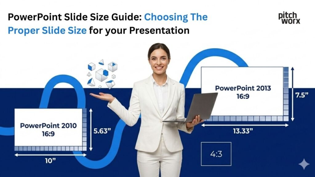
Published: 27 february 2026 | Reading Time: 16 minutes | Author: PitchWorx Strategy Team Quick Answer The best PowerPoint slide size for most presentations in the USA is Widescreen (16:9) because it matches modern laptops, TVs, Zoom screens, and most new projectors. Use Standard (4:3) only when you’re presenting on older projectors or when you […]
Best Presentation Design Service for Your Business Needs in 2026

Direct Answer The best presentation design service for your business needs in 2026 is one that combines creativity, strategic storytelling, and professional aesthetics tailored specifically to your audience. Pitchworx stands out as a leader in this space offering customized PowerPoint and presentation design services that elevate brand messaging and improve engagement. With a focus on […]
75 Trending Technical Presentation Topics for Engineering & IT 2026

Published: 26 february 2026 | Reading Time: 17 minutes | Author: PitchWorx Strategy Team Table of Contents Direct Answer: Technical Presentation Topics for 2026 Introduction: Why the Right Topic Matters Why Students Get Stuck Choosing Topics — And How to Fix It Step-by-Step Solution: How to Choose a Winning Topic 75 Trending Technical Presentation Topics […]
AI Model Optimization Ppt Topics for College Competitions 2026

Published: 25 february 2026 | Reading Time: 16 minutes | Author: PitchWorx Strategy Team Quick Answer AI Model Optimization PPT topics for college competitions in 2026 should focus on improving model speed, accuracy, efficiency, and real-world performance. Winning presentations clearly explain technical concepts in simple language, show real data, and use strong visuals. A well-structured […]
The 4 Key Principles of Presentation Design in 2026 Explained Simply
Published: 25 february 2026 | Reading Time: 15 minutes | Author: PitchWorx Strategy Team Table of Contents Quick Answer: The 4 Key Principles of Presentation Design in 2026 Why Presentation Design Matters in 2026 Principle 1: Clarity – One Message Per Slide Principle 2: Visual Hierarchy – Guide the Eye Principle 3: Consistency – Build […]
Write for Us: Submit Your Design Blog To PitchWorx for Free

Published: 24 february 2026 | Reading Time: 10 minutes | Author: PitchWorx Strategy Team Quick Overview Are you a designer, creative thinker, presentation expert, or branding professional? PitchWorx is now accepting design-focused guest contributions. If you have valuable insights, case studies, tutorials, or industry trends to share, you can submit your blog and get featured […]
PowerPoint Slide Size & Dimensions Guide 2026 (16:9 vs 4:3 Explained)
Published: 24 february 2026 | Reading Time: 15 minutes | Author: PitchWorx Strategy Team Quick Answer Use 16:9 (Widescreen) for most modern business meetings in 2026 because it fits laptops, TVs, Zoom/Teams sharing, and modern projectors. Use 4:3 (Standard) only when you know the room has older screens or you are reusing legacy decks built […]
The 777 Rule in Presentations for High Pitch Engagement
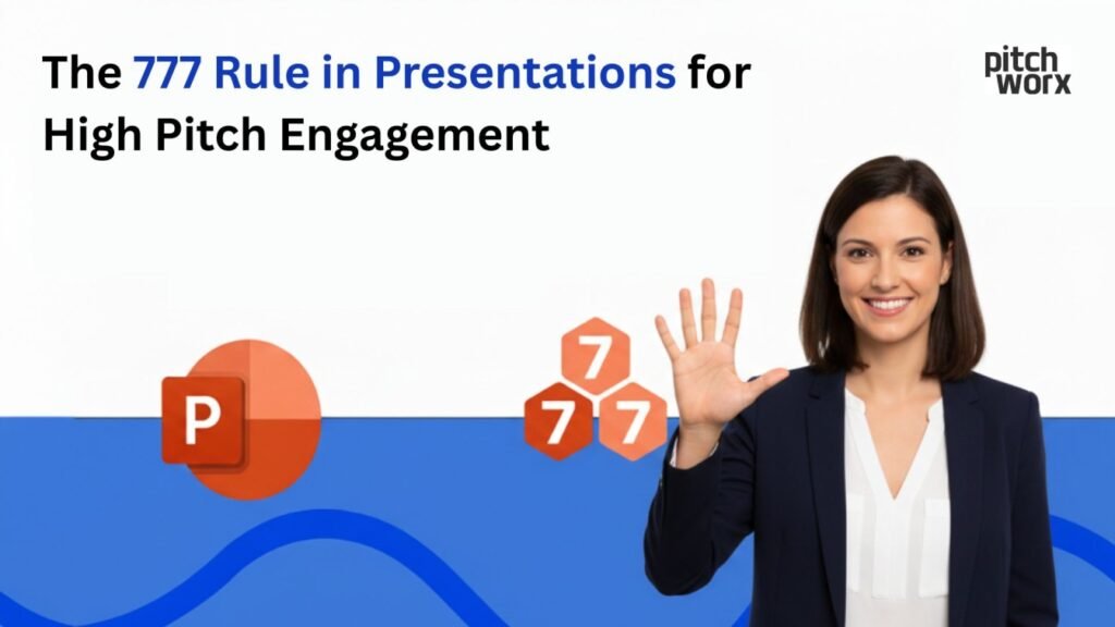
Published: 23 february 2026 | Reading Time: 16 minutes | Author: PitchWorx Strategy Team Quick idea in 2 lines The 777 Rule is a simple slide-writing method that keeps your pitch clear and fast to understand. It helps you reduce clutter so your audience focuses on the message, not the mess. PitchWorx uses this rule […]
How To Remove Watermark in PowerPoint (Legal Method) 2026
Published: 23 february 2026 | Reading Time: 14 minutes | Author: PitchWorx Strategy Team Quick Answer To remove a watermark in PowerPoint legally, you must either delete it from the Slide Master, remove background images, or edit the footer settings. If the watermark belongs to a licensed template, you should upgrade to the paid version […]