Published: December 16, 2025 | Reading Time: 11 minutes | Author: PitchWorx Design Team
Table of Contents
- Introduction
- Mistake 1: Text Overload
- Mistake 2: Death by Bullet Points
- Mistake 3: Template Trap
- Mistake 4: Color Chaos
- Mistake 5: Font Fiasco
- Mistake 6: Image Crimes
- Mistake 7: Animation Abuse
- Mistake 8: Data Disasters
- Mistake 9: Consistency Crisis
- The USA Startup Advantage: Why Design Matters for Pitch Decks
- Moving Forward: Your Action Plan
Introduction
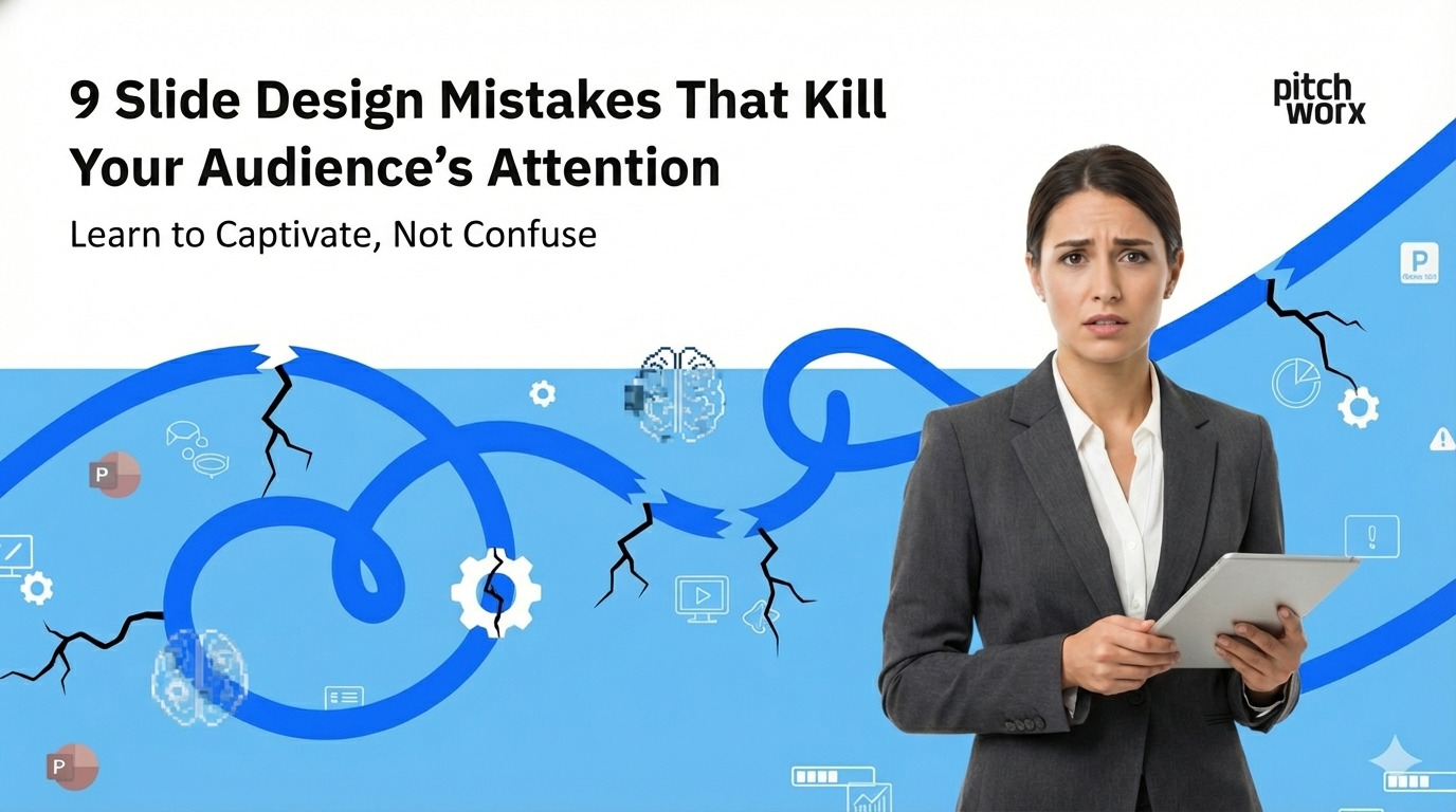
In the high-stakes world of American business, where PowerPoint design services can make or break a pitch, your presentation is often your only shot at making a lasting impression. With 91% of professionals reporting they suffer through “poorly designed” presentations, mastering slide design isn’t just about aesthetics—it’s about survival. Let’s explore the nine critical mistakes that are silently killing your audience’s attention and how to fix them.
1. Text Overload: The Corporate Death Trap
The Mistake: Cramming slides with paragraphs of text and dense information. Why It Kills Attention: The human brain can’t read text and listen to a speaker simultaneously. The Fix: Apply the 6×6 rule (6 words per line, 6 lines per slide) or embrace the “headline + visual” approach. Use speaker notes for detailed information.
2. Death by Bullet Points: The Corporate Zombie Effect
The Mistake: Using bullet points as the default format for every slide. Why It Kills Attention: Bullet points create a monotonous rhythm that is utterly forgettable. The Fix: Replace bullet points with data visualizations, icon arrays, progressive reveals, or comparison matrices.
3. Template Trap: The Generic Presentation Syndrome
The Mistake: Using default or overused stock templates. Why It Kills Attention: Generic templates make your billion-dollar idea look like a high school project and fail to stand out. The Fix: Invest in custom design that reflects your brand identity. The Best presentation design agency can create a unique and memorable visual story for you.
4. Color Chaos: The Rainbow Vomit Problem
The Mistake: Using too many colors or clashing color schemes. Why It Kills Attention: Color overload creates visual noise that distracts from your message. The Fix: Adopt a strategic color palette using the 60-30-10 rule: 60% primary brand color, 30% secondary color, and 10% accent color.
5. Font Fiasco: Typography That Screams Amateur
The Mistake: Using unprofessional or illegible fonts and mixing too many typefaces. Why It Kills Attention: Poor font choices undermine credibility. The Fix: Follow a font hierarchy with clean, sans-serif fonts like Montserrat or Raleway. Use a minimum of 24pt for body text.
6. Image Crimes: Low-Quality Visuals and Stock Photo Clichés
The Mistake: Using pixelated images or clichéd stock photos. Why It Kills Attention: Low-quality visuals diminish perceived value and professionalism. The Fix: Use high-resolution (minimum 1920×1080) and authentic photography or create custom graphics.
7. Animation Abuse: The Motion Sickness Maker
The Mistake: Overusing distracting transitions and animations. Why It Kills Attention: Excessive animation is annoying and unprofessional. The Fix: Use one consistent, subtle transition (like fade or cut) and animate only for purpose, such as revealing data progressively.
8. Data Disasters: Charts That Confuse Rather Than Clarify
The Mistake: Using 3D charts, cluttered graphs, or the wrong chart type. Why It Kills Attention: Poor data visualization forces the audience to work harder to understand your message. The Fix: Maximize the data-ink ratio, choose appropriate chart types, and use color only to highlight key points.
9. Consistency Crisis: The Franken-Deck Problem
The Mistake: Mixing design styles, spacing, and font sizes. Why It Kills Attention: Inconsistency creates cognitive dissonance and signals carelessness. The Fix: Establish and maintain a comprehensive style guide with a layout grid, consistent spacing, and element alignment. Top agencies use master slide templates to ensure consistency.
The USA Startup Advantage: Why Design Matters for Pitch Decks
In America’s competitive startup ecosystem, presentation design is strategic. Data from DocSend shows that professionally designed decks receive 32% more meeting time from investors. Partnering with the best presentation design agency gives you a competitive edge when competing for attention.
Moving Forward: Your Action Plan
Audit your current presentations against these nine mistakes. For critical presentations, consider professional design support. The ROI of great design is measured in the respect and attention your ideas command. In the attention economy of modern American business, slide design isn’t about making things pretty—it’s about making your message impossible to ignore.