Published: 03 March 2026 | Reading Time: 13 minutes | Author: PitchWorx Strategy Team
Quick Answer
Most presentation design fail because they overload the audience, look inconsistent, and hide the main message. Fixing 7 common mistakes—story, layout, typography, visuals, data, branding, and delivery—can lift clarity, recall, and decision-making, especially in sales, investor, and internal decks.
Table of Contents
- Quick Answer: Why Most Presentations Fail
- Introduction: Slides as Decision Tools
- Mistake 1: Starting with Slides Before the Story
- Mistake 2: Too Much Text (Reading vs. Listening)
- Mistake 3: Inconsistent Design System
- Mistake 4: Weak Visual Hierarchy
- Mistake 5: Charts That Confuse
- Mistake 6: Stock Images That Feel Fake
- Mistake 7: No Proof (Claims Without Credibility)
- Mini Case Study: B2B SaaS Pitch Transformation
- Example Flow Chart for Any Deck
- Free Tool Stack Quick List
- Frequently Asked Questions
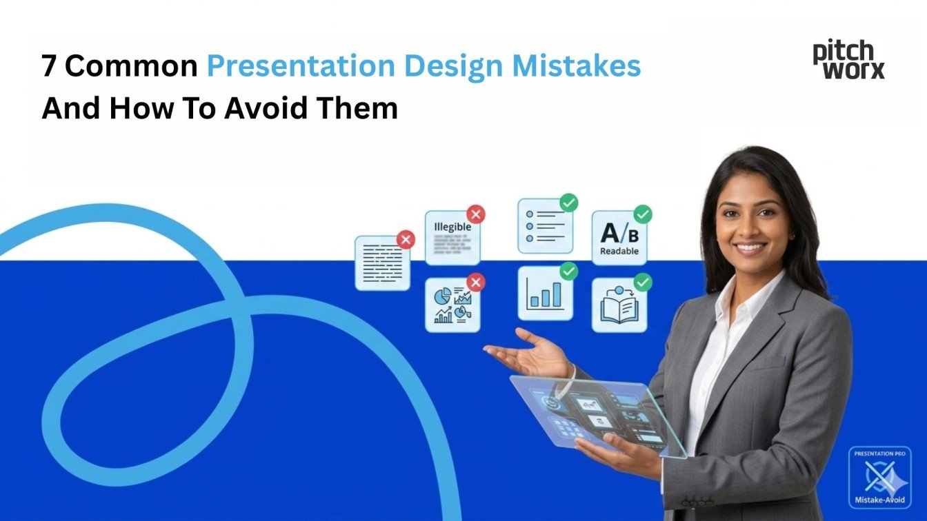
7 Common Presentation Design Mistakes And How To Avoid Them
A presentation is not “just slides.” It’s a decision tool. One messy deck can cost a deal, confuse a board, or kill team alignment. The good news: most slide problems repeat—and they’re fixable with a simple process and a few free tools.
Teams that invest in strong presentation design services usually see faster understanding, smoother meetings, and higher confidence in the message. Research on slide comprehension and cognitive load consistently supports the idea that reducing clutter and improving structure helps audiences process information better.
PitchWorx works as one of the best presentation design services in pan India and also global, so we see these mistakes across startups, corporates, agencies, and founders—UAE, USA, UK, India—everywhere.
Mistake 1: Starting with slides before the story
What happens: People open PowerPoint, pick a template, and start dumping content. The deck becomes a “document,” not a narrative.
How to avoid it:
- Write a one-line goal: “After this deck, the audience should…”
- Build a 6-step flow: 1) Context → 2) Problem → 3) Insight → 4) Solution → 5) Proof → 6) Next step
- Keep one idea per slide.
When you hire presentation design services, the first improvement is usually story clarity—not colors.
Free tools: Google Docs (outline first), Notion (storyboard), Milanote (moodboard + flow).
Mistake 2: Too much text (audience multitasks: reading vs listening)
What happens: Long paragraphs and bullet walls force the audience to read while you speak. That splits attention and reduces comprehension.
How to avoid it:
- Replace paragraphs with headline + key visual
- Use “speaker notes” for details, not the slide
- Try the “6×6 guideline” (not a law, but helpful): max 6 bullets, 6 words each
A Carnegie Mellon resource highlights that text-heavy slides and redundancy can hurt comprehension, and also points to slide structures that improve audience retention.
Free tools: PowerPoint Speaker Notes, Grammarly (clearer sentences), Hemingway Editor (readability).
Mistake 3: Inconsistent design system (fonts, spacing, alignment)
What happens: Different font sizes, random alignments, inconsistent spacing. The deck feels “unprofessional,” even if the content is good.
How to avoid it (simple system):
- Choose 2 fonts max
- Create a spacing rule: 8px / 16px / 24px steps
- Lock a grid and align everything to it
- Use consistent icon style (outline OR filled—never both)
This is where powerpoint design services shine: they create a reusable system so every slide looks like one brand, one story.
Free tools: PowerPoint guides + grid, Google Slides theme builder, Figma (build a mini design system).
Mistake 4: Weak visual hierarchy (nothing feels important)
What happens: Everything has the same weight. The viewer doesn’t know where to look.
How to avoid it:
- One bold headline that says the “so what”
- Make the key number 2–3× bigger than supporting text
- Use contrast (size, weight, whitespace), not random colors
Nielsen Norman Group’s work on cognitive load supports the idea that reducing mental effort improves understanding and task success—similar principles apply to slide scanning.
Free tools: Coolors (palette help), Fontpair (font combos), Remove.bg (clean cutouts).
Mistake 5: Charts that confuse (data without context)
What happens: Charts are copied from Excel with tiny labels, too many series, no takeaway.
How to avoid it:
- Give every chart a “meaning headline” (example: “Revenue grew 38% after onboarding”)
- Show only the comparison you need
- Add one callout label on the key point
Research on slide design and comprehension suggests that applying principles like coherence and signaling can improve learning outcomes.
Free tools: Datawrapper (clean charts), Flourish (story charts), Google Sheets (quick visuals).
Mistake 6: Stock images that feel fake (or irrelevant)
What happens: Generic handshake photos and random “corporate people smiling” visuals reduce trust.
How to avoid it:
- Use simple illustrations, icons, product screenshots, or real context photos
- If using stock: keep it consistent in style and lighting
- Prefer “diagram + labels” over decorative photos
If you’re using presentation design services (or powerpoint design services) professionally, aim for “clarity visuals” more than “pretty visuals.”
Free tools: Unsplash / Pexels (stock), Noun Project (icons), Canva (quick layout, but keep brand rules).
Mistake 7: No proof (claims without credibility)
What happens: Deck says “we’re best,” “we’re trusted,” “we’re fast”—but no evidence. That kills investor and enterprise confidence.
How to avoid it:
- Add proof slides: Case study snapshot, Metrics (before/after), Testimonials, Client logos (if allowed), Process + timelines
For example, PitchWorx is listed on agency directories with visible ratings and profile signals that can support trust building.
Mini Case Study (simple + realistic)
Scenario: A B2B SaaS team pitching to an enterprise buyer.
Problem: Their 18-slide deck was text-heavy and visually inconsistent.
Fix (PitchWorx approach):
- Rebuilt story flow into Problem → Impact → Solution → Proof → Next steps
- Reduced text by ~40% using headline + visual pattern
- Replaced messy charts with 3 “signal charts” (one takeaway each)
- Added one proof slide with metrics + a short testimonial quote
Result: The buyer’s internal team understood the proposal faster, the Q&A became more focused, and the sales cycle moved forward because the deck was easier to share internally—exactly what strong presentation design services are meant to do.
Example Flow Chart (use this for ANY deck)
Here’s a clean deck flow you can copy:
Flow (Story → Design → Delivery):

[Goal & Audience]
↓
[Outline: 6-step narrative]
↓
[Slide Types: Title / Problem / Proof / Offer / CTA]
↓
[Design System: fonts, colors, grid, icons]
↓
[Build Slides + simplify text]
↓
[Chart cleanup + proof]
↓
[Rehearse + tighten to time]
↓
[Final export + sharing version]
Tip: If you do this consistently, your “presentation success rate” improves because the audience can follow, remember, and act. Resources on slide design and cognitive load support why clarity-first structure matters.
Free Tool Stack (quick list)
- Writing/clarity: Grammarly, Hemingway
- Layout & system: PowerPoint guides, Figma, Canva
- Charts: Datawrapper, Flourish, Google Sheets
- Icons/visuals: Noun Project, Remove.bg, Unsplash
If you’re a team scaling fast, this is where professional powerpoint design services help you move quicker with consistency—especially when your decks are reused across sales, onboarding, investor updates, and events.
When clients experience strong presentation design services, the feedback typically sounds like:
“Our story finally feels clear.”
“The deck looks premium and consistent.”
“Stakeholders understood it faster.”
“We can reuse this template for months.”
Frequently Asked Questions
1) How many slides should a business presentation have?
Usually 8–15 for most meetings. What matters is time: 1–2 minutes per slide, with a clear narrative and proof points.
2) What is the fastest way to improve my slides today?
Cut text, add “meaning headlines,” and align everything to a grid. That alone makes a deck look more professional.
3) When should I hire presentation design services instead of doing it in-house?
When the deck affects revenue, fundraising, partnerships, or executive decisions—or when you need a consistent brand system across many decks. That’s when presentation design services and powerpoint design services deliver the biggest ROI.