Published: 09 february 2026 | Reading Time: 17 minutes | Author: PitchWorx Strategy Team
Quick Answer
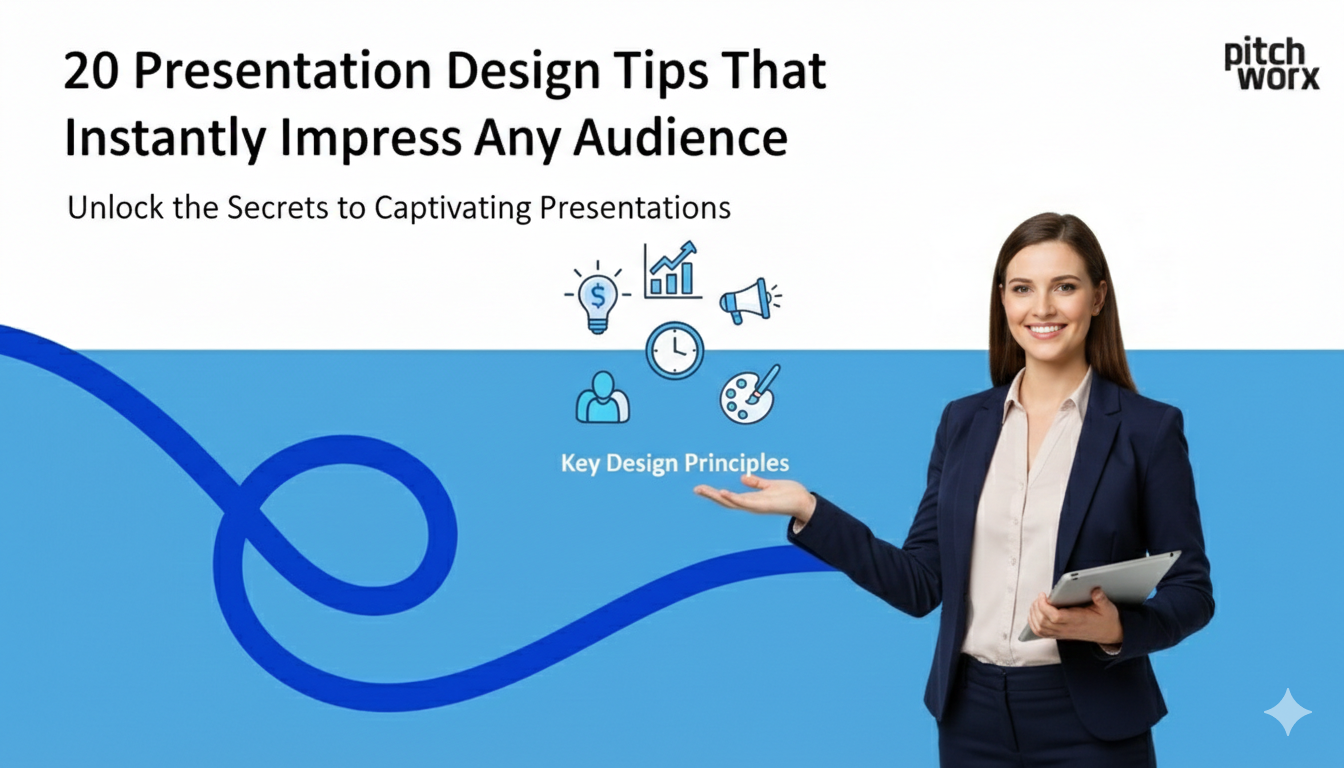
The 20 presentation design tips that instantly impress any audience are: use the 1-6-6 rule, apply the rule of thirds, maintain visual hierarchy, choose maximum 3 fonts, use high-quality images only, leverage white space effectively, ensure color contrast, implement data visualization, create visual consistency, limit bullet points, use animations purposefully, design for readability from distance, include storytelling elements, apply brand consistency, optimize slide transitions, incorporate visual metaphors, maintain aspect ratio consistency, use icon sets strategically, ensure accessibility compliance, and end with strong call-to-action slides. For example, Apple’s product launches consistently apply these principles—minimal text, stunning visuals, clear hierarchy, and emotional storytelling—creating presentations that captivate millions worldwide.
Table of Contents
- Quick Answer
- Introduction
- 1. Follow the 1-6-6 Rule
- 2. Apply the Rule of Thirds
- 3. Establish Clear Visual Hierarchy
- 4. Limit Font Choices to Three Maximum
- 5. Use Only High-Quality Images
- 6. Leverage White Space Strategically
- 7. Ensure Sufficient Color Contrast
- 8. Transform Data Into Visual Stories
- 9. Create Visual Consistency Throughout
- 10. Eliminate Excessive Bullet Points
- 11. Use Animations With Purpose
- 12. Design for Readability From Distance
- 13. Incorporate Storytelling Elements
- 14. Maintain Brand Consistency
- 15. Optimize Slide Transitions
- 16. Use Visual Metaphors
- 17. Maintain Consistent Aspect Ratios
- 18. Deploy Icon Sets Strategically
- 19. Ensure Accessibility Compliance
- 20. End With a Powerful Call-to-Action
- Free Presentation Design Tools
- When to Hire Professional PPT Design Services
- Conclusion
Introduction
Whether you’re pitching to investors, presenting at conferences, teaching students, or delivering sales proposals, your presentation design can make or break your message. Research from 3M Corporation shows that visuals are processed 60,000 times faster than text, meaning your audience judges your presentation quality within seconds of seeing your first slide. Professional presentation design agency services like PitchWorx have spent over 13 years mastering these principles, creating presentations that not only look stunning but also communicate effectively and persuade audiences. While hiring ppt design services delivers optimal results, understanding core design principles helps anyone create more impactful presentations. Let’s explore 20 actionable presentation design tips that will instantly elevate your slides and impress any audience.
1. Follow the 1-6-6 Rule
Limit yourself to one idea per slide, maximum six bullet points per slide, and maximum six words per bullet point. This forces clarity and prevents the dreaded “wall of text” that causes audiences to disengage. Cognitive load theory shows that humans can only process limited information simultaneously. Simplified slides keep audiences focused on your spoken message rather than reading dense text.
2. Apply the Rule of Thirds
Divide your slide into a 3×3 grid and place important elements along these lines or at their intersections. This photography principle creates more dynamic, visually interesting compositions than centering everything. Most professional presentation design agency teams use this technique instinctively, creating slides that feel balanced without appearing static.
3. Establish Clear Visual Hierarchy
Your most important information should be the most prominent—larger text, bolder colors, or more prominent positioning. Guide your audience’s eyes to what matters most. Create hierarchy through font size variation, color contrast, spatial positioning, and visual weight.
4. Limit Font Choices to Three Maximum
Use one font for headlines, one for body text, and optionally one for accents or callouts. More fonts create visual chaos and undermine professionalism. Recommended combinations include Montserrat with Open Sans, or Raleway with Lato. Professional ppt design services carefully select fonts that reflect brand personality while maintaining readability.
5. Use Only High-Quality Images
Pixelated, stretched, or low-resolution images instantly destroy credibility. Use images at minimum 1920×1080 resolution for full-slide backgrounds and never stretch images beyond their native dimensions. Free high-quality image sources include Unsplash, Pexels, Pixabay, and Burst by Shopify.
6. Leverage White Space Strategically
Empty space isn’t wasted space—it’s breathing room that makes your content digestible. Crowded slides overwhelm audiences, while generous white space creates sophistication and focus. Aim for at least 30-40% of each slide to remain empty. This counterintuitive approach actually increases information retention.
7. Ensure Sufficient Color Contrast
Text must be easily readable against backgrounds. Use online contrast checkers to ensure WCAG AA compliance (minimum 4.5:1 ratio for normal text, 3:1 for large text). Good contrast examples are dark navy text on a white background or white text on a dark navy background.
8. Transform Data Into Visual Stories
Replace boring spreadsheet tables with compelling charts, graphs, and infographics. Visual data representation increases comprehension by 400%. Use bar charts for comparisons, line charts for trends, and pie charts sparingly for composition.
9. Create Visual Consistency Throughout
Maintain consistent colors, fonts, layouts, and styling across all slides. This creates professional polish and helps audiences focus on content rather than noticing design inconsistencies. Elements requiring consistency include your color palette, font sizes, icon styles, image treatment, and spacing.
10. Eliminate Excessive Bullet Points
Bullet points have their place, but overuse creates “Death by PowerPoint.” When appropriate, replace bullets with images illustrating each point, icons representing concepts, timeline visualizations, process diagrams, or numbered steps for sequences.
11. Use Animations With Purpose
Animations should reveal information progressively or emphasize key points—not distract with unnecessary movement. Avoid spinning text, bouncing images, or any animation that calls attention to itself rather than your message. Effective uses include revealing bullet points one by one or building complex diagrams step-by-step.
12. Design for Readability From Distance
Conference rooms and auditoriums require larger text. Minimum recommended font sizes are 36-44 points for headlines and 24-28 points for body text. Test by viewing your presentation from 10 feet away if you can’t read it easily, increase the font size.
13. Incorporate Storytelling Elements
Every presentation tells a story. Structure your slides with a clear beginning (problem/situation), middle (solution/analysis), and end (conclusion/call-to-action). Use narrative techniques to create an emotional connection. This is where experienced presentation design agency services excel, translating business information into compelling narratives.
14. Maintain Brand Consistency
Incorporate your organization’s colors, fonts, logos, and visual style. Brand consistency builds recognition and reinforces professionalism. However, avoid cluttering every slide with logos a subtle footer or opening/closing slides suffice.
15. Optimize Slide Transitions
Stick with simple transitions like “fade” or “push.” Elaborate transitions distract from content and appear amateurish. Consistency matters here too—use the same transition throughout unless you have a specific reason to vary.
16. Use Visual Metaphors
Abstract concepts become concrete through visual metaphors. Representing growth as climbing stairs, challenges as mountains, or collaboration as puzzle pieces helps audiences grasp intangible ideas. Professional ppt design services like PitchWorx excel at identifying and visualizing appropriate metaphors.
17. Maintain Consistent Aspect Ratios
Modern presentations typically use a 16:9 widescreen format. Ensure all images and graphics match this ratio to avoid distortion or awkward black bars. When incorporating multiple images on one slide, maintain consistent sizing and proportions.
18. Deploy Icon Sets Strategically
Icons provide visual interest while conveying concepts quickly. Use cohesive icon sets (same style, line weight, and design approach) rather than mixing different styles. Free resources include Flaticon, Noun Project, Icons8, and Font Awesome.
19. Ensure Accessibility Compliance
Design presentations that work for all audiences: provide alt text for images, ensure color isn’t the only way information is conveyed, use readable fonts, maintain high contrast ratios, and include captions for video content.
20. End With a Powerful Call-to-Action
Your final slide shouldn’t just say “Thank You.” Instead, include clear next steps, contact information, memorable summary points, or specific actions you want the audience to take. Effective closing slides include a summary, a specific call-to-action, contact details, and QR codes linking to resources.
Free Presentation Design Tools
While professional results often require expert assistance, free tools like Canva, Google Slides, Prezi, Beautiful.ai, LibreOffice Impress, and Visme can help improve your presentations.
When to Hire Professional PPT Design Services
DIY approaches work for internal meetings, but high-stakes situations like investor pitches, conference keynotes, or major sales presentations benefit from professional expertise. PitchWorx, with its ISO certification and 13+ years of experience, specializes in transforming complex information into visually compelling presentations that achieve specific objectives.
Conclusion
Impressive presentations combine visual excellence with clear communication. These 20 tips provide a framework for creating slides that engage audiences and reflect professionalism. Remember that design serves your message. Whether you choose DIY or professional routes, prioritizing presentation design quality demonstrates respect for your audience’s time and attention. Great presentations don’t happen by accident—they result from intentional design choices. For presentations where excellence is non-negotiable, consider partnering with experienced professionals like PitchWorx who’ve spent over a decade mastering the art and science of presentation design.