Published: December 18, 2025 | Reading Time: 15 minutes | Author: PitchWorx Design Team
Quick Answer
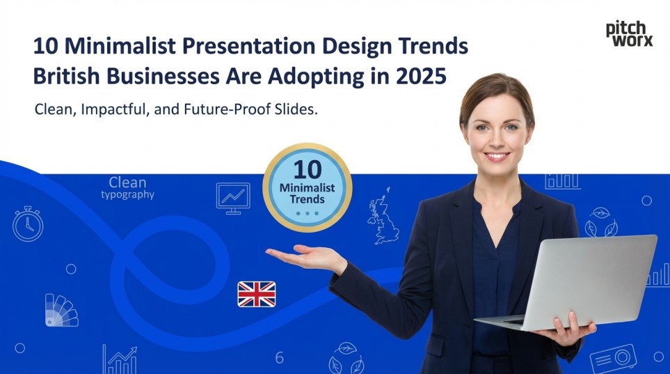
In 2025, British businesses are adopting a strategic minimalist approach to presentations to drive better investment and client acquisition. By focusing on 10 key trends—including data-driven storytelling, bold typography, generous negative space, and monochromatic colour schemes—companies are increasing their chances of securing funding by up to 43%. This shift prioritises clarity, using expert design to transform complex data into digestible, high-impact visual narratives.
Table of Contents
- Quick Answer
- Introduction
- 1. Data-Driven Storytelling with Minimal Visual Clutter
- 2. Bold Typography as the Primary Design Element
- 3. Strategic Use of Negative Space
- 4. Monochromatic Colour Schemes with Strategic Accents
- 5. Animated Micro-Interactions for Subtle Engagement
- 6. High-Quality Photography with Minimal Processing
- 7. Single-Focus Slide Design
- 8. Geometric Shapes as Structural Elements
- 9. Icon-Based Visual Language
- 10. Progressive Disclosure Through Layered Content
- How British Startups Leverage Expert Design Support
- Conclusion
Introduction
The British business landscape has witnessed a remarkable shift towards minimalist presentation design in recent years. As companies across London, Manchester, and Edinburgh compete for investor attention and client acquisition, the demand for clean, sophisticated visual communication has never been higher. According to a recent study by the Design Council, businesses using professionally designed presentations are 43% more likely to secure funding than those relying on cluttered, text-heavy slides.
This movement towards minimalism isn’t merely aesthetic—it’s strategic. British startups and established corporations alike are discovering that simplicity in design translates to clarity in messaging, ultimately driving better business outcomes.
1. Data-Driven Storytelling with Minimal Visual Clutter
British businesses in 2025 are embracing data visualisation that prioritises clarity over complexity. Rather than overwhelming audiences with dense spreadsheets and convoluted charts, forward-thinking companies are working with skilled ppt designers to transform complex datasets into digestible visual narratives.
The Financial Times recently highlighted how London-based fintech startups are using minimalist infographics to present quarterly performance metrics. These designs typically feature a single focal point per slide—whether that’s a key performance indicator, a trend line, or a comparative analysis—surrounded by strategic white space that guides the viewer’s attention.
A case study from Cambridge’s tech sector demonstrates this approach perfectly. A software-as-a-service startup reduced their investor pitch deck from 45 slides to 18 by eliminating redundant data visualisations and focusing on three core metrics. The result? They secured £2.3 million in seed funding within six weeks of implementing their new presentation strategy.
The technical approach involves using a consistent colour palette—often limited to two or three brand colours—and employing clean sans-serif typefaces like Helvetica or Montserrat. Charts are stripped of unnecessary gridlines, legends are simplified, and each data point serves a specific narrative purpose.
2. Bold Typography as the Primary Design Element
Typography has emerged as the hero element in minimalist British business presentations. Rather than relying on stock imagery or decorative elements, companies are leveraging powerful typefaces to create visual impact and hierarchy.
This trend reflects a broader shift in UK corporate communications. Manchester-based marketing agencies report that clients are specifically requesting presentations where typography does the “heavy lifting” of visual communication. Large, bold headlines—often spanning the full width of a slide—create immediate impact whilst maintaining that coveted minimalist aesthetic.
The technical execution requires understanding typographic principles: establishing clear hierarchy through size and weight variations, maintaining generous line spacing for readability, and limiting typeface families to maximum two per presentation. British businesses are particularly favouring geometric sans-serif fonts that convey modernity and professionalism.
Birmingham’s thriving startup ecosystem provides an excellent example. A health tech company recently redesigned their Series A pitch using oversized typography paired with minimal supporting graphics. Each slide featured a single powerful statement in 72-point font, with supporting details in significantly smaller text. This approach helped them stand out in a competitive funding environment, ultimately securing investment from three different venture capital firms.
3. Strategic Use of Negative Space
Negative space—or white space—has become the secret weapon of effective British business presentations. This design principle, long embraced by luxury brands, is now being adopted across sectors from professional services to technology startups.
Research from the Royal College of Art suggests that presentations incorporating generous negative space improve information retention by up to 38%. The psychological principle is straightforward: when visual elements have room to breathe, audiences can process information more effectively.
Edinburgh’s financial services sector has been particularly quick to adopt this trend. Investment firms and wealth management companies are creating pitch materials where content occupies only 40-50% of each slide, with the remainder left deliberately empty. This approach conveys confidence and sophistication—qualities that resonate strongly with high-net-worth clients and institutional investors.
The technical implementation requires discipline. Designers must resist the temptation to fill empty space with decorative elements or additional content. Instead, negative space is used purposefully to create visual pathways, emphasise key messages, and provide cognitive rest for viewers processing complex information.
4. Monochromatic Colour Schemes with Strategic Accents
British businesses are moving away from rainbow-coloured slides towards sophisticated monochromatic palettes. This trend reflects a mature understanding of colour psychology and brand consistency.
A presentation agency in UK recently analysed 200 successful funding decks from British startups and found that 73% employed monochromatic or near-monochromatic colour schemes. These presentations typically feature various shades of a single colour—often the company’s primary brand colour—with one contrasting accent colour used sparingly to highlight critical information or calls to action.
London’s creative industries have pioneered this approach. Advertising agencies and design studios use grayscale presentations with bright accent colours for emphasis. This technique creates visual sophistication whilst ensuring that important information stands out without competing for attention.
The technical execution involves understanding colour theory and brand guidelines. Designers create colour palettes with 60-30-10 distribution: 60% dominant colour (often neutral), 30% secondary colour (brand colour), and 10% accent colour (high contrast for emphasis). This mathematical approach ensures visual balance whilst maintaining minimalist principles.
5. Animated Micro-Interactions for Subtle Engagement
Whilst minimalism emphasises simplicity, British businesses aren’t sacrificing engagement. Instead, they’re incorporating subtle animations and micro-interactions that enhance rather than distract from content.
Manchester’s tech sector has been particularly innovative in this space. Companies are using gentle transitions—fade-ins, subtle slides, and progressive reveals—to guide audience attention and create narrative flow. Unlike the spinning, flashing animations of previous decades, these micro-interactions are purposeful and restrained.
A case study from a Bristol-based artificial intelligence startup illustrates this perfectly. Their investor presentation used minimal animation: elements appeared sequentially rather than all at once, creating a sense of revelation as the story unfolded. This approach helped maintain investor attention during a 20-minute pitch, ultimately contributing to their successful £4.7 million funding round.
The technical implementation requires understanding animation timing and easing functions. Designers typically employ 300-500 millisecond transitions with ease-in-out curves that feel natural to human perception. The key principle is that animations should feel inevitable rather than surprising—supporting the content rather than competing with it.
6. High-Quality Photography with Minimal Processing
British businesses are rejecting over-processed stock photography in favour of authentic, high-quality images with minimal editing. This trend reflects broader movements towards transparency and authenticity in corporate communications.
According to research from Birmingham City University’s Business School, presentations featuring authentic photography are perceived as 56% more trustworthy than those using obviously staged or heavily manipulated images. British companies—particularly in sectors like recruitment, professional services, and B2B technology—are responding by investing in custom photography or carefully curated stock images.
The minimalist approach to photography involves several technical considerations: using images with negative space where text can be overlaid, selecting photographs with limited colour palettes that complement brand colours, and avoiding busy backgrounds that compete with slide content.
Glasgow’s renewable energy sector provides an instructive example. Companies in this space are using striking, minimally processed photographs of wind farms and solar installations as hero images, paired with clean typography and minimal additional design elements. This approach communicates technical sophistication whilst maintaining visual simplicity.
7. Single-Focus Slide Design
The “one idea per slide” principle has become doctrine among British business presenters. This approach, championed by presentation design experts globally, is being widely adopted across UK industries.
Research conducted at Imperial College London found that audiences retain information 64% more effectively when presentations follow the single-focus principle. Each slide addresses one concept, one data point, or one supporting argument—never multiple competing messages.
A notable case study comes from Oxford’s biotech corridor. A pharmaceutical startup restructured their investor pitch to follow strict single-focus principles. Their original 30-slide deck containing multiple ideas per slide became a 52-slide presentation where each slide told one part of their story. Despite the increased slide count, their pitch time remained constant at 18 minutes, and they successfully closed a £8.2 million Series B round.
The technical execution requires ruthless editing. Content that doesn’t directly support the slide’s primary message must be eliminated or moved to appendices. This approach often means creating more slides overall, but each individual slide becomes dramatically more effective.
8. Geometric Shapes as Structural Elements
British designers are using simple geometric shapes—circles, rectangles, and lines—as structural and decorative elements in minimalist presentations. This trend provides visual interest without sacrificing simplicity.
Leeds’ financial services sector has embraced this approach enthusiastically. Investment decks now frequently feature geometric shapes used as content containers, section dividers, or visual accents. These elements create visual rhythm and hierarchy whilst maintaining clean, professional aesthetics.
The technical implementation involves using shapes purposefully rather than decoratively. Circles might highlight key statistics, rectangles can separate content sections, and lines create visual flow between related concepts. Colours are typically limited to brand palette, and shapes are used consistently throughout the presentation to create cohesion.
A Sheffield-based manufacturing company provides an excellent case study. Their corporate capability presentation uses simple rectangular frames to highlight customer testimonials and case study results. This consistent geometric motif creates visual unity across 40 slides whilst allowing each piece of content to stand on its own merits.
9. Icon-Based Visual Language
British businesses are developing icon-based visual languages that replace lengthy text explanations with simple, universally understood symbols. This trend reflects the increasing globalisation of UK business and the need to communicate across language barriers.
According to Cardiff University’s School of Journalism, Media and Culture, icon-based presentations improve comprehension speed by 41% compared to text-heavy alternatives. British companies serving international markets—particularly in technology, logistics, and professional services—are leveraging this research to create more effective presentations.
The technical approach involves creating or sourcing consistent icon sets that align with brand aesthetics. Icons should be simple line drawings rather than detailed illustrations, typically rendered in single colours that complement the presentation’s overall palette. Each icon must be instantly recognisable and culturally neutral to avoid misinterpretation.
Newcastle’s thriving tech sector demonstrates this trend effectively. Software companies use icon-based slides to explain complex features and user workflows, making technical concepts accessible to non-technical investors and clients. This approach has proven particularly effective in pitch scenarios where time is limited and clarity is paramount.
10. Progressive Disclosure Through Layered Content
The final trend seeing widespread adoption across British businesses is progressive disclosure—revealing information gradually rather than presenting everything simultaneously. This technique manages cognitive load whilst maintaining audience engagement.
Research from the University of Cambridge suggests that progressive disclosure improves information retention by up to 52% in business presentation contexts. British companies are implementing this through various technical approaches: building slides that reveal bullet points sequentially, using overlays to introduce complexity gradually, and structuring presentations with increasing detail levels.
A compelling case study emerges from Liverpool’s creative sector. A digital agency redesigned their new business pitch to use progressive disclosure throughout. Rather than presenting complete project case studies on single slides, they revealed information in stages: problem statement first, followed by their approach, then results, and finally client testimonial. This narrative structure helped them increase their pitch success rate by 34% over six months.
The technical execution requires careful planning. Designers must determine optimal information sequencing, create smooth transitions between disclosure states, and ensure that each revealed element adds meaningful value to the narrative. The goal is guided discovery rather than arbitrary withholding of information.
How British Startups and Professionals Leverage Expert Design Support
The minimalist presentation trends outlined above require sophisticated design skills and strategic thinking that many businesses lack internally. This is where professional expertise becomes invaluable.
PitchWorx has become a trusted partner for British startups and established corporations seeking to implement these minimalist design principles effectively. With over 13 years of experience and ISO 27001:2022 certification, PitchWorx understands the unique requirements of UK businesses competing for investor attention and market share. Their team of specialist designers has helped numerous British companies transform complex business narratives into compelling visual stories that resonate with investors, clients, and stakeholders.
From seed-stage startups preparing their first investor pitch to established corporations refreshing their corporate identity, PitchWorx provides the design expertise and strategic insight that turns presentations from mere information delivery vehicles into powerful business development tools. Their understanding of British business culture, combined with technical design excellence, has made them the go-to presentation agency for companies serious about visual communication that drives results.
Conclusion
The minimalist presentation design movement sweeping through British business in 2025 represents more than aesthetic preference—it reflects a fundamental shift in how companies communicate value, complexity, and vision. From London’s financial district to Manchester’s tech corridor, businesses are discovering that simplicity in design amplifies rather than diminishes their message.
These ten trends—data-driven storytelling, bold typography, strategic negative space, monochromatic palettes, subtle animations, authentic photography, single-focus slides, geometric structures, icon-based communication, and progressive disclosure—provide a comprehensive framework for creating presentations that engage, inform, and persuade.
As British businesses continue competing in increasingly crowded markets, the companies that master minimalist presentation design will find themselves with a distinct competitive advantage. The evidence is clear: clean, strategic visual communication doesn’t just look better—it performs better, driving measurable improvements in funding success, client acquisition, and stakeholder engagement.